


 Add Review
 Subscribe
 Nominate
 Submit Media
 RSS
RSS

Posts 

Pages:
1

Is this still being done by Roden? The style looks way different.
edit: there's also some issues with straight lines on the inner edges of the dirt autotile.
edit: there's also some issues with straight lines on the inner edges of the dirt autotile.

Sooz

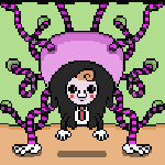
They told me I was mad when I said I was going to create a spidertable. Who’s laughing now!!!
5354
I don't want my children anywhere near that octopus.
This place is going to be subtly horrifying is it, with the monsters running around and no children.
This place is going to be subtly horrifying is it, with the monsters running around and no children.


author=Dragol
Everything looks... more flat than your previous locations. Or it's me... >.<
Yeah, I think you could address this with a bit of shading. For the octopus, for instance, you could use a darker, less saturated yellow (more advanced shading probably uses a nearby, cooler color, but I'm not the best at this kind of thing so play around and be consistent) on the bottom of the tentacles to round them out a bit. Also, you could use shadows to better anchor everything to the ground. I usually use a grey that's very close to black (30 on the brightness) and set it as a transparent color, but you can also just have black shadows if you want a lot of contrast; I seem to remember Breath of Fire 3 doing that.
Having things stylized like you currently have them isn't a bad thing, but it might clash with Pizza's tiles.
author=Housekeepingauthor=DragolYeah, I think you could address this with a bit of shading. For the octopus, for instance, you could use a darker, less saturated yellow (more advanced shading probably uses a nearby, cooler color, but I'm not the best at this kind of thing so play around and be consistent) on the bottom of the tentacles to round them out a bit. Also, you could use shadows to better anchor everything to the ground. I usually use a grey that's very close to black (30 on the brightness) and set it as a transparent color, but you can also just have black shadows if you want a lot of contrast; I seem to remember Breath of Fire 3 doing that.
Everything looks... more flat than your previous locations. Or it's me... >.<
Having things stylized like you currently have them isn't a bad thing, but it might clash with Pizza's tiles.
Sooz also informed me that the Kraken looks flat because I literally forgot to draw in the top of its head ^^;; I did a quick fix of that and took her recommendation to add some more tentacles behind it. I went ahead and re-uploaded the screenshot. For those who are curious, here are the before-and-after:

I may do more to make it look better, but this is a start, at least, I hope ^_^
author=Craze
that octopus just got way more terrifying in the update, gj
Thanks! :D

Pages:
1

