Login
Login
Register
Recover Password
The only place where it is socially acceptable to discuss menu systems for JRPGs
GAMES
Full Games List
Featured Games
New Games
Reviews
Media
Images
Blogs
Game Updates
DEVELOPMENT
Development Spotlights
Images Feedback Summary
Game Design Highlights
Tutorials
Articles
Scripts
Utilities / Plugins
Resources
Engines
Engine Bulletins
What is Makerscore?
EVENTS
Past Events
Achievements
Misaos
COMMUNITY
Forums
Post History
Chat
New to RMN?
STORE
Full Store List
RMN Music Pack (free)
Important
MISAO RESULTS 2023
Download Now
43.5 MB
297 downloads
2 reviews
Save to Dropbox
Add Review
Subscribe
Nominate
Submit Media
RSS
Summary
Blog
Images
Reviews
Media
Characters
Downloads
Play Lists
Sgt M
Added: 04/06/2018 12:56 AM
Last updated: 04/20/2024 03:46 PM
1956 views
Posts
Pages:
1
visitorsfromdreams
3530
visitorsfromdreams
View games
View playlists
Close
04/06/2018 01:03 AM
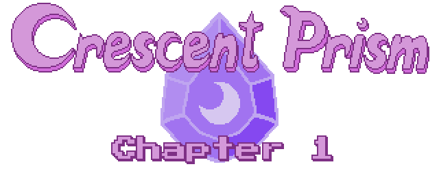
The moon on the I is a nice touch. Colours behind the logo are a bit intense for me though. :(
Sgt M
h
7268
Sgt M
View games
View playlists
Close
04/06/2018 01:06 AM
I'll see what I can do about that. They dont show up especially bright for me, but if it's a problem for folks I'll darken that layer a tad.
visitorsfromdreams
3530
visitorsfromdreams
View games
View playlists
Close
04/06/2018 01:11 AM
I think its just the abundance of colour, it looks kind of busy despite not much actually going on. I think removing the line separating each beam might help along with making them a little more subtle... maybe...
Sgt M
h
7268
Sgt M
View games
View playlists
Close
04/06/2018 01:27 AM
I see what you mean! Maybe this will do the trick:
Show
visitorsfromdreams
3530
visitorsfromdreams
View games
View playlists
Close
04/06/2018 01:30 AM
That looks heaps tidier!
Pages:
1

 Add Review
 Subscribe
 Nominate
 Submit Media
 RSS
RSS