


0RANGE00'S PROFILE
0range00
0
Search
Filter
 The Screenshot Topic Returns
I like the coral. It could use some work to make it match rest of the chipset more, but it's a great way to make that beach less generic.
BizarreMonkey, that's a cool artstyle. Kinda clusterfuck, but in a good way ^^
Hatch, that light radius is a little small, no? Looks unbelieavable otherwise, really cool!
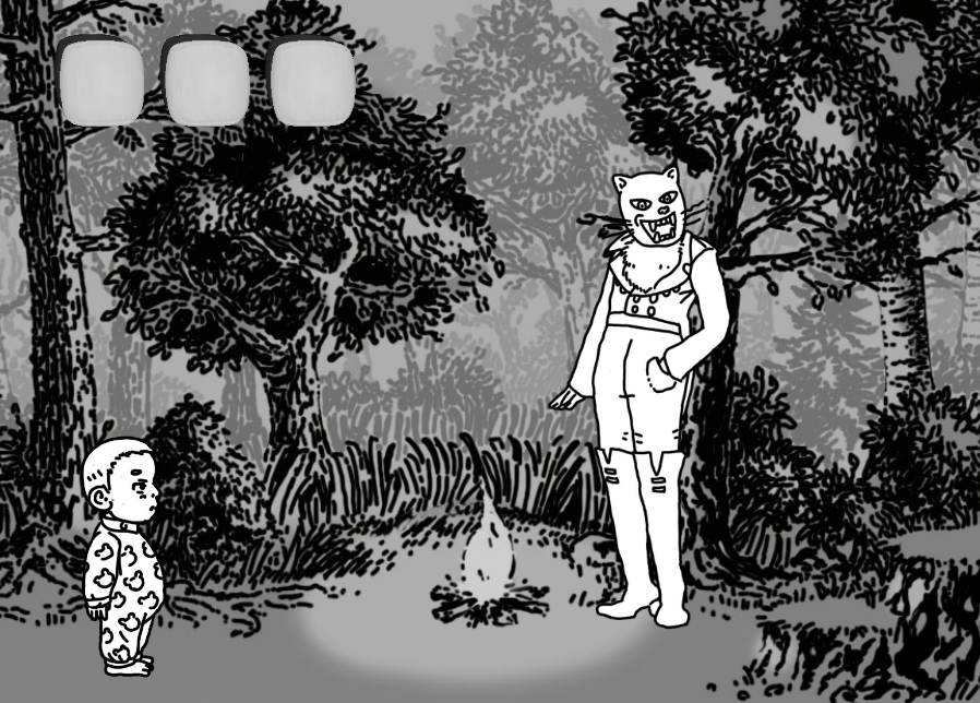
NOACCEPTANCE, you got a noble cause there, lynch-inspired game sounds always great. God's appearance is quite puzzling
BizarreMonkey, that's a cool artstyle. Kinda clusterfuck, but in a good way ^^
Hatch, that light radius is a little small, no? Looks unbelieavable otherwise, really cool!
NOACCEPTANCE, you got a noble cause there, lynch-inspired game sounds always great. God's appearance is quite puzzling
 What Videogames Are You Playing Right Now?
author=Red_Nova
I got Metal Arms: Glitch in the System for the Gamecube last week at the insistence from a friend I hadn't seen in years. By "insistence", I mean he literally blocked my exit from Gamestop until I bought it. He told me that it was a hidden gem, and that I'd be doing a series disservice by not getting it. Okay, fine. I'll buy it! Just let me out already!!
Anyway, I picked up the game for $10 buck, went home and popped it in.
And I looooooooove it!!
I usually go after RPGs or games with a strong story. So I had forgotten that sometimes I just want to kick back, relax, and blow shit up. This is a particular itch that Metal Arms scratches VERY well. I feel like a child again, gleefully running around, spraying more bullets than a Touhou game, and cackling like a madman watching enemy robots break apart limb from limb.
If you don't like the ideas of over 40 varied missions, a rocket launcher that can hold 50 rockets, and FARTING ROBOTS, then you seriously need to reevaluate your standards.
Hey, i was meaning to buy that game for years back then. Never got around buying it. Might check online auctions for cheap prices...
Anyways I'm playing Tactics Ogre for GBA. I got used copy for like 5 bucks, i call that a steal.
 [Poll] Favorite Link Incarnation
It's a close call between toon Link and OoT Link... I like how OoT Link(i'm talking about the big nosed one, not the pretty remake Link) seems to always be completely clueless.
I liked Toon Link right from the beginning. As someone said, he's got more personality than others. Art style is beautiful too.
As a side note, I'm not too keen on how Link looks in ZeldaU. But I'll wait to see more before passing final judgement.
I liked Toon Link right from the beginning. As someone said, he's got more personality than others. Art style is beautiful too.
As a side note, I'm not too keen on how Link looks in ZeldaU. But I'll wait to see more before passing final judgement.
The Screenshot Topic Returns
I can see fairly well what's going on
I like the vibe you got. Somewhere between Final Fantasy 6,7 and 8.
I like the vibe you got. Somewhere between Final Fantasy 6,7 and 8.
The Screenshot Topic Returns
I haven't been able to do anything game related on my free time for whatever reasons, but we had a brief course on flash, animation, etc. in school and I had a couple of days time to make a small game.
this is the result:
unfortunately I'm studying to become a graphic designer, so coding isn't my forte. Thus the results are very brief and buggy. If anyone wants to try it out you can download it here. It only has 3 screens and barely any interaction.
sailerius: did you make that 3D stuff? looks awesome!! What kind of game is this?
The Screenshot Topic Returns
^ yes! Great improvement! I love those trees and that character! Those cliffs look a bit too square for my liking. If you could round them up?
Dookie, I agree on palette swap. Older snes games got really nostalgic effects with multiple palettes for gradual change. Your game doesn't look that earthboundy anymore. A lot more detailed stuff! I'm liking your style
Dookie, I agree on palette swap. Older snes games got really nostalgic effects with multiple palettes for gradual change. Your game doesn't look that earthboundy anymore. A lot more detailed stuff! I'm liking your style
The Screenshot Topic Returns
author=LockeZ
The tiger is way lighter than the monkeys, but they match so well aside from that, that I assume the tiger is just in the middle of flashing white because it's attacking. If that's not the case, you probably want to darken the lines and shadows on the tiger a little. Otherwise, just try to take screenshots that aren't mid-flash in the future!
I didn't even notice the main character at the bottom at first... I love that he's shown there. Is he actually part of the background image? Everything looks pretty great graphics-wise.
Some minor suggestions with the interface. "Stam" is a more common abbreviation than "Stami" for stamina. I'm not a fan of those squished letters that RPG Maker uses when you type too much. I wonder if you could decrease the font size on that text so it doesn't do that... or maybe make the bars wider since no one's name is hopefully more than twelve letters long? Or just use HP/TP/RP... but I dunno, I kinda like seeing the words.
@karins_soulkeeper: It looks a little less generic now, I like it. Do you still not like it? What aren't you happy with?
There is some flashing happening in that animation... although I'm not sure if that's the case here. I'll look into it.
I used an old-school Rm2k trick where characters are part of battle animations. I remember it being a thing for some period of time...
As for the menu, it's still very much a placeholder. I haven't gotten very deep into actual gameplay mechanics and interfaces. Just some basics are down and otherwise I'm using the stuff that comes as default.
link_2112, that looks like some of the earlier PC-games. Like way back before I was even born, like mid 80's or something o_O (actually that's not way back before I was born...)
That static in clouds looks maybe a bit too strong compared to other colour variations you got there. You could add some more details, I can see you got the skills for it, it's just a matter of how much time and effort you're willing to put there.
I absolutely love that characterset! Really nice doodly-style!
The Screenshot Topic Returns
Holy S***! Where did this sudden barrage of awesome screens come from?
Let's see where do I begin...
facesforce, I love ASCII graphics and am glad to see someone still having guts to use em'! It's no eyecandy, in fact it's ugly, but looks just right! ;D I started gamemaking with ZZT and Megazeux, so this is a nostalgia boost.
calunio, I've always had the same urge to make an all-muscle project. Looks good, got that modern pixelart vibe to it.
xenomic, that map looks tons better in-game. I think you got some decent mapping there and interesting landscape. You're definitely improving!
Dookie, as said, very earthbound-looky. Very much so. (sorry if you didn't want to hear this) Although I don't consider it bad thing at all. Maybe there is a little bit more detail compared to earthbound.
yuna21, it's pretty standard map really. Well made for sure, can't really see ways to improve it... One could say that rivers usually don't run that straight or something like that, but I like some order in nature every now and then. Especially with VX's graphics style I think sometimes a forced 3-tile rule looks a bit... forced(?)
karins_soulkeeper, I like it :) Reminds me of Palette Town from Pokemon for some reason.
I wasn't meaning to show more screens anytime soon as my progress has pretty much halted for now, but since I was posting this stuff for my portfolio, might as well put something here:
The Screenshot Topic Returns
momeka, that looks super interesting! That guy banging his head on the wall especially. What kind of game is this?
chaosvine, it's pretty decent for a beginning pixel artist. You already got some shading there and such. Trees do standout now but if you create more stuff similar, such as bushes or something, they might mesh better with the rest of tiles.
chaosvine, it's pretty decent for a beginning pixel artist. You already got some shading there and such. Trees do standout now but if you create more stuff similar, such as bushes or something, they might mesh better with the rest of tiles.
What Videogames Are You Playing Right Now?
i never cared for DDS games. They felt too stripped to me. I'd recommend SMT Nocturne.
I finally got Siren Blood Curse from PSN (i think it's a remake of the firsr Forbidden Siren) It's been fun so far, although not as scary as I hoped. Maybe people hyped it's scare-factor too much or something.. At first I was really scared of those monsters finding me and tried my best not to get caught, but when I realized I could beat pretty much all lone enemies easily, that broke some of the immersion.
still, it's got it's moments. Escape from that hospital was intense, as well as that little cabin full of monsters.

