AZNCHIPMUNK'S PROFILE
Search
Filter
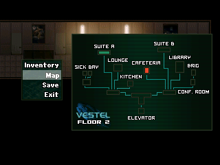
 ChromatoseCBS3.png
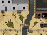
 Screenshot4.PNG
Also, this isn't RPGMaker. You can type all the way to the eeeeeeeeeeeeeeeeeeeeeeeeeeeeeeeeeeeeeeeeeeeeeeeeeeeeeeeeeeeeeeeeeeeeend without having to line break.
 Screenshot4.PNG
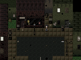
Wide open spaces tend to look awful because it doesn't look realistic. Most rooms are not that large, if you compare proportions of the hero to real life. And even using large rooms, wide open spaces don't look good because real floor patterns have variation while tiles are monotonous.
If you take a look at this or this or this, they are examples of condensing so that maps don't feel so bland and monotonous. And also it makes it more realistic, and can help your atmosphere, whether it is claustrophobic or cozy.
If you take a look at this or this or this, they are examples of condensing so that maps don't feel so bland and monotonous. And also it makes it more realistic, and can help your atmosphere, whether it is claustrophobic or cozy.
 ChromatoseCBS3.png
Seriously. Thanks for reiterating an obvious point.... (again.)
 ChromatoseCBS3.png
:) That's the point. One is a mockup (meaning it's just a drawing of what the battle was supposed to look like) and this one is a shot of the working version. There are subtle differences, if you pay attention.


