


CARRIONBLUE'S PROFILE

Some sort of thing from planet x

Search
Filter
 sc1.png
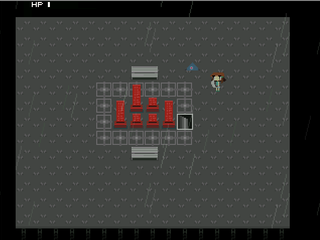
Gameplay.png
The game looks great so far!
You do however have a lot of stray antialiased colors in this screen though, which kinda clashes with the awesome spritework. This is only a minor problem though.
You do however have a lot of stray antialiased colors in this screen though, which kinda clashes with the awesome spritework. This is only a minor problem though.
screenie_three.png
Battle.png
safetypress1.png
author=bulmabriefs144author=CARRIONBLUEThere's a better way.
Insanely enough i made my own font and individually made each dialogue frame.
Pretty tedious XD
Individually make the text as a picture, and reuse the frame.
I even managed to cycle the down arrow thing on the textbox, and it allows foreign text like Chinese.
That is cool sounding!
I tried out a lot types of custom dialogue systems, but I settled with the one here pretty much just because. It's really neat how many ways simple parts can make so many solutions and stuff.
safetypress1.png
author=Link_2112
haha It looks decent, but it's not exactly a new technique.
Not too keen on that font, with all the bottom corners. And those tiles are a so...busy.
Is that a door to the left of the characters? And are those rock tiles supposed to be walls? They are all over the place and its hard to make sense of the structure of this room, unless that was your intent.
I don't mean to sound totally negative, there's lots to love about this game.
It's all cool, and it is meant to be more of a odd space- which goes for the entire game i guess.
@calunio: :D

