


CIRROCUMULUS-CLOUD'S PROFILE

* currently 20 years old
* female
* german
* Professor Layton, Pokemon, Final Fantasy and Rune Factory fan
* female
* german
* Professor Layton, Pokemon, Final Fantasy and Rune Factory fan
The Haunted World: Hell'...
Do you believe in ghosts? You sure should! The (un)dead are just a dimension away - and when you see them you will be shocked to death. No pun intended.
Do you believe in ghosts? You sure should! The (un)dead are just a dimension away - and when you see them you will be shocked to death. No pun intended.
Search
Filter
 A new year, a fresh start! or "How I found my motivation after a year of not doing shit."
author=unity
Welcome back ;u; Glad you're still up for making games! Tho a sidescroller is an unexpected development XD
Thank you! I'm glad that I'm around again, too! Well, it's a sidescroller alright. Without the scrolling bit. It will be like Dreaming Mary. Or 1bitheart. That sort of thing! ^_^
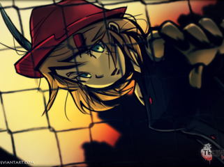
 First look on main char sprite
author=Xnition
Thanks for your suggestion i'll try to fix the sprite :)). By the way, i drew this with both paint tool sai and Photoshop. I drew it with a graphic tablet
That is good to know! If you want to, I can link you to a few good tutorials for SAI. =)
First look on main char sprite
Hey Xnition! First of all, It's great that you went for a sprite that shows more of the character than just the head. And your anatomy isn't that bad, either! What your character lacks is definition in the hair - the black bar suggesting shadows doesn't really serve it's purpose really well. But I will go into more detail regarding your sprite, if that is alright with you. Please don't see this as an attack, it is all just a critique because I want to see you do even better!
Let's start at the top of the character. The head and the hair that sits on top of it. I already mentioned the black bar as a shadow - it would look a lot better without it. I see that you tried to use normal shadows, too. Those are a little too light though, darker definition would look better. A little more 'flowy' hair would look a lot better, too. Hair isn't quite as static as you drew it, unless you go for a Dragonball Z kind of style. You tried to do this with the long part of her hair, which doesn't look bad at all. But the front piece of her hair needs to flow, too. Curves are your friends, here!
Her face looks quite good, I like the eyes. She looks a little to the left, yes? You could improve her looks if you made the left eye (from our point of view) a little smaller. Also, if you define the nose a little more, that becomes a little more clear as well. The left eye should also be put down a little, it is sitting too high at the moment. Her mouth could be placed a little higher, to show more of her chin.
The neck looks quite good, but necks aren't straight either. A little curve towards the ear would do you good - your neck/head does connect to where your ears start, after all.
I like her shirt! The little ribbon is a cute touch, too. But you should draw the rest of her arm, as of now it is simply cut off. If you want to, you could give her breasts a little more definition, that will make her seem more '3D' for lack of a better word. To show that she has breasts you could also make the ribbon curve a little to the left, as if it is resting against one of her breasts.
Lastly, mind if I ask what program you are using and if you draw via mouse or a graphic tablet? If you decide on one style (pixely or shading via gradiant) you should stick to one. A pixely style clashes quite hardly with a gradient if not done well. If you want to have the lines less thick and hard on the eyes you could also use a darker shade than your darkest shade of skin colour, hair colour etc and use that colour as the outline. It can look a lot better than black outlines. =)
Long time no see!
author=Zealconis
Oh, I see. Are you in college? ^^, because I am in college, too. I understand your situation. Please take your time. We'll be all here supporting you... ^^, *high five* Take care now and GREAT LUCK! YOU CAN DO IT!
Ah, no. I'm in twelfth grade. I live in Germany, our school system is quite different from other countries. I will finish my Abitur next year, which could basically be described as a ton of exams that have a great influence on your overall end-score. It's really stressful to get there, but since I want to become a game designer it's worth it. You need to have some kind of Abitur to go to university, after all. :)
Long time no see!
author=Zealconis
Great, now... any tentative dates for the release? I'm guessing that'll be in late 2015? How many chapters does the game have? Good luck! We're looking forward to this! HI-5!
Since I'm in my last year of school it will probably be around summer. Exams are stressful and I want to get good grades.
The game will have seven chapters in total, but they won't be released in one big update. I will release the game in chapters - next update will be chapter 1, then chapter 2 and so on. I think I can release two to three chapters per year.
Thank you! *high five*
Demo Update - Coming Soon
Character Sprites - Cute or 'Realistic'?
I just wanted to thank all of you for helping me. We decided for the cute style. It also looks a lot better now. :)
Character Sprites - Cute or 'Realistic'?
@TungerManU: Yes, Hisao is a boy. Although he's a rather boy-ish boy. Not a huge manly man dude. Yeah, they definitely need some more work put into them. My own sprite needs better shading, especially the shoes seem a bit too clunky. LunaElto's sprites need a bit more shading and stuff so that it fits together with the tiles. Man, that's one tough decision.
Character Sprites - Cute or 'Realistic'?
@JJJ7: No, no, I really like the cute style as well! A lot more than my own sprites, to be honest. Or, I should rather say that I find them a lot more adorable. I just heard very, very often that people do not like cute sprites in a gory horror game, that's why I would like to give you guys the choice to determine which art style makes it into the game. =)

