


LIBERTY'S PROFILE

I enjoy playing and creating games (mostly RPGs) and have a love of story and characterisation above graphics. I've been into RM* since '96 and have used all makers - started on the PSX makers, found and used a patched version of the SNES RM, then moved to RM95. When I found RM2K I finally decided to join some forums and I've been a part of the community ever since.
Absolute Justice
Site last broken: 7th January, 2017
Before that: 24th May 2016
http://pile.randimg.net/1/120/92579/Katt.png
Absolute Justice
Site last broken: 7th January, 2017
Before that: 24th May 2016
http://pile.randimg.net/1/120/92579/Katt.png


Search
Filter
 Screenshot Drama-rama!
The above post is for AFD. Sorry it's so loooong!
:blush:
I don't really think RealmS belongs in a list like that! Not for a long while yet at least.
LWG: Have I ever mentioned that I really like those trees? I really, really like those trees! And the maps in general! You, sir, are great at using those Rudra chips. Yes, even the town ones. XP
NicoB: Nice. I love the little boat on the water. ^.^ The dialogue is pretty well done too.
post=105006
Actually, here's one thing I can say that might guide you in the right spot somewhat.
http://rpgmaker.net/games/1512/
http://rpgmaker.net/games/650/
http://rpgmaker.net/games/371/
http://rpgmaker.net/games/736/
http://rpgmaker.net/games/471/
I can easily say that these games look leagues better than yours in almost every way for different reasons.
:blush:
I don't really think RealmS belongs in a list like that! Not for a long while yet at least.
LWG: Have I ever mentioned that I really like those trees? I really, really like those trees! And the maps in general! You, sir, are great at using those Rudra chips. Yes, even the town ones. XP
NicoB: Nice. I love the little boat on the water. ^.^ The dialogue is pretty well done too.
Screenshot Drama-rama!
AFrenchDreamer, this is a post for you! Please read and take note!
Okay, I know I don't really comment in this thread much, but I think I need to get this off my chest. FIrstly, you have shown these screen three times now. That is two times too many. Usually people don't appreciate screen dumpage - one to three screens is fine, but most of these should be put on your gamepage instead. You don't need to repost the same shots on every page. If people want o comment they will, if not, then don't shove it in our faces.
Now, sure, the guys are being a bit grumpy with you. From my point of view it's understandable, though I'm sure you don't think so. So let me just put this out there for you. Some constructive criticism.
Your first screen: The whole sentence is pretty bad, but I understand that not everyone is great at english. That's fine, but perhaps you can ask someone for help in that department. As for the actual map, well, compared to some uses of the same chipset I've seen before it's not that great. There's far too much empty space (though that's really been covered by the face graphics.) You could cut that room in half and it'd work better. As for the faces, they really don't match the sprites much do they? I do like your message box, but maybe you can move the face pictures off screen a bit more so we can see more of the maps? They take up a lot of room.
Second Screen: I'm going to guess that this a dream sequence of some sort. I have no problems with that. The graphics are significantly different to those used in the last screen, but it can be hard to find the right chips to use for the scenes that you imagine. Despite the differences in graphics I have no problems with this screen, really.
Third Screen: Okay so straight off the bat this one suffers from the last screens diagnosis - different graphical style. Now, with the dream one I could let it slide because dreams are supposed to be all kinds of fucked up, but this one, well, it's not like there are no outside graphics that suit the first style. There are a lot. Let's ignore the graphical difference for a moment, though, and focus on the mapping itself. The area is really bare. Like, really. If you've ever played the game they're ripped from you would see that the maps are pretty nice. Even with just a few items. This is the VGA version, but I assume you get the idea?

How to fix this? Well, again cut down on the size of the area, make things a bit closer together. Go have a look outside your window and count how many things you can see. Take a walk in the neighbourhood and see if there's two trees and a few pots. My guess - no.
Fourth Screen: Great! This looks a lot better than any of your other maps. Why? Because there's something for our eyes to look at - details to take in. Most good maps have quite a few details in them so that our eyes and mind don't get bored looking at them whilst we move through them. If a map has few details then players get bored easily and aren't distracted from the logistics of playing, aren't getting immersed in the game experience. Details keep the player occupied and interested. Details keep you looking and enjoying. Of course, too many details can be too distracting. If I had to offer advice on this map I would say perhaps add a few more cliffs of differing heights.
Fifth Screen: Okay let me just say that I like the general hud that you have, though I will agree that it is a bit too large. I like the layout and the bars, but you could make them smaller and still have them looking great. I really don't have much to say about the mapping because it's a boss fight and you need to focus on the boss. Still, a bit of graphical quality can make a good boss fight into a great one, so perhaps experiment a little. Also, on another note, maybe add an indicator of how many items you have left? Even if it's a x3 or an overlap to show you have more than one. Other wise, yeah, not bad.
Last Map: Same thing about the hud. I like that his face changes. Hm, you can get away with the boat being a Golden Sun one but maybe look into getting a boat that fits with the graphics you use most.
Okay, so to wrap up! From looking at the fourth shot it's apparent that you can map but that you're too lazy/can't be bothered to. If I were you I'd look into getting some consistant graphics happening. Either stick with the Golden Sun ones and learn how to use them or change to the other ones instead.
There's a little rule that most good mappers disdain, but that help new mappers out a bit. It's called the three tile rule. Basically, if you have more than three or four tiles of the same in a row you need to do a bit of redesign. I think this idea will help you a bit.
Also, take a look at other maps and check out a couple of games to see how they did things. Look for games that use the same chips as you for a start and see if you can't improve a bit. Think in the terms of 'what makes sense to go here' and try not to take it too hard when others tell you that they don't like your maps.
I must say that I've seen worse maps, but I would like to see how much better you can get through experience and listening to others.
Okay, I know I don't really comment in this thread much, but I think I need to get this off my chest. FIrstly, you have shown these screen three times now. That is two times too many. Usually people don't appreciate screen dumpage - one to three screens is fine, but most of these should be put on your gamepage instead. You don't need to repost the same shots on every page. If people want o comment they will, if not, then don't shove it in our faces.
Now, sure, the guys are being a bit grumpy with you. From my point of view it's understandable, though I'm sure you don't think so. So let me just put this out there for you. Some constructive criticism.
Your first screen: The whole sentence is pretty bad, but I understand that not everyone is great at english. That's fine, but perhaps you can ask someone for help in that department. As for the actual map, well, compared to some uses of the same chipset I've seen before it's not that great. There's far too much empty space (though that's really been covered by the face graphics.) You could cut that room in half and it'd work better. As for the faces, they really don't match the sprites much do they? I do like your message box, but maybe you can move the face pictures off screen a bit more so we can see more of the maps? They take up a lot of room.
Second Screen: I'm going to guess that this a dream sequence of some sort. I have no problems with that. The graphics are significantly different to those used in the last screen, but it can be hard to find the right chips to use for the scenes that you imagine. Despite the differences in graphics I have no problems with this screen, really.
Third Screen: Okay so straight off the bat this one suffers from the last screens diagnosis - different graphical style. Now, with the dream one I could let it slide because dreams are supposed to be all kinds of fucked up, but this one, well, it's not like there are no outside graphics that suit the first style. There are a lot. Let's ignore the graphical difference for a moment, though, and focus on the mapping itself. The area is really bare. Like, really. If you've ever played the game they're ripped from you would see that the maps are pretty nice. Even with just a few items. This is the VGA version, but I assume you get the idea?
How to fix this? Well, again cut down on the size of the area, make things a bit closer together. Go have a look outside your window and count how many things you can see. Take a walk in the neighbourhood and see if there's two trees and a few pots. My guess - no.
Fourth Screen: Great! This looks a lot better than any of your other maps. Why? Because there's something for our eyes to look at - details to take in. Most good maps have quite a few details in them so that our eyes and mind don't get bored looking at them whilst we move through them. If a map has few details then players get bored easily and aren't distracted from the logistics of playing, aren't getting immersed in the game experience. Details keep the player occupied and interested. Details keep you looking and enjoying. Of course, too many details can be too distracting. If I had to offer advice on this map I would say perhaps add a few more cliffs of differing heights.
Fifth Screen: Okay let me just say that I like the general hud that you have, though I will agree that it is a bit too large. I like the layout and the bars, but you could make them smaller and still have them looking great. I really don't have much to say about the mapping because it's a boss fight and you need to focus on the boss. Still, a bit of graphical quality can make a good boss fight into a great one, so perhaps experiment a little. Also, on another note, maybe add an indicator of how many items you have left? Even if it's a x3 or an overlap to show you have more than one. Other wise, yeah, not bad.
Last Map: Same thing about the hud. I like that his face changes. Hm, you can get away with the boat being a Golden Sun one but maybe look into getting a boat that fits with the graphics you use most.
Okay, so to wrap up! From looking at the fourth shot it's apparent that you can map but that you're too lazy/can't be bothered to. If I were you I'd look into getting some consistant graphics happening. Either stick with the Golden Sun ones and learn how to use them or change to the other ones instead.
There's a little rule that most good mappers disdain, but that help new mappers out a bit. It's called the three tile rule. Basically, if you have more than three or four tiles of the same in a row you need to do a bit of redesign. I think this idea will help you a bit.
Also, take a look at other maps and check out a couple of games to see how they did things. Look for games that use the same chips as you for a start and see if you can't improve a bit. Think in the terms of 'what makes sense to go here' and try not to take it too hard when others tell you that they don't like your maps.
I must say that I've seen worse maps, but I would like to see how much better you can get through experience and listening to others.
 third.png
Poor Feld's screenshot has turned into an off topic thread. X_x
I really like the mix of the larger trees with the smaller ones. They look great! Maybe add a tree or something in the top right corner 'behind' the cliff? It just looks oddly bare to me. Otherwise - niiiice!
I really like the mix of the larger trees with the smaller ones. They look great! Maybe add a tree or something in the top right corner 'behind' the cliff? It just looks oddly bare to me. Otherwise - niiiice!
SHOW ME YOUR SCREENSHOTS - Fall Edition
Ch23.jpg
I really like the atmosphere, though I'm questioning the 'hedge' wall tile used. (Sunken treasure chest is cool!)
SHOW ME YOUR SCREENSHOTS - Fall Edition
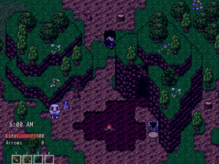
Niiice! It's great to see those mountains acually work. Although the 'earth' tile should really be a dirt tile - the purple looks odd.
And nice use of the clouds there.
And nice use of the clouds there.
SHOW ME YOUR SCREENSHOTS - Fall Edition
Not bad, not bad at all. It's pretty good Jakester. Are those dead trunks edits or rips? Either way they suit pretty well - maybe a bit of a palette adjustment and they'd look just like the RTP.
 Your Top 5
1) Suikoden II
2) Breath of Fire II
3) Okami
4) Terranigma
5) Lufia II
I just love SNES games. Other favourites include: Suikoden V, Star Ocean: Second Story, Breath of Fire 3 & 4 (I forgot Wild ARMs and Chrono Trigger ^.^;)
2) Breath of Fire II
3) Okami
4) Terranigma
5) Lufia II
I just love SNES games. Other favourites include: Suikoden V, Star Ocean: Second Story, Breath of Fire 3 & 4 (I forgot Wild ARMs and Chrono Trigger ^.^;)

