MADURAI'S PROFILE

Search
Filter
 Neeyick_Variations.png
author=orochii
1 2 3
4 5 6
I like #2. Or maybe #5 depending on his personality. If he is kind of weird in some way, give him #5. If he is a sage-kind of person, giving straightforward advice and being pretty normal, give it #2.
Thank you much for the advice!!
author=NTC3
OK... Can we have a gameplay update/changelog now or something?
More demos are planned and coming as soon as they can. The game is very large, complex and has a lot of systems.
AA_Portrait_JamesSamsonDISTRESSED.png
author=NTC3
Looks good, but all those images you've recently uploaded should be resized (besides the loading screen, that looks fine.)
Also... I hope that's not too pointed a question, but since my recent review on Divided Infinity received no comments so far, should I take the apparent resumption of work on AA as a sign that my plea for DI to be rethought is being taken to heart?
Both projects have been in development for quite some time simultaneously.
Your review for DI, like anything we have or will receive have been taken into consideration. Please look forward to the future demos for DI and AA both.
For now, click "view image in new tab" until we resize.
DI_5.PNG
author=CashmereCat
I think he's referring to the fact that your character looks rather thin, like it was stretched to fit. I agree with slash on the text, it's the biggest eyesore. The outline of the text looks ugly, and even though it may enhance readability as opposed to having no outline at all, find a way to either space those letters out or make the outline more subtle so that the text doesn't look like it's all joining together.
Ahh, well nothing is changed with the portrait, style at play is all.
We're working on making the text/color scheme for this section for read-able.
DI_5.PNG
author=LockeZnothing is shrinked. I'm bot sure what you mean.
He is squished really badly. Please make sure you shrink images proportionally.
11.PNG
author=orochii
I don't know if those RMXP trees fit well or not... I would suggest working a little on the colours (filters or something like that), to make them match the style a little better.
Yep, agreed! It's been done, toned them to match better sometime after making this area.
SoledadComplete.png
author=NTC3Only half her face being visible is for a more symbolic reason than a physical one.
Is she missing one eye? I would hope there's a more optimistic reason for that veil, but after watching your artist's video I'm not sure. It's certainly an eye-catching design regardless.
SoledadComplete.png
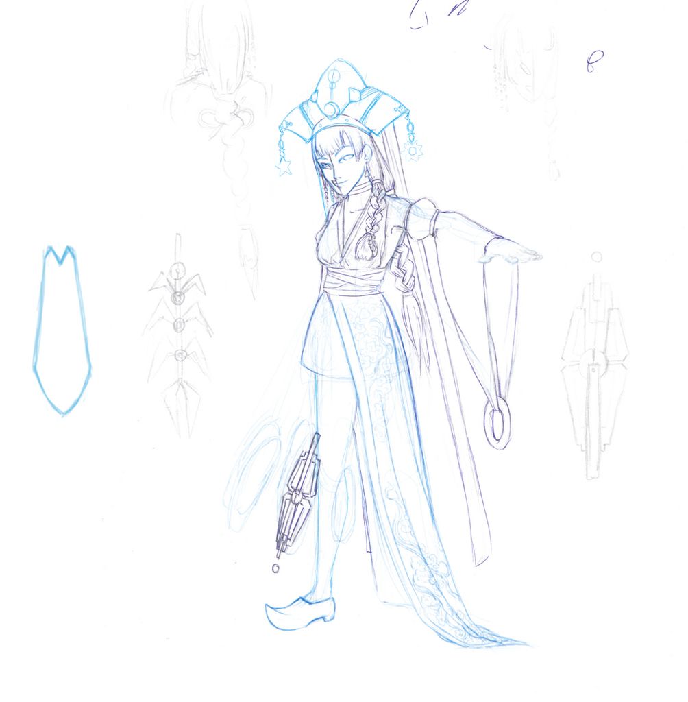
author=slashI directed our designer on this design heavily, she had very specific needs from me as a director. She was meant to have clothing from many different cultures on her.
I really dig this; the dozens of clothing layers and the weird mix of traditional and tech is mucho cool.
She also needed to have robotic/android features to her.
Myself and the character designer Melody Brown pretty made her half each.
She turned out really great, here's her original draft if you're curious!