


DETHMETAL'S PROFILE


Search
Filter
 wellofsouls.png
cathedral.png
This map wasn't completely finished when I took this screenshot, but finished enough! (That's why parts of the roof near the top look a little weird.)
oldvsnew.png
new.png
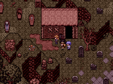
cemetary.png
Hey, I appreciate your feedback! Just because this isn't the screenshot thread doesn't mean I don't appreciate it. These maps won't be completed until the day the game comes out (and even then, I'll probably be tempted to fix some things and release updates).
I'll definitely consider creating some broken headstones. I think that would help get the "abandoned cemetery" feeling across. I may put shadows underneath the headstones, as well. I think that will help rid away the illusion that they are floating.
I'll definitely consider creating some broken headstones. I think that would help get the "abandoned cemetery" feeling across. I may put shadows underneath the headstones, as well. I think that will help rid away the illusion that they are floating.
TitleScreen2016.gif
HazeGrotto.gif
poison1.png
Thanks! You're probably right about the tint. I'll work on changing that. As for the bridge, I'll see what I can do. I may just leave it to save myself some work. And don't worry, I can totally see how you thought they were mushrooms! Sometimes I forget that it may be hard to tell what certain things are when I post a very zoomed out image of one of my maps!
poison1.png
Thanks for the input, guys! The bridge is indeed supposed to be far above the water. I tried to use shadows in the water and on the edge of the cliff to left to reflect this, but I suppose the shadows aren't dark enough and thus not very noticeable.
Blindmind, monotony is something I'm always keeping in mind when designing big maps. I have a few techniques to help combat this:
1. None of my dungeons take place in a single type of location. For example, if it takes place in a large tower, there will always be sections where you go outside as well to advance. If the dungeon is located in a cave, there's always a forest section or mountainous section as well.
2. I try to place "landmarks" throughout my maps. If you look at the full map I posted of this cave, you'll notice there are some manmade structures placed throughout the map. This helps break up the monotony of the cave and are easily recognizable. As well, many of my maps have rivers or other water sources weaving in and out of the player's path which I believe helps orient the player.
3. Most of my dungeons, when heavily simplified, are a simple shape. This one is kind of like a plus sign if you simplify it enough.
4. I always make sure to make the path clear and highly visible.
5. If you find a key, you'll always have seen the door it belongs to beforehand. Likewise, if you flip a switch that opens a passage, it will be a passage that you've seen so you don't get lost looking for it.
I learned most of these things from studying Zelda's dungeons. I really hope players don't have a problem navigating my maps! The last thing I want is for my caves to seem bland and repetitive.

