


PSY_WOMBATS'S PROFILE
psy_wombats

13315
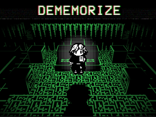
Dememorize
a 2.5d explorer/horror game about NEURAL-9, a memory disease that spreads via eye contact
a 2.5d explorer/horror game about NEURAL-9, a memory disease that spreads via eye contact

Search
Filter
 opening_scene.PNG
too_many_caves_this_world.png
zelda010.png
CutScene.png
I can only think of these: http://ohcorny.tumblr.com/tagged/umineko/chrono
iris_working_title.png
uvxWPWm.png
Neat. Joking aside, I like text-heavy games and nontraditional storytelling like this, but it seems weak when you have both the text and the map there showing the same story. Like, either one independently conveys the same information, so in this case the graphics seem a lot weaker. Wonder if there's a better way to have them complement each other. There's a decent discussion of this in Understanding Comics chapter 6 (should be a PDF version out there) if you're interested.
uvxWPWm.png
parish.png
We're emulating a GB game played on a GBC. The sprites and tiles are rendered separately with a different palette for each. The tiles have four colors (blackish, gray-blue, gray-green, white) and the sprites have three colors (blackish, brown, white, and ~transparency~). It's actually pretty faithful to how the original hardware works, and there's a shader in place to make sure that no more than those colors are rendered at a time.

