author=TheRexion
author=doomed2die
The MP bar really looks like "HP." It'd be better if the pixels moved downward as they went towards the center.
Looks cool though!
I believe that says AP. The top pixels of the A are over the black outline of the HP, thus making them hard to see.
Yeah, it's actually AP. I can see it just fine, but it's not a problem anyway when you play it.
But it's funny how you notice all those little things,
after you upload an image, like:
-the g's are cut off on the second line of the spell description
-
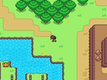
Link's the elf's bow is missing the bowstring (forgot to update the battler graphic)
-the remaining CD text on Hex isn't as big as the AP cost number (I'll probably change it to a 25 AP cost anyway)
-the HP number is hard to read (but then again, that's only on the skill selection screen)
-the background is kinda empty (I hate doing them! :X)
-hey, that elf looks like Link! (j/k, that was deliberate!)
Will fix most of those though.
author=Irili
Look! It's Link! Let's kill him!
First Navi, now Link? Not sure if you even like Zelda games...!


 Add Review
 Subscribe
 Nominate
 Submit Media
 RSS
RSS
 Byah
Byah