0 reviews
  • Review
  • Subscribe
  • Nominate
  • Submit Media
  • RSS


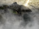
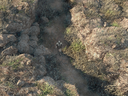
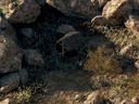
Rise of Dragon Souls
Sinchross is licensed under a LicenseCreative Commons Attribution-noncommercial-Sealed creating derivative works 3.0 Brazil, the use of any materials created for this game is forbidden.


The winner of the monthly best project contest in the Mundo Rpgmaker and Centro Rpgmaker.


Winner of the contest "Hit the High (Ad) Spots" in the rpgmakerweb.com.
Link: http://blog.rpgmakerweb.com/announcements/hit-the-high-ad-spots-winner/
The winner trailer: http://www.youtube.com/watch?v=eju5Htr1FA8


*I'm needing someone to help me to correct my grammar on some english texts that I want to post here telling about the game history and some texts in the game trailer that I need to correct. I'm sorry about my bad english...But I'm trying to do my best for that you can understand me and the game history.

*The topic is being updated.

Videos:

08 - 14 - 2012


07 - 20 - 2012


All Videos: http://www.youtube.com/playlist?list=PLF28142ECA20D0948


Latest Blog

New Hero Sprites Style = ]

New outfit and 8 Frames in the walk movement = ]


The walk movement is a 8 frames chara... the walk archive have 32 different poses for the walk movement. The archive to the running graphic of the character have the same value, 32 diferent poses for the running movement. xD (8 for each direction).

And for the attack, I'm using the same 8 frames to each direction xD.

A normal Npc will consist of a two archives of 32 poses. A archive only for the stand pose and a second one for the walk pose. The enemies have at last three archives of 32 poses... the extra archive is for the attack animation.

xD

(sorry for my english, I'm without time now to revise the grammar)
  • Production
  • sinchross
  • RPG Maker VX Ace
  • RPG
  • 05/09/2011 08:12 AM
  • 03/08/2013 08:33 PM
  • N/A
  • 67931
  • 130
  • 0

Posts

Pages: first 12 next last
Damn dude, your game looks pretty as hell. Clicks the subscribe button.
author=Ghost
These looks pretty cool man. Some screen shots look a bit over done though... I think you should use some of your lighting effects occasionally. Just remember to NOT make your maps too dark or to contrasted to really see what's going on. The player should clearly see things on the map.


Thanks! But the game have day and night system, then the maps change a little in the dark. I already make some pages to add about the history and a video, but I don't know how to do they appears in the game page together with the Menu Images and download.

author=Ghost
Also you got to replace the graphics for the title. It's pretty hard to read and generally not so nice to look at.


Thanks for the tip. I will make this soon ^^

author=Ghost
Here I'll tell you the ones I like in general,

The interiors are very well done. I still like your outer areas a lot too but

http://rpgmaker.net/games/3082/images/17654/
http://rpgmaker.net/games/3082/images/17652/

The first one is an example of getting too dark and using weird hues. Red isn't so bad but it should be subtle. The second screen, this world map does not really compare with the other one. I think you're adding too many effects and the map just comes off as too busy and different from the other world map posted.


That's because that region of the map don't is the place where that house is located. And in that exemple worldmap, is day time, and in the house, is night time. =]

author=Ghost
In general, the sprite design is very refreshing and I can sense a pretty cool level of atmosphere.

Hope I helped.


You can be sure that you helped a lot!! Thanks for the comment!
Is a shame that I cannot do the story menu appears...
The game atmosphere in some parts is dense and dark... the game objetive in the begining is to save a continent called Telkyr from the destrution, that is caused by a Creature of Ishtar, creatures that are known by most people as devils.
I never realized how awesome XP/VX games can look because so few people try to get away from the ugly square RTP. This is the kind of thing that raises the bar for future developers.
Make sure you never let this project die.
Weird. I looked at this on RMRK only yesterday. Kinda surprised to find it here too in such a short time. ;D
Looks pretty good, nice job.
Clyve
GOATSE FOR LIFE
1858
author=Ghost
Also you got to replace the graphics for the title. It's pretty hard to read and generally not so nice to look at.


I second this to the max.
@Dyhalto ->
Thanks ^^ , I will make everything that is possible to my project don't die ^^

@dezz123 ->
Thanks dude =D

Clyve ->
But i already replace the graphics of the title. ^^
Looks awesome and I agree with Dylato. So many people let their games die and it's a BIG dissappointment. This one looks like it has potential. Subscribing.
Are these custom chipsets created by you/your team, because those screenshots look phenominal. :O
Wow, this has the best looking overhead 2d graphics I've ever seen.
The graphics aren't perfect, but they are amazing. :)

If you made any of those graphics please tell me what your secret is. ^^
LockeZ
The Z is for Znderson; RMN's resident antagonator
1686
The quality of these graphics is insanely good.
NewBlack
☽ TRASH THAT IS A WASTE OF TIME
4879
I was wondering... Will the final release of this game and/or it's demos (if you make any demos) be in English or at least will there be a fully-translated English version available when you're done?

Also would love to hear more behind the scenes stuff about how this project came to be/who's involved etc.
@ Hardin91 - I've edited and created some chipesets to create that world map =]
Thanks for the compliment man!

@Felix20 - I've made all the things about the graphics, that is editing or creating something new to be added to the set, the secret is artistic, I use a lot of art in each type of tile.

@Lockez - Thanks for the compliment man! I'm glad that you liked!

@NewBlacy -> Then, I am the only one directly involved in the project.
I have intention to release a demo in English, but in the moment I'm focusing on my native language because some people coming here will test the game and I need be that they understand what they are doing when playing.
But surely I've decided to post the game here because an English translation is inevitable.
calunio
Come home with me.
5610
Don't make games in Portuguese. It's not worth it.
It's way easier to get people to help you to translate it to Enlish than to find people to play games in Portuguese. Honestly. Brazilian RM community is not what it once was anymore.
Hi there,

your game looks fantastic - can't wait, that it'll be finished.
wildwind
Holy pretty, batman.

Very nice, Sinchross =) I just have a couple remarks; as mentioned above, the logo has a lot going on. I'm not sure what change you made, I see one without an outer glow and one with. In this case, I'm definitely thinking less is more (if you understand the idiom). Solid color, or simpler color-based textures. You might be surprised how much class you could add to your game with such minor tweaks.

Also, the vignette effect is a bit strong on the images that have them. For example, the corners reach full-black. This is especially confusing in scenes that don't necessarily appear to be at night, like that market scene. It's a nice effect; I've messed with it before. I've found that having a strong vignette makes a bold statement, while a much lighter vignette adds a really nice texture to an image.

Speaking of texture, I see that all of your maps are post-processed; very well, too. A lot of effort. I have some questions regarding your process.

1) Do you create the maps in RPG Maker first, then screenshot them over to Photoshop, then bring them back over to RPG Maker as a parallax BG? Or do you leave the maps there, create the lighting effects in Photoshop as a transparent layer, and load them up in RPG Maker as an overlay? Do you use one overlay, or many per map?

2) Do your maps scroll, or are they all minimum size? That seems unlikely, but to pull off those effects, it looks like you'd have to combine a parallax BG with one or more overlays.

I'd also like to hear what your general process is in Photoshop =) It looks like you apply a painstaking amount of shadowing, lighting, and overall texture. Sorry for the all the questions!
So yeah, one of the screenies appeared in my Random Screenshots. Any progress happening?
This looks like another one of the best project ever in rpg maker. I only subscribe to projects that look worthy and you've proved it with your visuals. Watched your trailer. Wondering when you gonna have a download up.
demo pls ^^ (in english)
Pages: first 12 next last