Download Now

66.2 MB
6536 downloads
1 reviews
  • Review
  • Subscribe
  • Nominate
  • Submit Media
  • RSS
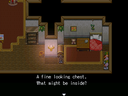
In the dream of a child stands an ancient manor filled with forsaken fancies and empty memories. Mysterious yet familiar to the child that wanders the lifeless house. What lies at the start of waking? Is this truly a dream? A memory? An illusion or reality?


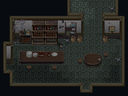
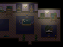
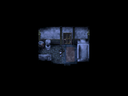
This project contains the compiled maps from the Manor Mapping Madness collaboration. The aim of this project was to create a room with atmosphere - whether it be spooky, dream-like or creepy is up to the map maker.

Mappers (in alphabetic order)
ae
arcan
chana
Deckiller
Demicrusaius
Faenon
Gibmaker
Happy
Julev
Liberty
Marrend
Max McGee
Merlinman
psy_wombats
SGCN
sillydan
Zephyr
Zyntax

Latest Blog

Finally Complete and Getting back in the Fryingpan

As the title says, the new version - the complete version - is now up and ready for your perusal. Finally, it's done. The bugs are fixed, the missing files added, the new ending finally sorted out and it is done.

Just in time for the next Halloween event. That is, FoMaMa. That's right, I'm putting myself back in the seat but this time with a few extra rules. Namely map size limits and no extension rule. I'll also be setting up a few things before-hand so I don't have to rush around and get them done afterwards.


Also, here's an image from the alternate ending~

Posts

Deckiller
Mad bank for RMN server bills yo
12185
This is what I'm talking about! :D
benos
My mind is full of fuck.
341
holy crap!
Marrend
The Armageddon deals -6400 damage.
7407
Oh don't mind me. I'm just going to continue being tight-lipped about the room I made for a bit longer.

I assume, though, that I could upload my own image, since I'm on the dev team?


Side note: Light blue text on a white background? I can barely see these comments!
Liberty
~RTP Princess~
9501
If you wish... and yeah, I'm still trying to figure out the CSS. If anyone want's to mess with it a bit, feel free. You'd have more idea what you're doing than I do. :P
Marrend
The Armageddon deals -6400 damage.
7407
Me, mess with colors? Nahhh!
Max McGee
My name is Legion: for we are many.
8101
Liberty, please change the font of the game page to something more readable. (I would do it myself if I knew how.) Right now there is almost 0 contrast with the background color.
Sorry guys if it might look weird for a moment.
I thought I could try experiment with the CSS a bit.

Any idea what colors might go well for the page?

EDIT: The colors I try out in Photoshop turn of slightly different on the page. That's annoying...
chana
(Socrates would certainly not contadict me!)
1914
Deckiller
Mad bank for RMN server bills yo
12185
Still not feeling the page colors :3
Marrend
The Armageddon deals -6400 damage.
7407
It seems that the color that the comments use is the same as the color that is used for the description text. Black text on a dark blue background isn't all that readable either, I'd think. I might try experimenting with things myself but my artistic tastes are, well....

Until things get more stabilized, I'm using the "color" tag in my comments for readability.


*Edit: Well, it used to be a dark blue background!
author=Marrend
I'm still somewhat trying to sort out CSS and what colors to use.
If you don't feel up to trying out first hand, I'll gladly take advice.
It is a shared page after all.
Marrend
The Armageddon deals -6400 damage.
7407
I'm pretty sure I know which variable alters the text color, and I think I know which one altered the background color. I'm just not sure what combination this page wants to have.

Though, arguably, this game page should be "atmospheric". Whatever that means!
Melkino
saccharine disposition!
1753
*shares the magic of kuler*

:)
Gibmaker
Now older than Gordon Freeman. :(
7314
Looking good. :) But yes the red background is hard on the eyes.
alterego
RMN's wet blanket
1582
Oh, but what is this? Nice gamepage! xD - And I like the tittle of the game too. =)
Liberty
~RTP Princess~
9501
Right, I'll try to make it a bit less red. Thanks for the help with the css though!

EDIT: Hopefully that's a bit easier on the eyes. >.<;
chana
(Socrates would certainly not contadict me!)
1914
Yep, nice color (a tintsy more red? naah, don't bother, fine like that), And that title, sounds great too.
Gibmaker
Now older than Gordon Freeman. :(
7314
well the background colour's fine now but what about the MAPS? :3 Screens are looking sweet.
Looking at these, my map's probably a little small...
Liberty
~RTP Princess~
9501
No such thing as too small. Trust me, there's a diverse group of maps. ;p
I'll post up a couple more screenshots today.