Login
Login
Register
Recover Password
A Cool Place to Level Up!
GAMES
Full Games List
Featured Games
New Games
Reviews
Media
Images
Blogs
Game Updates
DEVELOPMENT
Development Spotlights
Images Feedback Summary
Game Design Highlights
Tutorials
Articles
Scripts
Utilities / Plugins
Resources
Engines
Engine Bulletins
What is Makerscore?
EVENTS
Past Events
Achievements
Misaos
COMMUNITY
Forums
Post History
Chat
New to RMN?
STORE
Full Store List
RMN Music Pack (free)
Important
MISAO RESULTS 2023
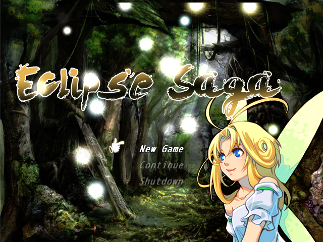
Eclipse Saga
Download Now
212.7 MB
1531 downloads
1 reviews
Save to Dropbox
Add Review
Subscribe
Nominate
Submit Media
RSS
Summary
Blog
Images
Reviews
Downloads
Play Lists
DemonLamma
Added: 03/05/2013 11:15 PM
Last updated: 04/27/2024 09:07 PM
2061 views
Posts
Pages:
1
SoulAuron
50
SoulAuron
View games
View playlists
Close
10/27/2017 02:17 AM
i think its all very good, but then again, just as long as it is pretty and detailed that is already enough for me.
WolfCoder
3554
WolfCoder
View games
View playlists
Close
10/24/2014 12:44 AM
So is the font, cursor and bright spots. In fact the only thing that doesn't fit artistically
is
the background for how not cheesy it is.
alterego
RMN's wet blanket
2875
alterego
View games
View playlists
Close
03/07/2013 05:06 AM
Mmh. I think you should lose the RTP fairy. The art style clashes with that of the background and it looks kind of cheesy.
Pages:
1


 Add Review
 Subscribe
 Nominate
 Submit Media
 RSS
RSS