THE SCREENSHOT TOPIC RETURNS
Posts
He is indeed only wearing a loincloth and boots. (and bracers enchanted with water breathing)
author=NightowlIt feels 100% more oldschool with it in game!
I really like that CRT overlay, or whatever TV overlay that is supposed to be.
With the shading it looks like the white part is a shirt
I love it, quite abstract, professional looking, one of those games that can be fun... so stop elaborately procrastinating like this!

Do you think this is okay. I made this mock-up of this video.
For me, It looks pretty neat.
EDIT: Dang! The video's private, I should've downloaded the video
LockeZ

I'd really like to get rid of LockeZ. His play style is way too unpredictable. He's always like this too. If he ran a country, he'd just kill and imprison people at random until crime stopped.
5958
Nessy that is just random-ass RTP tiles floating in outer space
WHY DOESN'T IT SUCK
how did you do that
WHY DOESN'T IT SUCK
how did you do that
I haven't been on here lately (Too scared to forum and I secretly tell Miracle about my progress) bleh...
But I made some progress. I halted because of my disgust at the character sprites
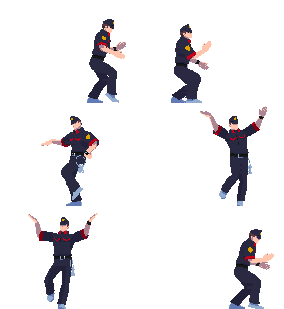
Battle Character animation Revolution! (It still sucks)

Frostberg wonderland

as well as a character message system

But I made some progress. I halted because of my disgust at the character sprites
Battle Character animation Revolution! (It still sucks)

Frostberg wonderland

as well as a character message system


Screenshots look fairly good in all their simplicity. For some reason I like the second battle animation the most. Second and third got this cool style that I like. Fourth (And the latest?) got too blurry shading for the hair and the stance is a bit off.
As for your message portraits, you're on a good path. Wrinkles in clothing don't quite look right just yet, they could be a bit simpler at places, but poses themselves looks great. Why not use similar colouring in your battle animations as well?
As for your message portraits, you're on a good path. Wrinkles in clothing don't quite look right just yet, they could be a bit simpler at places, but poses themselves looks great. Why not use similar colouring in your battle animations as well?
For the um, battle characters, I'm just planning to get rid of some jaggies in the sprite, the fourth is waaay too small. I might go with the 2nd or third again. All they just need a color fix.
As for the portraits, Yeah I just updated those, so I don't really have any silly tangent lines on the sprites themselves, thanks for the tips! :)
As for the portraits, Yeah I just updated those, so I don't really have any silly tangent lines on the sprites themselves, thanks for the tips! :)
Your anatomy is a bit off, and not just in a stylized way, either. Also, you don't shade boobs like that. When someone's wearing a shirt the shirt doesn't dip down between the breasts, it stretches across them.
This is a wip, but it gives you an idea of shading girls:

Try to avoid using black outlines and derive from a purple base instead. Your colours in the latest sprites are improving but the anatomy/shading/outlines aren't doing them any favours.
Try referencing from pose guides like posemaniacs, or looking up real images. Posemaniacs is great sometimes but you need to have a firm basis of how skin works to use it well.
Anyway, a screenie:
This is a wip, but it gives you an idea of shading girls:

Try to avoid using black outlines and derive from a purple base instead. Your colours in the latest sprites are improving but the anatomy/shading/outlines aren't doing them any favours.
Try referencing from pose guides like posemaniacs, or looking up real images. Posemaniacs is great sometimes but you need to have a firm basis of how skin works to use it well.
Anyway, a screenie:

author=MISTER BIG T
(image omitted)
This is great. My concern is that I can't tell which character is speaking immediately without memorizing names. If you want to make it clearer, possibly darken or reduce the opacity of the non-speakers? Just a small suggestion. You've got a lot of style already.
author=KlisterVX
Do you think this is okay. I made this mock-up of this video.
For me, It looks pretty neat.
I like it a lot. You could even have a roof graphic with pictures that disappears as you enter the house (think SoulBlazer), but that's a bit of extra work. It looks nice as-is.
author=AquaXranoX
I haven't been on here lately (Too scared to forum and I secretly tell Miracle about my progress) bleh...
But I made some progress. I halted because of my disgust at the character sprites
Battle Character animation Revolution! (It still sucks)
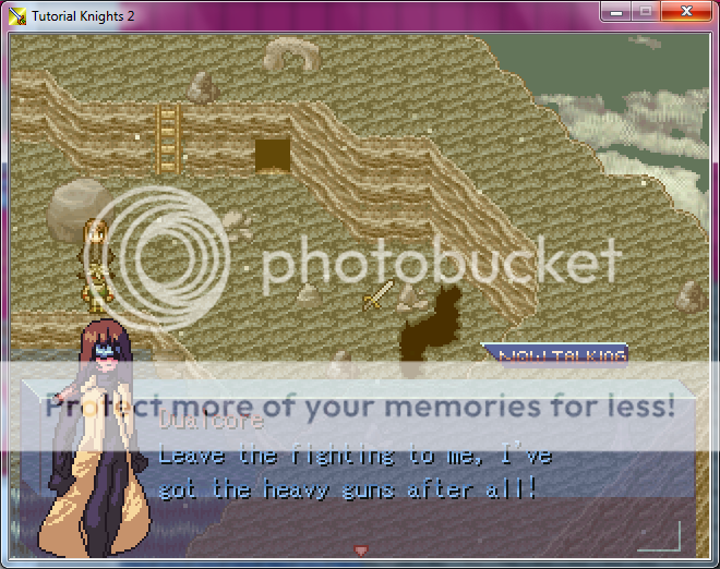
You have a good palette and in general the sprites and shading look pretty good. Your character size is a bit inconsistent and I think someone already mentioned the boobs. Still, I think the message box looks neat. (What's the purpose of "Now Talking"? Isn't it a bit redundant UI? Or is there some design decision I'm not aware of?)
author=SorceressKyrsty
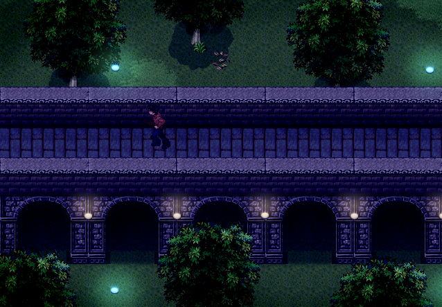
Anyway, a screenie:
Nice atmosphere, and not seeing chibi characters is certainly a breath of fresh air.
LockeZ

I'd really like to get rid of LockeZ. His play style is way too unpredictable. He's always like this too. If he ran a country, he'd just kill and imprison people at random until crime stopped.
5958
I'm working on the assumption that the NOW TALKING is not actually part of the UI, but is actually a wooden sign lying on the ground at the top of that cliff
author=SorceressKyrsty
Your anatomy is a bit off, and not just in a stylized way, either. Also, you don't shade boobs like that. When someone's wearing a shirt the shirt doesn't dip down between the breasts, it stretches across them.
Yeah... I was never good with Anatomy or shading, (and folds) my worst enemy but I joined some site to help, and I actually used ..a very dark purple. Well either way
The Big blue coat girl was just practice for some other thing.

author=LockeZ
I'm working on the assumption that the NOW TALKING is not actually part of the UI, but is actually a wooden sign lying on the ground at the top of that cliff
Haha It wouldn't even match the ground though. This is where i referenced it from, I love the talking system.

I also finally got VX Ace (Sorry for the chibi lol)

It's second opinion time again.
I'm contemplating running my portraits through the same filter I run everything else through to avoid resolution clash. My question to anybody who cares to answer : Is it worth it?


edit : Ignore the differently shaded hood.
I'm contemplating running my portraits through the same filter I run everything else through to avoid resolution clash. My question to anybody who cares to answer : Is it worth it?


edit : Ignore the differently shaded hood.
LockeZ

I'd really like to get rid of LockeZ. His play style is way too unpredictable. He's always like this too. If he ran a country, he'd just kill and imprison people at random until crime stopped.
5958
You would change them from the top to the bottom, or the bottom to the top?
What resolution is the rest of the game? I'd have to see how each one looks in-game to tell you if the "worse" one looks bad enough to change.
What resolution is the rest of the game? I'd have to see how each one looks in-game to tell you if the "worse" one looks bad enough to change.
Yeah, from top to bottom.
It's hard to tell the difference with one of our modern 10000x8000 resolution monitors, but it's much more noticeable in the program's native 640x480. Basically, the top's pixels are exactly 2x the size of everything else, while the bottom's were put through a smoothing-filter used by MAME.
Here's a comparison shot involving normal resolution map and whatnot.
LockeZ

I'd really like to get rid of LockeZ. His play style is way too unpredictable. He's always like this too. If he ran a country, he'd just kill and imprison people at random until crime stopped.
5958
Mmm, I can tell the difference, I just wasn't sure which one you were going to use.
I was gonna be like "Man that filter is balls, it's not gonna match your game, it's gonna look as bad as that tactical game someone was making with the ridiculous blobby watery thick-outlined sprites" but then you posted the screenshot and :(((((((
I don't think the filter actually makes it look any less pixelated. Just makes it look pixelated and blurry. But if you're gonna do it to the sprites, go ahead and do it to the faces too, so they match. It still looks totally different from the background, but it's better to have two different styles that don't match than three.


