SCREENSHOT SURVIVAL 20XX
Posts

author=CharlieENDEven should that happen, I will never support it!
I definitely didn't expect that RTP is going to become cool again.
Your map doesn't look all that RTP, the pure black outlines in the sprites is why. Though this might be an older maker.
@Cashmerecat: Love that art-style and scenery, if you can make a whole project like that I'd recommend.

@Cap_H Those pictures hurt/confuse my eyeballs, but I do like them. I like the enemies in the battle screen & the little boat.
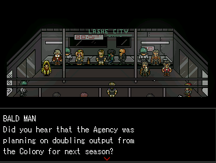
@CharlieEND cute robots.
@CharlieEND cute robots.

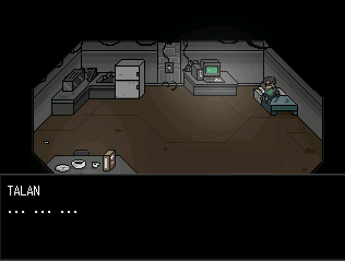
author=CharlieEND
I definitely didn't expect that RTP is going to become cool again.
Here's my RTP thingy. Unimpressive and remarkable.

Um... okay to start? You're using carpet as well tiles and table tops as roofing. That's really weird. Aside from that, it looks good I guess. A bit bare and empty, though.

author=LouisCyphre
Progress continues! I am aware of wackiness with shadows. They do not layer in a way I am pleased with at this time.
The map should look like a fortress that was grown over, then rapidly retrofitted for active service. It is a very old fort.

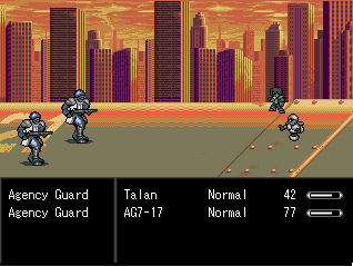
LC, what is going on here? What did you DO? I mean that second screenshot...is it me or is that an in-game screenshot but...it seems to show way MORE of the map than is possible with the engine...am I just going crazy?
It's 19 tiles high and 25 tiles wide. I'd say they he either added a wide-screen script, a higher resolution script or just did a copy/paste of a few screenshots together to show off more of the screen.
I didn't think it was the last one because of the text box but I sure am interested in the first two.
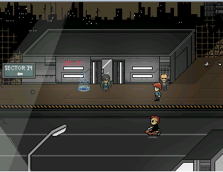
My game submission was denied because the mapping does not meet site standards. They said I was close, I just need a few pointers. So, how do I improve?


I'm really eager to make my first game as good as I can make it, so please help!
I'm really eager to make my first game as good as I can make it, so please help!


I'm not sure if LouisCyphre used that or not. Maybe the .dll I guess. Everything you see there is coded by him, however -- even the textbox auto-magically resizes to fit the text. Bastard even made his own fake CTB (it's actually not a "real" CTB, but more along the lines of Persona 4's invididual actions. clockticks allow for haste effects, however).

author=Lucy1212
My game submission was denied because the mapping does not meet site standards. They said I was close, I just need a few pointers. So, how do I improve?
I'm really eager to make my first game as good as I can make it, so please help!
author=Lucy1212
My game submission was denied because the mapping does not meet site standards. They said I was close, I just need a few pointers. So, how do I improve?
I'm really eager to make my first game as good as I can make it, so please help!
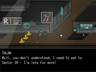
The first map - Move the shelves and bed down a little, maybe the vanity, counter and oven as well.
The second map - I see those trees, a bit choppy. Try going for a more random shape; nature isn't square, after all.
The third map - Those stone paths could maybe use a bit of working on. Other than that there's really nothing else I could point out.
The fourth map - This map is amazing, but some of it is a bit too square, like the ocean/pond/river/thing and the trees.
Work on those and you'll have a generally good game, maybe!
I look forwards to playing it~
Thanks for the advice. I took your words into reconsideration and redid almost every map. I think they are now quite improved. Thanks a lot!

author=Max McGeeauthor=LouisCyphreLC, what is going on here? What did you DO? I mean that second screenshot...is it me or is that an in-game screenshot but...it seems to show way MORE of the map than is possible with the engine...am I just going crazy?
Progress continues! I am aware of wackiness with shadows. They do not layer in a way I am pleased with at this time.
The map should look like a fortress that was grown over, then rapidly retrofitted for active service. It is a very old fort.
Yes, I used a .dll to manually pull the screen resolution up to 800x608. x640 felt to tall, and x600 wasn't a multiple of 32.
author=Liberty
Um... okay to start? You're using carpet as well tiles and table tops as roofing. That's really weird. Aside from that, it looks good I guess. A bit bare and empty, though.
Or are they carpets and tabletops? That was the whole point of this location actually, to challenge conventions. The floor is also a wall texture by the way. This project is actually just a side thing for fun where I try to cram all the weird things I can think of.
Speaking of weird...

Don't look.

author=Lucy1212
My game submission was denied because the mapping does not meet site standards. They said I was close, I just need a few pointers. So, how do I improve?
Since when does RMN discriminate based on mapping? HAHAHAH like look at 80% of the games on here, they're pretty comparable to what you posted. I'm sure there was another reason.
But yeah, what Christamoose said. Be sure to let us see the updated versions!
Btw, I never in my life thought RTP would make such a stylistic return. Especially Rm2k3's. It was absolutely shunned when I came into the community, so I guess I have mixed feelings lol. But a lot of people seem to love it.
I hate RTP because it tends to get overused, not because of it's style, though the purple shading used and just the general style of the RTP faces pisses me off. That said, those kidmode faces someone has been showing around recently are cute.
As for what I'm up to, well the game I'm working on now doesn't have any worthwhile screens yet, but it will. Future it will.
As for what I'm up to, well the game I'm working on now doesn't have any worthwhile screens yet, but it will. Future it will.
the rtp has a wider variety of settings than reusing nothing but rudras and suikoden chipsets for six years (and not even having played the games, which is the real travesty). gamingworld more like creative bankruptcy world
dude blindmind i remember your old art for your game where the backgrounds were literally paintings of suikoden tiles. also your mc was "omega" or some shit but mostly i remember you actually convinced somebody to paint suikoden settings as backdrops for your game
bizzaremonkey:

dude blindmind i remember your old art for your game where the backgrounds were literally paintings of suikoden tiles. also your mc was "omega" or some shit but mostly i remember you actually convinced somebody to paint suikoden settings as backdrops for your game
bizzaremonkey:

author=LouisCyphre
Yes, I used a .dll to manually pull the screen resolution up to 800x608. x640 felt to tall, and x600 wasn't a multiple of 32.
I WAS ABOUT TO QUESTION YOUR CHOICES IN LIFE.
author=CrazeIt's too dumb not to love. Also since you probably made that purely for my response, here's me returning the favor.
bizzaremonkey:

Oh hey look at that it's a screenshot.