


SCREENSHOT SURVIVAL 20XX
Posts

author=yuna21Wow, yeah, those are phenomenal! Especially since you're so new to pixel art (?), the rate that you've picked it up is pretty impressive. :D Is everything in those screens custom-made? The second shot in particular really looks professional.
Testing out my custom tiles. TileA2 is about 97% complete ( 31 out of 32 autotiles done so far ).
Tree is a placeholder. I'm not very fond of it. As well as the flower autotile.
But I do love how my dirt cave autotiles came out. ^^


The only real criticisms I have are a few tiles that could use an extra color/layer of shading, such as the water auto-tile. The cliffs also could use a bit of rounding out. Lastly, the "bright" grass tiles seems off from the color palette of the rest of the map.
I actually don't mind the tree, although I think you would work on brightening the trunk and shading the bottom part a tad more. All in all, great stuff though!

So I finally began doing actual maps for Perseverance: Adherance, this isn't yet completed, but it gives a good idea of what the game will look like.


author=BizarreMonkey
So I finally began doing actual maps for Perseverance: Adherance, this isn't yet completed, but it gives a good idea of what the game will look like.
Is that Pep
please tell me that's Pep
is it Pep
it looks like Pep
Lol, nope! It's Pep's daddy. Pep isn't tall like that nor does he wear a jacket or blind fold.
Pep comes into the story a little later.
Here's a video of another map and also all the stuff in it's animated form.
I really like the atmosphere beginning to take shape, here.
Pep comes into the story a little later.
Here's a video of another map and also all the stuff in it's animated form.
I really like the atmosphere beginning to take shape, here.

author=yuna21
Testing out my custom tiles. TileA2 is about 97% complete ( 31 out of 32 autotiles done so far ).
Tree is a placeholder. I'm not very fond of it. As well as the flower autotile.
I love those colorful and cheerful flower autotiles! It reminds me of SD3.


Thanks for the comments on black future. Its been fun going back and forth between that and Eagleland.
@bizarre. I like the more consistant look of these hand drawn parallax maps. The animation looks neat. I still think you could detail them a little better but I'm digging it.
@bizarre. I like the more consistant look of these hand drawn parallax maps. The animation looks neat. I still think you could detail them a little better but I'm digging it.
author=DookieCan I just say that whatever you're doing looks super cool.
Thanks for the comments on black future. Its been fun going back and forth between that and Eagleland.
snip
author=DookieThose were warmups.
@bizarre. I like the more consistant look of these hand drawn parallax maps. The animation looks neat. I still think you could detail them a little better but I'm digging it.

Since that alone doesn't do it justice, here's a video of it all in action. (Some of these graphics are still placeholder, like the log and it's punt animation).
The map can actually be largely altered since all it takes is swapping out a paralax or removing/adding picture overlays. In the three maps you learn all the basic non-combat controls, next stage will be an introductory boss fight that'll quickly teach you the art of combat.

author=Dookie
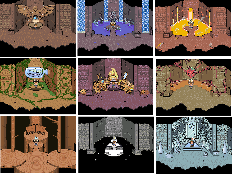
http://rpgmaker.net/media/content/users/2321/locker/EAGLE_ALTARS.PNG
:-o ... I want to play that. That looks beautiful. Are each of those dungeons I assume?

Your work is stunning, Dookie. :0 You pretty much inspired me to start doing my own tilesets ( oh, and Pizza and Itaju as well XD ).

Tileset test. Take 2.
Tileset test. Take 2.

@Yuna: My only criticisms are:
1. The trees are really flat. They look like big solid walls of leaves. I'd recommend concentrating more highlights to one side and suggest the other "bunches" of leaves with simpler lines "curving" off of the main highlighted area.
Quickest example I could find:

2. The log is looking like it's on the wrong viewing angle. It's suggesting that you're looking down at it from a top down view, not a 3/4 view.
3. The little patches of tall grass are too hard to see. Consider using the same palette as your regular grass, just lower or higher end shades.
1. The trees are really flat. They look like big solid walls of leaves. I'd recommend concentrating more highlights to one side and suggest the other "bunches" of leaves with simpler lines "curving" off of the main highlighted area.
Quickest example I could find:
2. The log is looking like it's on the wrong viewing angle. It's suggesting that you're looking down at it from a top down view, not a 3/4 view.
3. The little patches of tall grass are too hard to see. Consider using the same palette as your regular grass, just lower or higher end shades.

y'all keep praising dookie in here but his game profiles are rather barren. he has even more images on his game profiles, guys! take a look!
yuna: read pizza's post, although i think i can see where you tried doing what he's talking about with the tree, it's just not enough contrast to really work. also i think the log looks fine? but #1 and #3 i agree with
bizzaremonkey: i have no idea what's going on there but uh, good luck i guess
yuna: read pizza's post, although i think i can see where you tried doing what he's talking about with the tree, it's just not enough contrast to really work. also i think the log looks fine? but #1 and #3 i agree with
bizzaremonkey: i have no idea what's going on there but uh, good luck i guess
LockeZ

I'd really like to get rid of LockeZ. His play style is way too unpredictable. He's always like this too. If he ran a country, he'd just kill and imprison people at random until crime stopped.
5958
Maybe if he posted them with the Looking For Feedback tag, so they actually show up in the list of screenshots that people want comments on!
Actually I didn't even think he had a game profile. He's been posting this stuff here for a long time without having them.
Actually I didn't even think he had a game profile. He's been posting this stuff here for a long time without having them.

So, I am PRETTY sure even though I think this looks darn near perfect, SOMEONE will think of a way to improve this.
It's for my Phantasy Star fan game.... the one I been working on for YEARS now.
The title screen so far.

Might come up with a subtitle at some point.
I had a title screen already, but recently decided to uprez the graphics to my game, rather than going with the retro 16 bit look...
Anyhow, it's a slow process and i got the title screen done (I hope.)
I'm kinda iffy about the background..
Thoughts?
It's for my Phantasy Star fan game.... the one I been working on for YEARS now.
The title screen so far.
Might come up with a subtitle at some point.
I had a title screen already, but recently decided to uprez the graphics to my game, rather than going with the retro 16 bit look...
Anyhow, it's a slow process and i got the title screen done (I hope.)
I'm kinda iffy about the background..
Thoughts?


Not a real map. This is mainly a test map to experiment with colours...and to show off the style of character sprites that I'm going for. Not one of the two possible main characters, but I think he looks cute anyway. What do you guys think?
@Markus: I think it looks pretty god damn good. You have a nice balance of colours going on between the logo and the background there, and from what I can see there's no resolution clash (although I don't know what the game looks like). Is that black border just in the screenshot, or in-engine? If it's in the game, I'd consider filling it in since it's distracting on the bottom left corner.
@Begriff: Going with black for the area outside of the room would be better, imo, since it would focus the player's vision on the map itself. Right now it's sort of muddy as to what you should be looking at. The way the glass table lines up perfectly with the wall looks awkward. You may want to consider bringing it down a bit or having it overlap.
I think some of the shading could be improved. I know the use of pastel sort of colours is indicative of your style, but the legs of the tables and the sides shouldn't blend like that, because they end up looking very flat. The pillow shading on the seats could also use some work.
The way the floor tile in the kitchen blend with the main floor is a little too blend-y, but fixing that is largely your decision, and how you would go about it is also up to you. I think it should be a bit more obvious where the tiles change, though.
As a final note, is there a dark 1 pixel line on the floor moulding? if there is, it's playing with my eyes. It should be darker in order to be apparent, because right now it's blurring things together.
It's just in the shot, you won't notice it in the game when it's running.
Considering a different background though.
Considering a different background though.
Corfaisus

"It's frustrating because - as much as Corf is otherwise an irredeemable person - his 2k/3 mapping is on point." ~ psy_wombats
7874
author=MarkusT
Thoughts?
I'd strongly recommend getting a new background. There's just something odd about a fantasy game having legit Earth and the moon as it's title screen. Also, lens flare is near-always frowned upon, so if you go with something that isn't a photograph (I'd assume that's what that is), make sure to not include it.
Also, don't bother with a subtitle; that'll just add unnecessary clutter to the title screen. Besides, if they ever made an official PS5, the last thing you'd need is something like "A New Dawn" slapped on top of it.


