THE SCREENSHOT TOPIC RETURNS
Posts
author=Dyhalto
Yeah, from top to bottom.
Here's a comparison shot involving normal resolution map and whatnot.
Ahh! Great Knight Duessel! Are you making that on 2k3?
And since you reminded me of a TBS, that's my little input in this topic for today. Just need to implement the menu, it's just a little test.
So I've been spending time learning more about cg graphics and art among other things. I've modified my style since Eden Gate so here is a mock with Bastion sprite placeholders as I'm still studying pixel art/character modeling.
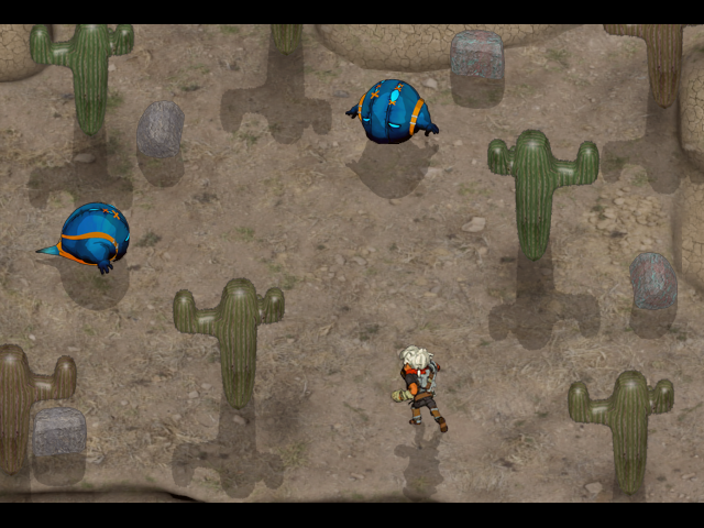

Thanks Roots! Man I have a long ways to go but I do enjoy learning more and more everyday, can't wait to turn this into something more than just a mock =]
"You can't have animated monsters in the DBS," they said.
"It's impossible in RM2k3!" they said.
"It's impossible in RM2k3!" they said.
DOFL (Dying On Floor Laughing)
LockeZ

I'd really like to get rid of LockeZ. His play style is way too unpredictable. He's always like this too. If he ran a country, he'd just kill and imprison people at random until crime stopped.
5958
oh fuck I can't breathe
Oh good lord, this is beautiful LOL... And awesome that theres such a plugin as this! I must see it!
XD
I got a good laugh out of that. Great job, man!
Trying to pick a good transparency/tint. Any thoughts on which is best?
Keep in mind this part of the dungeon is the first basement floor under the church.
Lighting 1: More transparency, no screen tint.

Lighting 2: Not as much transparency, no screen tint.

Lighting 3: Same transparency as Lighting 1, desaturated orange screen tint.

I did have a fourth which was Lighting 2 + desaturated orange tint, but it was too dark for my liking.
I got a good laugh out of that. Great job, man!
Trying to pick a good transparency/tint. Any thoughts on which is best?
Keep in mind this part of the dungeon is the first basement floor under the church.
Lighting 1: More transparency, no screen tint.

Lighting 2: Not as much transparency, no screen tint.

Lighting 3: Same transparency as Lighting 1, desaturated orange screen tint.

I did have a fourth which was Lighting 2 + desaturated orange tint, but it was too dark for my liking.
dragonheartman
"You can't have animated monsters in the DBS," they said.
"It's impossible in RM2k3!" they said.
*DHM CASTS EPIC SEXOPHONE
CRAZE -- 9999 DAMAGE
HIT WEAK SPOT !!
*CRAZE HAS FALLEN !!
Some first pictures of my next release "Ankharia".
It's a small platform puzzle game made with Unity.
Planned release date is end of february, as I still need some time for finetuning and betatests.


It's a small platform puzzle game made with Unity.
Planned release date is end of february, as I still need some time for finetuning and betatests.


@Liberty: I think 1 is a bit too bright and I like 2 and 3.
3 might look a little more eerie thanks to the desaturated tint. I guess it's up to you to judge what kind of atmosphere you want to give to that area.
3 might look a little more eerie thanks to the desaturated tint. I guess it's up to you to judge what kind of atmosphere you want to give to that area.
YOUR CHARACTERS HAVE STATS

DEREK HAS AN ODD SENSE OF DOMESTICATION

SPEND LOTS OF CASH SO THAT YOU CAN SPEND MORE CASH*

RECRUIT SEVEN HEROES INTERESTED IN SLAYING EVILGOD**

*gonna change the shop status to only show four/three names at a time in the bottom-right, with a note saying that you can press shift to alternate who's showing
**you do not actually start out with all of them, only two. i have learned from past mistakes, okay
EDIT: boring test battle: http://i.imgur.com/qWgBw.png

DEREK HAS AN ODD SENSE OF DOMESTICATION

SPEND LOTS OF CASH SO THAT YOU CAN SPEND MORE CASH*

RECRUIT SEVEN HEROES INTERESTED IN SLAYING EVILGOD**

*gonna change the shop status to only show four/three names at a time in the bottom-right, with a note saying that you can press shift to alternate who's showing
**you do not actually start out with all of them, only two. i have learned from past mistakes, okay
EDIT: boring test battle: http://i.imgur.com/qWgBw.png
IN A WORLD WHERE EVERYONE HAS GONE DEAF
THE ONLY SOLUTION IS YELLING
YELLING ALL OF THE TIME
I like the look of the stats screen and especially like that you have an easy-to-read list of what a character can equip, because trying to decipher and remember that in RPGs always irritates me.
Any chance you can spoil some of your plans for the battle system?
EDIT:
Koaangel, that looks really really good, I like the focus on bright colors and they contrast well with the sand. What shaders are you using for the bricks/sand/spikes?
@slashphoenix:
Thanks. The shaders are Unitys standard Diffuse Shader and some Unlit and Specular Shaders for the spikes, nothing special. The bright colors are more the result of textures with high color saturation.
@kentona:
Thanks. There's still some work to do.
I think I'll need 4 more weeks to finish it. I'm still looking for some Betatesters, so if you're interested in giving it a try, I would contact you, when betatests start.


