


OH NO ITS OCEAN
Posts

Just a bunch of stuffs I've been working on recently.

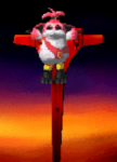
Title for Island Sky.

Konata!

The original Ninja Gaiden screen (Which before anyone says something, was not made by me)

Remade Ninja Gaiden screen. I call it Ninja Nonsense Gaiden

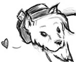
Shinobu!

A testmap (Not an actual one) from Alcarys Complex.
Title for Island Sky.
Konata!
The original Ninja Gaiden screen (Which before anyone says something, was not made by me)
Remade Ninja Gaiden screen. I call it Ninja Nonsense Gaiden
Shinobu!
A testmap (Not an actual one) from Alcarys Complex.
What did you use to make your character art? It looks like watercolor or acrylic. Your anatomy could still use some work, too.
I like the remake of the Ninja Gaiden screen, but the Alacrys map's sharp contrast makes the objects on the screen appear unnatural. The rock formation and bridge especially don't look like they are really 'on' the ground.
Nice to see more graphic artists posting here!
I like the remake of the Ninja Gaiden screen, but the Alacrys map's sharp contrast makes the objects on the screen appear unnatural. The rock formation and bridge especially don't look like they are really 'on' the ground.
Nice to see more graphic artists posting here!

The character art was all done in Photoshop. Well, except for the lineart, that was done on paper.
Yeah, my anatomy is still off. I had a particularly hard time with Konata, I don't normally draw lolis. But either way, I don't draw all that much so I still have much to learn.
I don't think I have the time, or I would probably make Ninja Nonsense Gaiden. But it'd be too much effort...
Yeah, my anatomy is still off. I had a particularly hard time with Konata, I don't normally draw lolis. But either way, I don't draw all that much so I still have much to learn.
I don't think I have the time, or I would probably make Ninja Nonsense Gaiden. But it'd be too much effort...


I've replaced the chairs on the top with bigger chairs, but I was too lazy to upload that version.

Rydia!
This is funny:

These are serpent enemies I've made, from 2005 to now.

Batman meets Haruhi. This idea came about when Dark Knight was released, and I was giving fake spoilers that were really from Haruhi. So, Dajhail told me to do this scene. All pixelled. Did I post this before? I don't even remember.
These are serpent enemies I've made, from 2005 to now.
Batman meets Haruhi. This idea came about when Dark Knight was released, and I was giving fake spoilers that were really from Haruhi. So, Dajhail told me to do this scene. All pixelled. Did I post this before? I don't even remember.
Nice to see an art post that isn't Ness! (No offense to Ness or anything, it's just lonely in here)
The serpent enemies show a drastic increase in quality, the last one looks particularly nice.
The Haruhi/Batman one has nice colors and improved anatomy over a lot of your older stuff, but the perspective is awkward. Haruhi looks like she's about to fall off her chair.
The serpent enemies show a drastic increase in quality, the last one looks particularly nice.
The Haruhi/Batman one has nice colors and improved anatomy over a lot of your older stuff, but the perspective is awkward. Haruhi looks like she's about to fall off her chair.
Life2!

29 colors, Taurus

20 colors, Libra

10 colors, Pisces

12 colors, Capricorn

21 colors, Cancer

32 colors, Gemini

30 colors, Aquarius
That's all I have so far, I want to have the whole collection done very soon, as it's also for a project.
29 colors, Taurus
20 colors, Libra
10 colors, Pisces
12 colors, Capricorn
21 colors, Cancer
32 colors, Gemini
30 colors, Aquarius
That's all I have so far, I want to have the whole collection done very soon, as it's also for a project.
Yeah, I'm happy with Aquarius. I don't feel that way for all of them, but I do have to rush these, unfortunately.
Aries? I think so, I don't have any particular order, but I'll post it here when it's up!
Aries? I think so, I don't have any particular order, but I'll post it here when it's up!
I don't care for the last too much. They're straight on while the others are at an angle of interest. For some reason the straight on greekish building doesn't catch my eye in the pleasing way the others do. but I won't worry about it. no big deal.


