


GAME DENIED. MY MAPPING NEEDS "SOME PRETTY SERIOUS HELP." THAT'S LESS THAN HELPFUL...
Posts
author=Archeia_Nessiah
ka, this was denied by another person.
And even then there is nothing wrong to have an intention to make someone's level designing and chipset usage improved. That and your insult is uncalled for.
i thought i was being hilarious
i didn't see the submission in it's entirety so i don't have all the facts but the game being denied because of sub-par visuals seems pretty inconsistent with alot of the games that have been submitted (and accepted) over the years. from what i've seen so far in this thread, it's way better than other games submitted, even up until recently. i'm guessing the submission in it's entirety was lackluster but then the biggest problem aren't the graphics
LockeZ

I'd really like to get rid of LockeZ. His play style is way too unpredictable. He's always like this too. If he ran a country, he'd just kill and imprison people at random until crime stopped.
5958
Uh, what? A lot of games are denied over looking shitty. Especially since all the staff has to go on are your screenshots and a couple paragraphs of description. I've personally had a game denied for looking shitty, with an almost identical reason given by the staff member who denied it. The fact that a few have slipped through the cracks on days when staff members were feeling nice isn't indicative of an intentional policy of tolerance.
I'm putting the last touch on this map with those rocks along the river that were mentioned, but I wasn't sure if that suggestion was supposed to go at floor level or water level.
EDIT:
Ok, here's an update on my map:
Temple v2.5
EDIT:
Ok, here's an update on my map:
Temple v2.5
For the record, I denied this game, not Deckiller.
I did so largely on the basis of this screenshot:
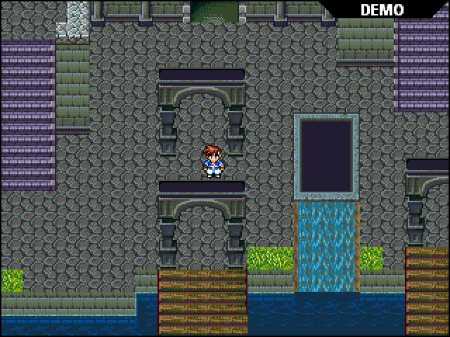
Very jumbled, lots of misused tiles. I am glad to see this is the exact issue that's been worked on in this thread! Thank you to everyone who stepped up to help.
I do think Carlsev Saga is an example of a game that uses these tiles well, so I still suggest checking it out if you haven't. Also check out Ara Fell if you want to make things REALLY pretty, just be careful that it doesn't also become hard to navigate!
I did so largely on the basis of this screenshot:
Very jumbled, lots of misused tiles. I am glad to see this is the exact issue that's been worked on in this thread! Thank you to everyone who stepped up to help.
I do think Carlsev Saga is an example of a game that uses these tiles well, so I still suggest checking it out if you haven't. Also check out Ara Fell if you want to make things REALLY pretty, just be careful that it doesn't also become hard to navigate!
author=Solitayre
For the record, I denied this game, not Deckiller.
I did so largely on the basis of this screenshot:
Very jumbled, lots of misused tiles. I am glad to see this is the exact issue that's been worked on in this thread! Thank you to everyone who stepped up to help.
I do think Carlsev Saga is an example of a game that uses these tiles well, so I still suggest checking it out if you haven't. Also check out Ara Fell if you want to make things REALLY pretty, just be careful that it doesn't also become hard to navigate!
Yes, I really appreciate all the feedback! And the waterfall definitely looks silly with no other knowledge of the game. Redoing it also helped my goal with this map of making it feel very open (i.e. less black ceiling tile in places).
Although, would doing something like in this screenshot (but to a less blocky degree) be alright if this location were deep underground and there was water falling from the ceiling?

author=LockeZauthor=bulmabriefs144If you know that, you should really either fix or delete your game.
I dunno what the big fuss is about. My mapping is loads more horrible.
I don't need to. And this is my point. Mapping is about more than the quality of the graphics or the feng shui of the room. Picture a well-built room (for emphasis, and to tick you off, we'll use yours as an example).
From Vindication. Okay, so I've played your games, and truth be told, I like them okay. But for the sake of argument, we're gonna say that the down exit dead-ends immediately, leaving only two options (railroading), the characters inside the cell can't be talked to, any exits from this room are warped either to some random location or back to this room, and when you touch those barrels either you can walk through them or they're above your head. Is this still good mapping? No, not even if this screen has multiple layers and parallax, and looks really freaking beautiful. One this note, I introduce the order of priority in mapping.
1. Functionality (any issues with this, I am fixing). Does the screen work? Does it connect with others, do all the tilesets behave as they should with you not able to outright walk through objects or have strange overhead issues on short objects?
2. Conversation of detail. You see this a ton of times, someone who drew a pretty picture, of perhaps a library. You can't read any of these books though. Maybe there's a chest at the foot of someone's bed. You can't open it though, and this is true across the game. If it doesn't work, don't include it. It just means the player sees a bunch of worthless items that they can't interact with.
3. Interaction. There should be plenty of people to talk to, items to access, etc. This section is where sidequests go too, along with weird jokes (Earthbound is a key example). Not just talking to people either, the Atelier Iris/Mana Khemia series had loads of items to harvest. I have little patience for stupid characters who are like "you must save the kingdom" over and over again (no, not multiple lines, even one interesting line is worth 12 cliched lines), so yes, Conversation of Detail still trumps this, meaning no you don't need a ton of stuff to make a "good" map. Wasted stuff is wasted stuff.
4. Freedom versus direction. Think Skyrim versus an NES/SNES dungeon crawl. This is not as necessary as the others, because if you play to your strengths, both a completely open-ended game where you ignore the main quest to go hunt mushrooms (hint: Skyrim), or a game that basically sends you on a straight course with no options can work. That said, balancing these two makes a great game.
5.
The best series I've played for mapping was the Lufia series.

But, you say, Lufia has crappy map graphics. Yes but, they got their priorities straight. Everything works (1), there are many items hidden by inspecting objects (2), there are plenty of people to talk to and what they have to say is interesting (the giant catfish quest, and the ruby apple are some highlights, as are the two semi-villains who meet you when you find the bomb) much like Lunar (3), the maps are designed around exploring (since you can go back to old areas with new tools and find more items), but at the same time keep you on track until various quests are completed (4), and the graphics are well-drawn for what matters, the characters (5).
I really like your train of thought on this matter. Where do you think realism would go on this list? And by realism, I just mean things making logical sense. I would say that it's tied into functionality to some degree, especially if you can't walk on top of a seemingly flat tile of grass or if you can phase through walls, etc.
This goes under function. Which is why you got disqualified, not because of prettiness or ugliness of the screen.
Those waterfalls could have been made to work with only a minor tweak actually. You could have something come out of a wall through a pipe or even just a stream of water in the middle with wall on either side. The tile above the water is a ceiling tile so it's basically a flowing block of water standing in midair.

A little island fortress. In this example, we presumably have water coming from a reservoir at the top of the hill, possibly rerouted around the castle by whoever built it. It's a little strange, but not completely unthinkable. The added details of stuff growing where the water runs through is accurate. It's mostly realistic, and it's the way I'd build my island castle.
For surrealism, this is a working part of the scenery. But in surrealism, the rules tend to emphasize a lack of boundaries, a strangeness of the overall scene.

The parallax is blood, and you cross bridges of bone, with assorted body parts cropping out of the ground, walls of muscle, and all of this is inside a floating egg in the sky responsible for birthing the universe. Surrealism is not the absence of realism, it's something that makes sense within its context.
Yeah, something surreal could make a lot of sense save for a few minor details. My water from the ceiling could be an example of this I guess, but was not at all what I was going for hence game denied.
LockeZ
I'd really like to get rid of LockeZ. His play style is way too unpredictable. He's always like this too. If he ran a country, he'd just kill and imprison people at random until crime stopped.
5958
Realism is a useful tool for bringing the world alive, which bulma apparently thinks is actually a bad thing to do, based on that horrible point #2 about removing details. Conservation of detail should never be a goal in my opinion. It's a common time-saving method, and one that players have been trained to accept. But it doesn't improve your game, it takes away from it. Your maps will look better if they look more like what they're representing - the player will see them and think "these are the ruins of an ancient temple, people probably worshipped here 600 years ago" instead of "this is a stone room with monsters, I should kill them to get to the boss."
In addition to bringing the experience to life in the player's mind, though, realism's also a useful tool for clueing the player in to the meaning of his/her surroundings. It's much easier to tell what you're supposed to be doing and realize what your options are if you can see things in the game and immediately recognize them instead of having to parse them through a mental filter that interprets what they are in the context of the game. For example, if heights and corridors and platforms all line up consistently, the player won't get disoriented by the gameplay as easily. If waterfalls have streams of water at the top and bottom, the player will be able to see a stream of water and immediately realize he's near the top of the waterfall he saw ten minutes ago. Make robots weak to lightning and plants weak to fire, and the player will remember those patterns a lot better than if they worked the other way around. A lot of people say it's all about consistency within your game, just so you keep following the same rules when laying out areas, but the player will be able to remember those rules a lot more easily if he/she already knew them before even starting the game.
In addition to bringing the experience to life in the player's mind, though, realism's also a useful tool for clueing the player in to the meaning of his/her surroundings. It's much easier to tell what you're supposed to be doing and realize what your options are if you can see things in the game and immediately recognize them instead of having to parse them through a mental filter that interprets what they are in the context of the game. For example, if heights and corridors and platforms all line up consistently, the player won't get disoriented by the gameplay as easily. If waterfalls have streams of water at the top and bottom, the player will be able to see a stream of water and immediately realize he's near the top of the waterfall he saw ten minutes ago. Make robots weak to lightning and plants weak to fire, and the player will remember those patterns a lot better than if they worked the other way around. A lot of people say it's all about consistency within your game, just so you keep following the same rules when laying out areas, but the player will be able to remember those rules a lot more easily if he/she already knew them before even starting the game.
Alright, I just resubmitted. Let's hope for the best! ^_^
I think the tough love was for the better.
I think the tough love was for the better.

Having watched the video and seen the improvements to your mapping just from this thread, I hope it gets approved - it looks rather interesting and I'm looking forward to having a chance to try it at some point. =)
author=Travio
Having watched the video and seen the improvements to your mapping just from this thread, I hope it gets approved - it looks rather interesting and I'm looking forward to having a chance to try it at some point. =)
Thanks for the encouragement, Travio! Hopefully, I will have the will and determination to finish this and not slack off from classes while I'm at it. I'm also now looking at the RM2k3 plug-in SDK, which may prove useful because the way damage and whatnot is calculated in RM2k3 is just dreadful.
I was able to make some work-arounds using attributes. One of LockeZ's tutorials was especially helpful with that, but I still find some things limiting such as the battle menus only displaying one status effect at a time rather than cycling through.
author=LockeZ
Realism is a useful tool for bringing the world alive, which bulma apparently thinks is actually a bad thing to do, based on that horrible point #2 about removing details. Conservation of detail should never be a goal in my opinion. It's a common time-saving method, and one that players have been trained to accept. But it doesn't improve your game, it takes away from it. Your maps will look better if they look more like what they're representing - the player will see them and think "these are the ruins of an ancient temple, people probably worshipped here 600 years ago" instead of "this is a stone room with monsters, I should kill them to get to the boss."
(RANT)
No, you shouldn't remove the details (I often do, but that's because I believe in minimalism). I'm saying, you should take responsibility for every detail you put in. If you have a graveyard, a library, or a kitchen, every grave should have an inscription, every book on the shelf should at least have a crappy poem about unicorns (the crappier, the better when it comes to unicorns), and every cabinet should have knives or ingredients and tell about them. Yes, there are pro games that don't, but you aren't a pro. You don't have the luxury of good graphics, even if you don't use the RTP, so you have to make the game a meaningful representation of what you want the game to say. Unless you want to go up to every flower in a bed ("this flower hasn't been well-watered" or "what a beautiful flower" or "This flower is a (Genus species)") inside a shop, it might be worth considering that while quite a few shops do grow flowers to appeal to customers, there are some shops that are dusty and bare (they sell insurance?) except for the items on display. Within the limits of sanity, you aren't expected to make every object count, but being a slacker and having a ton or pretty but non-functional objects is lame. If the ruins above, the character should be able to search the rubble, or notice whether the disrepair is ancient or recent.
(/RANT)
Condition_icons provided as an example appears to be able to display more than one at once, at least from the picture I've seen. But I can't get it to work that way, so I dunno (my status effect are all different priorities).

author=bulmabriefs144author=LockeZ(RANT)
Realism is a useful tool for bringing the world alive, which bulma apparently thinks is actually a bad thing to do, based on that horrible point #2 about removing details. Conservation of detail should never be a goal in my opinion. It's a common time-saving method, and one that players have been trained to accept. But it doesn't improve your game, it takes away from it. Your maps will look better if they look more like what they're representing - the player will see them and think "these are the ruins of an ancient temple, people probably worshipped here 600 years ago" instead of "this is a stone room with monsters, I should kill them to get to the boss."
No, you shouldn't remove the details (I often do, but that's because I believe in minimalism). I'm saying, you should take responsibility for every detail you put in. If you have a graveyard, a library, or a kitchen, every grave should have an inscription, every book on the shelf should at least have a crappy poem about unicorns (the crappier, the better when it comes to unicorns), and every cabinet should have knives or ingredients and tell about them. Yes, there are pro games that don't, but you aren't a pro. You don't have the luxury of good graphics, even if you don't use the RTP, so you have to make the game a meaningful representation of what you want the game to say. Unless you want to go up to every flower in a bed ("this flower hasn't been well-watered" or "what a beautiful flower" or "This flower is a (Genus species)") inside a shop, it might be worth considering that while quite a few shops do grow flowers to appeal to customers, there are some shops that are dusty and bare (they sell insurance?) except for the items on display. Within the limits of sanity, you aren't expected to make every object count, but being a slacker and having a ton or pretty but non-functional objects is lame. If the ruins above, the character should be able to search the rubble, or notice whether the disrepair is ancient or recent.
(/RANT)
Condition_icons provided as an example appears to be able to display more than one at once, at least from the picture I've seen. But I can't get it to work that way, so I dunno (my status effect are all different priorities).
Eh. Those background details should only have text associated with them if it's interesting. Otherwise no. Anything that bores your players needs to be removed, swiftly. No one cares if the flower hasn't been watered. If the graphics show that obviously the flowerbed is brown and withered then everyone gets the point instantly. However, if you wanted to write something like "You could have sworn you heard the desperate cry of a soul in anguish, but upon closer inspection you find that it really is just a dead flower." Then go ahead, it's weird and interesting.
I do like things with obvious inscriptions, like tombstones and books, to have something to say. But make sure you spend some time making them worth reading.
author=bulmabriefs144
Condition_icons provided as an example appears to be able to display more than one at once, at least from the picture I've seen. But I can't get it to work that way, so I dunno (my status effect are all different priorities).
If you could help me look into that, I would really appreciate it. Because I can guarantee that you will have more than one status condition at points in this game, and I want that to be as clear/logical as possible.
Also, in response to the discussion above: Pictures do speak louder than words. The scenery and music can give you a specific feeling without giving an excessive amount of dialogue to a player. Meanwhile, when used correctly, a lack of dialogue can give the player a chance to question and ponder what the scenery might suggest. I would agree that having text for books, etc and other objects are OK as long as they are pronounced. You don't want that rock in the corner to give a long soliloquy from the main character or something like that that would be wasted since hardly anyone will find that (except the most hardcore).
Also, like you said above, making things worth reading is important too. If something really isn't as significant as you intended, you shouldn't go back and try to add dialogue to something that should have never had it in the first place in an attempt to make it better.
If you're going for minimalistic game design, neither storytelling nor eye candy should be priorities. They are equally both compelling but lack actual gameplay value. However, these things are needed to some extent if you ever want people to play your game in the first place.

Shoob, if this is how you handle feedback in every aspect of game development, you will eventually turn out to be a fantastic dev.
author=LouisCyphre
Shoob, if this is how you handle feedback in every aspect of game development, you will eventually turn out to be a fantastic dev.
Thanks man! :D

Actually, the proper key to mapping is consistency. If you have houses one tile high on the outside, but two tiles high inside, all houses must be the same. If you have a cabinet that you can search, all cabinets should be able to be. If you have interaction with map objects, or shinies where treasure is or only green chests give money or NPCs with marks over their heads give quests or all red books can be read or no flowers can be walked over then all of these things, in all areas of map and game need to be the same.
That way the players learn the rules, understand them and don't miss out on things that they might later need to find or know. This way when they stumble apon a house with walls more than two tiles high, they realise that it's bigger than a normal house.
They have a frame of comparison to work with. This is the true key to good mapping. This and the Shift technique.
Besides, in RPGs the idea is to immerse yourself in a story. The details of the world are part of that. If the overlay on Chrono Trigger's Future world were removed, would it have been as immersive? If the Turtle Paradise Posters weren't actually on the walls of Final Fantasy 7, would that sidequest have been as interesting? If the Priphea flower patch was removed from that firs town in Lufia, would it have seemed as peaceful and alive?
Sure, place some of the details with care, but don't live in fear of every little tile placement. The idea is to leave white-space but not too much. Imagine the area as a page of blank paper and fill in with detail enough that your eyes can relax when looking at the whole. It takes a while to learn what works and doesn't, but making mistakes is a part of that learning.
We're here if you need to ask for a bit of critique or help. ^.^
I agree that balance is the key. I looked over my stuff and saw there were places where I wasn't following my own advice and had a ton of pots or something sitting around (faced with the choice of adding events to them, or just leaving them as decoration pots, I eventually caved and said "leave 'em", though I did add about five new events including a barrel that said "this barrel is more of a barrel than those other barrels"). Don't have empty screens because of fear of blank events, don't have blank libraries either. A happy medium sort of thing.

