


ART PRINCIPLES IN GAME GRAPHICS: MAKING PRETTY STUFF
Posts
Pages:
1

So a while ago I wrote some stuff up based on my experience working on Dreaming Mary. I posted it on tumblr first, but I figure it might be useful for people here, too. Some more seasoned gamemakers and artists can probably shed better light on this subject, but I think this is a fair starting point for discussion.
I also wrote some thoughts on how to insert custom backgrounds as 'character' graphics for RMVX Ace Lite which you could read here if you don't mind the tiny grey font.
Feel free to share your thoughts, whether you agree or disagree. Also, I'd love to hear about how you approach game aesthetics, as well as your own techniques for conceptualizing graphics!
I also wrote some thoughts on how to insert custom backgrounds as 'character' graphics for RMVX Ace Lite which you could read here if you don't mind the tiny grey font.
Designing Art for Videogames
This article focuses on teaching the elements of visual art and how to apply them when creating scenery concepts for videogames. The technical aspect, specifically geared towards sidescrollers in Ace Lite, will be posted as a separate tutorial.
Videogames are art. Games can set an unusual mood or atmosphere to transport the player to another world; they can evoke emotion, whether it's something complex like sadness or something as simple as amusement or frustration. Games can even convey morals and influence players for the rest of their lives. Of course, you probably know that, given that you're here reading about how to make games yourself.
This article/tutorial is about how to make visually engaging areas for your game and how to use ideas and techniques from art in order to evoke reactions from the player.
Why Does It Matter?
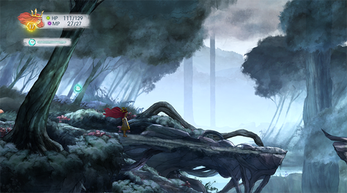
This is a screenshot from the game Child of Light, which came out April 30th. It's one of the most visually impressive games and it doesn't even depend on photorealism or 3D modeling, like so many other recent games do. The visual goal of this game was to take the player into a fairy-tale world fit for a storybook, and just a glance should tell you that they were highly successful.
The graphics for Child of Light actually are art, and when you're able to explore this world that moves and breathes like a living painting it's absolutely incredible. While we aren't able to do this with indie-geared game programs, we can certainly learn how to make our player feel like they're on a joyous adventure through an open world or make them feel trapped and isolated in a haunted mansion.
How Can We Do This?
I believe that video game art is about creating atmosphere. A game's map should present a strong visual impression that immediately tells the player what kind of mood the game/area has and what they can expect. As such, when we develop art for a game we should first focus on the biggest things that set the atmosphere and then move on to creating the little details that really bring the area to life.
There are six elements of art: Line, color, value, space, shape, and texture. Even if you haven't studied art before, just knowing these six elements can give you the push to make better compositions and areas. Visually, at least.
I will explain each element of art as well as how it can affect the atmosphere of your game's environment. Know that I'm also just a student artist, though, so you will have to take what I say with a grain of salt and decide for yourself whether you agree or not, and whether you can go even further to make greater things.
Line
As you can guess, line simply refers to using lines in art. This can be sketch lines, random dots in a row, really thick chunky rectangles, and so on. Lines can be used to divide up space, to show form and detail, and to create movement in art.
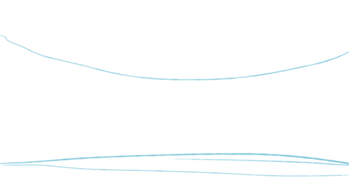
Horizontal lines are often used for landscapes. They give a sense of calm, relaxation, and trustworthiness. Imagine a vast open field with a long row of green grass swaying in the breeze, or the ocean washing back and forth from the horizon. Horizontal lines are not exciting or remarkable, but they are good for calm areas with a lot of nature and such.
Vertical lines are used to show stature, stability, and power. For example, you'd see long vertical lines for huge towers, skyscrapers, and castles. If you want to make something feel stately and grand, you can make it long with vertical lines that make the eye travel up and down. The further up something goes the more tense it feels because of our awareness of gravity.
Diagonal lines are the most exciting. They're action lines. Diagonals can show chaos, disorder; they feel like things are happening and moving. If you put a glass of water on a table you wouldn't be impressed, but as soon as you tip it over you're quickly tensed. The diagonal line makes things uncertain: will your glass fall and break? This instability makes diagonals exciting.
Thin lines, like thread, often feel fragile and delicate. Thick lines show confidence and power. The width of lines can also be used for spatial depth; closer objects can have thicker lines to show stronger presence, while farther objects can have small or no lines to fade them into the background.
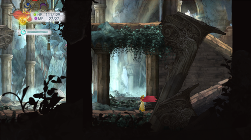
Let's take a look at another screenshot from Child of Light. We can see all three types of lines here. The ground is mostly horizontal, straight and stable. There are a lot of vertical lines coming from the tall stone pillars, which link the area to the grand and powerful Ancient Greek buildings. We can easily imagine that years ago, this may have been a shrine or a government building; somewhere trustworthy where people could feel safe. Yet this time was long past. The broken pillar shows that this place, despite its atmosphere of stability, is breaking down, no longer sacred.
Color
Color is a great way to immediately set a mood. Bright bloody red? Danger. Deep blues? Ocean calm. Emerald green? Forests. So on, so on. You don't need me to tell you what you already know.
Colors are actually one of the most complex things to work with though; they're subjective can look completely different if you put them next to other colors.

See this? Yeah, that middle grey is the same exact color. If you've ever seen that optical illusion of the rubix cube, this is the same principle. Our eyes see things relative to what's around them, so there is never any absolute in color.
Three components you'll want to keep in mind about color are hue, value, and saturation. Hue refers to things like is it red, blue, yellow. Value is how dark or how light the color is, and saturation (or purity) is how strong the color is or how grey it is. Low saturation means close to grey and high saturation means eyeburn.
Here are some more palettes to show how relative hue and saturation are.


You might be wondering how this even works. The main background colors are the extremes—very dark and very light, very blue and very yellow, very saturated and very desaturated. The circles in the center are the "middle" colors in between those extremes. So what does that mean? Putting a medium color on a very dark background makes the medium-dark look LIGHT. Putting a pukey yellow color onto gold makes it look GREEN. Putting a medium-saturated color on grey makes it look VERY SATURATED.
For the love of all that is holy keep this in mind, especially the saturation. Not understanding saturation is what causes a lot of graphics to look amateurish or even bad; the main problem is usually oversaturating colors, which makes the graphic look distracting or even painful (and not in the good way).
If you'd like to experiment with colors and how they work, you can copy those palettes above and just bucketfill each section with different stuff.
To learn how to make palettes and colors that really work well together I'd recommend just looking at actual art and seeing how they combine colors to set atmosphere. You can even paste them into photoshop and eyedrop each individual color to see how the painting fools you. You can also look up other resources for artists on color, though personally I never saw any merit to memorizing a color wheel and whatnot.
I will also share some general info which you might already know:
Light, highly saturated colors feel youthful and playful. Example: Pom Gets Wi-Fi
Dark and desaturated colors feel serious and grim. Example: Reap and Sow
Avoiding pure black/pure white and instead using dark/light colors can add a much greater stylistic appeal to your artwork. Example: Alice Mare
Colors are often referred to as "warm" or "cool". Warm colors are ones that appear in daylight such as yellow, red, magenta, orange, and green. Cool colors are ones that appear at night, such as deep green, cyan, blue, and purple. Warm colors move forward in space while cool colors recede, meaning if you put red and blue on a canvas the red looks like it's popping forward while the blue becomes the background. Desaturated colors also recede compared to saturated colors.

There's something called "aerial perspective", where things that are far, far away in the horizon turn lighter, cooler, and less saturated, while things closer to you are darker, warmer, and more saturated. If you look above at the Child of Light screenshots you can see aerial perspective activating there. Note that in dark areas things get darker the farther they are, though.

Here are some of my favorite colorist artists for your reference.
Megatruh – Alicexz – Rel – Qian Yi
Value
We've touched on this in our lesson on color already, but let's talk a little more about value.
Value refers to light and dark in art. High value means something that's light and grey, while low value means something that's dark and black. We can use words like "contrast" when referring to value, meaning that something with high contrast has a lot of white and a lot of black and something low contrast is mostly just one value.

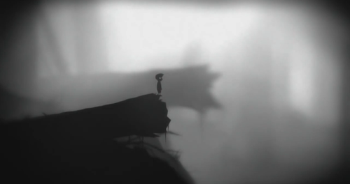
Ideally you should have enough value contrast to make your art interesting. An image with a lot of lights and darks is more interesting than an image that's mostly in the middle. This screenshot of Limbo shows that a game can be visually astounding even if it's just in black and white.
You can effectively use value contrast even if your area is mostly bright or mostly dark. In brightly-lit areas, having a bit of dark shadow or a place that's obscured adds mystery. In dark areas, having that one bright light source can help give players a sense of safety or assurance while still keeping a menacing or frightening atmosphere.
Something you'll want to be careful with is making sure your character/item graphics match the background's value enough that they don't look like they were ripped from another game, but are different enough that they stand out from the background.
Space
This element of art is… well, self-explanatory. It's space—open space, blank space, filled-up space, no space, and so on.
Space is something you manipulate even if you're not the most artistic person. If you want an area to feel open and inviting, you put a lot of empty space for the player to walk around in. Maybe you'll have a bright sky and clear plains with flowers or something. If you want a house to feel cramped and cluttered, you'll throw in a bunch of items and make a lot of areas impassible, and maybe you'll even put a foreground layer with more clutter to obscure the player's view of the entire mess.
The way you create space can make an area interesting. For example, how much of this place is the ground, how much is the sky? How much is the water? You can make a great evocative cliff scene with 15% land, 30% water and 55% sky. Only that 15% of the map would be available for the player to walk around on, but it still feels spacious and open because of the vastness of the unexplored parts of the map.
To make open worlds, you should give the illusion that areas continue off the limits of the map. For example, have mountain ranges that go higher in the sky than the player can see, and further to the side than they can walk. On the other hand, rooms with only a small walkable area and pitch black all around can feel isolated and trapped. That same small walking space but with a bunch of junk and people blocking your way can, on the other hand, feel busy and alive.
Being aware of depth perception can help boost your game's visuals by a lot. This means knowing that the area where the player can walk is the middle ground; everything behind them is the background; and everything in front of them is the foreground. Scrolling parallax backgrounds are great for giving that illusion of faraway areas the player has yet to explore; foreground elements (like tree branches, barrels and crates, fences, etc.) can give the player the illusion that they're actually there in the game, and they're looking into the scene that the character is walking in. Backgrounds and foregrounds are really great for creating atmosphere and I highly recommend using them when you can.
Shape
You're probably thinking about circles and rectangles when you see "shape", but this element of art refers to more than that. This element of art is about how you use the previous elements to make distinct forms that are recognizable as areas to the viewer. For example, you can make a shape by drawing lines to form a triangle. You create shapes when you add a darker color as a shadow; you create a shape in the sky when you surround it with trees.
Being aware of shape in art can help you make interesting stylistic choices. Especially in games where our goal is not photorealism, you can do some fun things. You can make a surreal setting by using many curves and nearly no straight lines; you can make an unforgiving and stark scene by using only straight lines and harsh angles.
Keep in mind that you can have implied shapes and shapes that don't have clearly defined edges.
Texture
The last element we'll talk about is texture. Before we make the graphics we decide on the texture pretty quickly—do we want it simple blocky with pixel art? Do we want paper-textured watercolor graphics? Do we want smooth vectors? And then we decide if we want it to have a lot of details and carvings and shadows or if we want it smooth and plain, and so on.
It is perfectly fine to use texture or to not use texture depending on the type of game you want. For a clean, nostalgic look, monochromatic and low-detail graphics are are great. Texture is used solely to provide necessary details like "Hey, this is a tree and that's grass", and there's no superfluous stuff to overwhelm the charming lightness and simplicity.
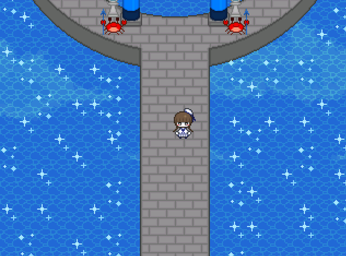
Here's a screenshot from Wadanohara and the Great Blue Sea, where we can see simple pixel art with basic textures that tell us just what we need to know.

On the other hand, there are games like Odin Sphere which use a lot of texture (each leaf is painted, there are individual blades of grass) to create beautiful scenery.
So, if you want something charming and nostalgic, minimal texturing is fine.
If you want something visually impressive, more texture details are good.
Just be wary of putting too much texture, as it can easily slip into messy and noisy.
Let's Try
Now that you've learned about the six elements of art, let's test them out quickly, shall we? Go ahead and get something you can draw with. I don't care if it's Photoshop or a sketchbook or your unsuspecting roommate's face; as long as you can doodle something up (with color too!), that's great.
This is just practice, so don't worry about it looking clean and professional. We're just going to draw the concept of a forest scene in a few easy steps. You can follow along with what I'm doing or you can branch off and add some flair. Whatever works for you!
0. Brainstorm what type of forest you're making. Is it a forest in Northern Germany? The spooky suicide forest in Japan? A fairy forest in a fantasy setting? Do you want it well-lit with warm yellow sunlight, or dark with a lot of purple shadows, or an enchanting otherworldly blue? If you have anything specific in mind you should research it to get good references.
1. Divide your space. We're going to have part of the image as sky, another part as trees, and another part as ground. Since this is a landscape, let's just make two mostly horizontal lines.
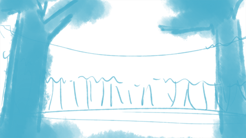
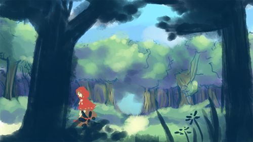
2. Draw some lines. Let's make some vaguely vertical lines for the trees. There'll be a lot in the background and also some big trees in the foreground to make the player feel like they're in the forest. Try to keep the foreground elements to the sides of the image and leave the middle open so that the player can see what's going on.
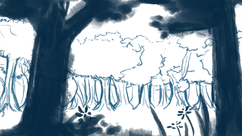
3. Refine your shapes and add texture. Start making some vague plans for the leaves, grass, and tree bark if you want.

4. Throw on some color. Remember that colors are relative when choosing your palette, so if you want a relaxing scene take colors from around the same area (blues, bluish greens). But if you want to go experimental, by all means do so!
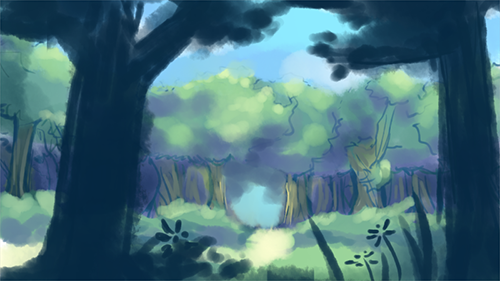
5. Start shading and highlighting. We need some value contrast now, so decide where the sun's at approximately and then shade things that are facing away from that spot. Add highlights at the edges of where the sun hits (optional).
6. Scribble in a character. Voila, concept art for an area!
This article focuses on teaching the elements of visual art and how to apply them when creating scenery concepts for videogames. The technical aspect, specifically geared towards sidescrollers in Ace Lite, will be posted as a separate tutorial.
Videogames are art. Games can set an unusual mood or atmosphere to transport the player to another world; they can evoke emotion, whether it's something complex like sadness or something as simple as amusement or frustration. Games can even convey morals and influence players for the rest of their lives. Of course, you probably know that, given that you're here reading about how to make games yourself.
This article/tutorial is about how to make visually engaging areas for your game and how to use ideas and techniques from art in order to evoke reactions from the player.
Why Does It Matter?
This is a screenshot from the game Child of Light, which came out April 30th. It's one of the most visually impressive games and it doesn't even depend on photorealism or 3D modeling, like so many other recent games do. The visual goal of this game was to take the player into a fairy-tale world fit for a storybook, and just a glance should tell you that they were highly successful.
The graphics for Child of Light actually are art, and when you're able to explore this world that moves and breathes like a living painting it's absolutely incredible. While we aren't able to do this with indie-geared game programs, we can certainly learn how to make our player feel like they're on a joyous adventure through an open world or make them feel trapped and isolated in a haunted mansion.
How Can We Do This?
I believe that video game art is about creating atmosphere. A game's map should present a strong visual impression that immediately tells the player what kind of mood the game/area has and what they can expect. As such, when we develop art for a game we should first focus on the biggest things that set the atmosphere and then move on to creating the little details that really bring the area to life.
There are six elements of art: Line, color, value, space, shape, and texture. Even if you haven't studied art before, just knowing these six elements can give you the push to make better compositions and areas. Visually, at least.
I will explain each element of art as well as how it can affect the atmosphere of your game's environment. Know that I'm also just a student artist, though, so you will have to take what I say with a grain of salt and decide for yourself whether you agree or not, and whether you can go even further to make greater things.
Line
As you can guess, line simply refers to using lines in art. This can be sketch lines, random dots in a row, really thick chunky rectangles, and so on. Lines can be used to divide up space, to show form and detail, and to create movement in art.
Horizontal lines are often used for landscapes. They give a sense of calm, relaxation, and trustworthiness. Imagine a vast open field with a long row of green grass swaying in the breeze, or the ocean washing back and forth from the horizon. Horizontal lines are not exciting or remarkable, but they are good for calm areas with a lot of nature and such.
Vertical lines are used to show stature, stability, and power. For example, you'd see long vertical lines for huge towers, skyscrapers, and castles. If you want to make something feel stately and grand, you can make it long with vertical lines that make the eye travel up and down. The further up something goes the more tense it feels because of our awareness of gravity.
Diagonal lines are the most exciting. They're action lines. Diagonals can show chaos, disorder; they feel like things are happening and moving. If you put a glass of water on a table you wouldn't be impressed, but as soon as you tip it over you're quickly tensed. The diagonal line makes things uncertain: will your glass fall and break? This instability makes diagonals exciting.
Thin lines, like thread, often feel fragile and delicate. Thick lines show confidence and power. The width of lines can also be used for spatial depth; closer objects can have thicker lines to show stronger presence, while farther objects can have small or no lines to fade them into the background.
Let's take a look at another screenshot from Child of Light. We can see all three types of lines here. The ground is mostly horizontal, straight and stable. There are a lot of vertical lines coming from the tall stone pillars, which link the area to the grand and powerful Ancient Greek buildings. We can easily imagine that years ago, this may have been a shrine or a government building; somewhere trustworthy where people could feel safe. Yet this time was long past. The broken pillar shows that this place, despite its atmosphere of stability, is breaking down, no longer sacred.
Color
Color is a great way to immediately set a mood. Bright bloody red? Danger. Deep blues? Ocean calm. Emerald green? Forests. So on, so on. You don't need me to tell you what you already know.
Colors are actually one of the most complex things to work with though; they're subjective can look completely different if you put them next to other colors.
See this? Yeah, that middle grey is the same exact color. If you've ever seen that optical illusion of the rubix cube, this is the same principle. Our eyes see things relative to what's around them, so there is never any absolute in color.
Three components you'll want to keep in mind about color are hue, value, and saturation. Hue refers to things like is it red, blue, yellow. Value is how dark or how light the color is, and saturation (or purity) is how strong the color is or how grey it is. Low saturation means close to grey and high saturation means eyeburn.
Here are some more palettes to show how relative hue and saturation are.
You might be wondering how this even works. The main background colors are the extremes—very dark and very light, very blue and very yellow, very saturated and very desaturated. The circles in the center are the "middle" colors in between those extremes. So what does that mean? Putting a medium color on a very dark background makes the medium-dark look LIGHT. Putting a pukey yellow color onto gold makes it look GREEN. Putting a medium-saturated color on grey makes it look VERY SATURATED.
For the love of all that is holy keep this in mind, especially the saturation. Not understanding saturation is what causes a lot of graphics to look amateurish or even bad; the main problem is usually oversaturating colors, which makes the graphic look distracting or even painful (and not in the good way).
If you'd like to experiment with colors and how they work, you can copy those palettes above and just bucketfill each section with different stuff.
To learn how to make palettes and colors that really work well together I'd recommend just looking at actual art and seeing how they combine colors to set atmosphere. You can even paste them into photoshop and eyedrop each individual color to see how the painting fools you. You can also look up other resources for artists on color, though personally I never saw any merit to memorizing a color wheel and whatnot.
I will also share some general info which you might already know:
Light, highly saturated colors feel youthful and playful. Example: Pom Gets Wi-Fi
Dark and desaturated colors feel serious and grim. Example: Reap and Sow
Avoiding pure black/pure white and instead using dark/light colors can add a much greater stylistic appeal to your artwork. Example: Alice Mare
Colors are often referred to as "warm" or "cool". Warm colors are ones that appear in daylight such as yellow, red, magenta, orange, and green. Cool colors are ones that appear at night, such as deep green, cyan, blue, and purple. Warm colors move forward in space while cool colors recede, meaning if you put red and blue on a canvas the red looks like it's popping forward while the blue becomes the background. Desaturated colors also recede compared to saturated colors.
There's something called "aerial perspective", where things that are far, far away in the horizon turn lighter, cooler, and less saturated, while things closer to you are darker, warmer, and more saturated. If you look above at the Child of Light screenshots you can see aerial perspective activating there. Note that in dark areas things get darker the farther they are, though.
Here are some of my favorite colorist artists for your reference.
Megatruh – Alicexz – Rel – Qian Yi
Value
We've touched on this in our lesson on color already, but let's talk a little more about value.
Value refers to light and dark in art. High value means something that's light and grey, while low value means something that's dark and black. We can use words like "contrast" when referring to value, meaning that something with high contrast has a lot of white and a lot of black and something low contrast is mostly just one value.
Ideally you should have enough value contrast to make your art interesting. An image with a lot of lights and darks is more interesting than an image that's mostly in the middle. This screenshot of Limbo shows that a game can be visually astounding even if it's just in black and white.
You can effectively use value contrast even if your area is mostly bright or mostly dark. In brightly-lit areas, having a bit of dark shadow or a place that's obscured adds mystery. In dark areas, having that one bright light source can help give players a sense of safety or assurance while still keeping a menacing or frightening atmosphere.
Something you'll want to be careful with is making sure your character/item graphics match the background's value enough that they don't look like they were ripped from another game, but are different enough that they stand out from the background.
Space
This element of art is… well, self-explanatory. It's space—open space, blank space, filled-up space, no space, and so on.
Space is something you manipulate even if you're not the most artistic person. If you want an area to feel open and inviting, you put a lot of empty space for the player to walk around in. Maybe you'll have a bright sky and clear plains with flowers or something. If you want a house to feel cramped and cluttered, you'll throw in a bunch of items and make a lot of areas impassible, and maybe you'll even put a foreground layer with more clutter to obscure the player's view of the entire mess.
The way you create space can make an area interesting. For example, how much of this place is the ground, how much is the sky? How much is the water? You can make a great evocative cliff scene with 15% land, 30% water and 55% sky. Only that 15% of the map would be available for the player to walk around on, but it still feels spacious and open because of the vastness of the unexplored parts of the map.
To make open worlds, you should give the illusion that areas continue off the limits of the map. For example, have mountain ranges that go higher in the sky than the player can see, and further to the side than they can walk. On the other hand, rooms with only a small walkable area and pitch black all around can feel isolated and trapped. That same small walking space but with a bunch of junk and people blocking your way can, on the other hand, feel busy and alive.
Being aware of depth perception can help boost your game's visuals by a lot. This means knowing that the area where the player can walk is the middle ground; everything behind them is the background; and everything in front of them is the foreground. Scrolling parallax backgrounds are great for giving that illusion of faraway areas the player has yet to explore; foreground elements (like tree branches, barrels and crates, fences, etc.) can give the player the illusion that they're actually there in the game, and they're looking into the scene that the character is walking in. Backgrounds and foregrounds are really great for creating atmosphere and I highly recommend using them when you can.
Shape
You're probably thinking about circles and rectangles when you see "shape", but this element of art refers to more than that. This element of art is about how you use the previous elements to make distinct forms that are recognizable as areas to the viewer. For example, you can make a shape by drawing lines to form a triangle. You create shapes when you add a darker color as a shadow; you create a shape in the sky when you surround it with trees.
Being aware of shape in art can help you make interesting stylistic choices. Especially in games where our goal is not photorealism, you can do some fun things. You can make a surreal setting by using many curves and nearly no straight lines; you can make an unforgiving and stark scene by using only straight lines and harsh angles.
Keep in mind that you can have implied shapes and shapes that don't have clearly defined edges.
Texture
The last element we'll talk about is texture. Before we make the graphics we decide on the texture pretty quickly—do we want it simple blocky with pixel art? Do we want paper-textured watercolor graphics? Do we want smooth vectors? And then we decide if we want it to have a lot of details and carvings and shadows or if we want it smooth and plain, and so on.
It is perfectly fine to use texture or to not use texture depending on the type of game you want. For a clean, nostalgic look, monochromatic and low-detail graphics are are great. Texture is used solely to provide necessary details like "Hey, this is a tree and that's grass", and there's no superfluous stuff to overwhelm the charming lightness and simplicity.
Here's a screenshot from Wadanohara and the Great Blue Sea, where we can see simple pixel art with basic textures that tell us just what we need to know.
On the other hand, there are games like Odin Sphere which use a lot of texture (each leaf is painted, there are individual blades of grass) to create beautiful scenery.
So, if you want something charming and nostalgic, minimal texturing is fine.
If you want something visually impressive, more texture details are good.
Just be wary of putting too much texture, as it can easily slip into messy and noisy.
Let's Try
Now that you've learned about the six elements of art, let's test them out quickly, shall we? Go ahead and get something you can draw with. I don't care if it's Photoshop or a sketchbook or your unsuspecting roommate's face; as long as you can doodle something up (with color too!), that's great.
This is just practice, so don't worry about it looking clean and professional. We're just going to draw the concept of a forest scene in a few easy steps. You can follow along with what I'm doing or you can branch off and add some flair. Whatever works for you!
0. Brainstorm what type of forest you're making. Is it a forest in Northern Germany? The spooky suicide forest in Japan? A fairy forest in a fantasy setting? Do you want it well-lit with warm yellow sunlight, or dark with a lot of purple shadows, or an enchanting otherworldly blue? If you have anything specific in mind you should research it to get good references.
1. Divide your space. We're going to have part of the image as sky, another part as trees, and another part as ground. Since this is a landscape, let's just make two mostly horizontal lines.
2. Draw some lines. Let's make some vaguely vertical lines for the trees. There'll be a lot in the background and also some big trees in the foreground to make the player feel like they're in the forest. Try to keep the foreground elements to the sides of the image and leave the middle open so that the player can see what's going on.
3. Refine your shapes and add texture. Start making some vague plans for the leaves, grass, and tree bark if you want.
4. Throw on some color. Remember that colors are relative when choosing your palette, so if you want a relaxing scene take colors from around the same area (blues, bluish greens). But if you want to go experimental, by all means do so!
5. Start shading and highlighting. We need some value contrast now, so decide where the sun's at approximately and then shade things that are facing away from that spot. Add highlights at the edges of where the sun hits (optional).
6. Scribble in a character. Voila, concept art for an area!
Feel free to share your thoughts, whether you agree or disagree. Also, I'd love to hear about how you approach game aesthetics, as well as your own techniques for conceptualizing graphics!

I appreciate this post, it's very informative. Thanks for sharing this with the community!
I don't really have much to say in terms of how I approach aesthetics in making games except that I always find it helpful to do things in steps, as you did with the forest sketch (spoiler alert). When I make maps for a game, for example, I make a preliminary outline of what I want to make with various ground textures and then fill things in from there. I remember for one map I actually made a simple version of it using the RPG Maker RTP, and then later on used that map as a visual outline to make a bigger, more detailed map with a better tileset.
I don't really have much to say in terms of how I approach aesthetics in making games except that I always find it helpful to do things in steps, as you did with the forest sketch (spoiler alert). When I make maps for a game, for example, I make a preliminary outline of what I want to make with various ground textures and then fill things in from there. I remember for one map I actually made a simple version of it using the RPG Maker RTP, and then later on used that map as a visual outline to make a bigger, more detailed map with a better tileset.
LockeZ

I'd really like to get rid of LockeZ. His play style is way too unpredictable. He's always like this too. If he ran a country, he'd just kill and imprison people at random until crime stopped.
5958
You should post this as an article instead of just a forum post. It's really extensive and really well described.

I love it. These are the kind of things I always look towards. As an aspiring concept artist, I always looked through those concept art sites for things like that. It certainly sticks out when you see these atmospheric qualities in RPG maker/ video games.
I certainly know I have to work on Space and color. Good article!
I certainly know I have to work on Space and color. Good article!
I agree with LockeZ. This would be great submitted as an article.
Really nice stuff here. Lots of good info and well laid out.
..I'll probably have more to say later when my brain is working.
Really nice stuff here. Lots of good info and well laid out.
..I'll probably have more to say later when my brain is working.

Great article, I enjoyed reading it and even though I probably do alot of stuff unconsciously by now, I learned a few new things. I never did go to art school, after all. The part about lines were new to me, and I've never thought about that.
My favourite colors!
author=accha
Dark and desaturated colors feel serious and grim. Example: Reap and Sow
My favourite colors!

author=LockeZ
You should post this as an article instead of just a forum post. It's really extensive and really well described.
author=LockeZ
You should post this as an article instead of just a forum post. It's really extensive and really well described.
I agree.
This is definitely article material.
Ahh, I wasn't sure about submitting it as an article but I'll go ahead and do that lol. Thanks for reading that monster, and great to see that it's useful =D
@Matthew, planning out with RTP sounds like a great strategy! Seems like it'd really help you visualize where things go before actually doing the painstaking tilemaking. Not to mention it's convenient ;)
@SnowOwl, you have some of the best-looking maps I've ever seen actually, and I spent a lot of time staring at screens of Reap and Sow XD No doubt you have an amazing sense for graphics/art/design, and I salute your unconscious knowledge *bow*

Oh yes, I forgot to say this was amaaaazing and I love it lols. Thanks for helping me become a better person by knowing this knowledge and now I can rule the world... booyah!
LOL glad it helped, and when you become our ultimate (evil?) overlord I hope you'll spare some mercy for me ;)

Actually, I don't really like " Child of Light " - at least character-design wise... the character looks kinda ugly to me, but that's just my opinion I guess...
The backgrounds on the other hand are, obviously, very professional and well made, even tho a bit pale in comparesion with a game like "Odin Sphere".
The backgrounds on the other hand are, obviously, very professional and well made, even tho a bit pale in comparesion with a game like "Odin Sphere".
author=NebelSoft
Actually, I don't really like " Child of Light " - at least character-design wise... the character looks kinda ugly to me, but that's just my opinion I guess...
The backgrounds on the other hand are, obviously, very professional and well made, even tho a bit pale in comparesion with a game like "Odin Sphere".
Hahaha can't argue with you there, certainly I didn't really like the character art/design at first either :'''D The clown siblings, they scared me. The backgrounds and music were really the biggest gems of the game...
I actually haven't played Odin Sphere (a travesty!) but it really is a beautiful game, one of the ones people always talk about when you ask about games with great graphics.

Vanillaware's games are absolutely visually delightful, not to mention bearers of amazing gameplay. (The few ones I played, I'm not sure it's all of them)
Odin Sphere is one of the most impressive PS2 games out there, both visually and in terms of gameplay. And it's story is great too!
Have some Grand Knights History <3
BTW accha, great article! I'll take it to heart -- there's been long since I last gave aesthetics their proper importance. :3
Odin Sphere is one of the most impressive PS2 games out there, both visually and in terms of gameplay. And it's story is great too!
Have some Grand Knights History <3
BTW accha, great article! I'll take it to heart -- there's been long since I last gave aesthetics their proper importance. :3
I'd love to visit their studio and meet their graphic artists in person, to observe their daily routine ; )
also see what instructions they get from the director, etc.
some other Vanillaware games I own: Muramasa on PSVita, Dragon's Crown on Vita and PS3, and for DS KumatanChi ( at least I think that was Vanillaware, too.. )
also see what instructions they get from the director, etc.
some other Vanillaware games I own: Muramasa on PSVita, Dragon's Crown on Vita and PS3, and for DS KumatanChi ( at least I think that was Vanillaware, too.. )
Pages:
1

