


SPIRTE ART GUIDANCE [RM2K]
Posts
Pages:
1
Share your favorite game art in pixels!
I am looking to get into spriting just for this site, because the fans are more into it...
But my animation skill in sprite is limited...
So fark, i like legend of mana.
it's not really pixel by pixel, but it gets the looks.

Or maybe something like breath of fire,it looks very anti aliased and blend with the background so well.
I'd love very specific tutorials too, but feel free to share your thoughts!
I am looking to get into spriting just for this site, because the fans are more into it...
But my animation skill in sprite is limited...
So fark, i like legend of mana.
it's not really pixel by pixel, but it gets the looks.
Or maybe something like breath of fire,it looks very anti aliased and blend with the background so well.
I'd love very specific tutorials too, but feel free to share your thoughts!
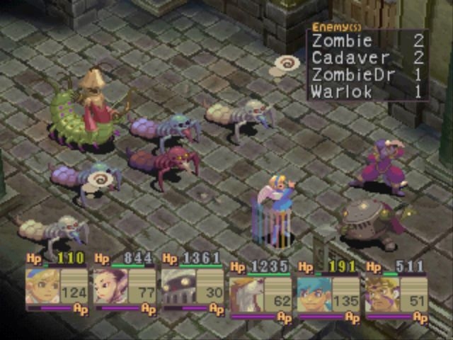
The Breath of Fire IV sprites may be having their colors adjusted to the surroundings, in terms of hue and brightness.
Something to think about.
Something to think about.

Another chance to post my favourite spriting tutorial!
http://www.pixeljoint.com/forum/forum_posts.asp?TID=11299
As for my own opinion on the most gorgeous games, I have a few.
I'll be a bit original and mention one I don't think most people think of. Ecco the Dolphin. Underwater levels are always good looking, and Ecco is ALL underwater. Nice.

Metal Slug is also another obvious choice, all of them.

Flink is a little know gem for Genesis (or Mega Drive as it is also known).

http://www.pixeljoint.com/forum/forum_posts.asp?TID=11299
As for my own opinion on the most gorgeous games, I have a few.
I'll be a bit original and mention one I don't think most people think of. Ecco the Dolphin. Underwater levels are always good looking, and Ecco is ALL underwater. Nice.
Metal Slug is also another obvious choice, all of them.
Flink is a little know gem for Genesis (or Mega Drive as it is also known).
author=Zachary_BraunThat's fancy!
The Breath of Fire IV sprites may be having their colors adjusted to the surroundings, in terms of hue and brightness.
Something to think about.
How do they do that?
I mean i know BOF 4 is partly 3d so light and shadow are casted to the pixels...
How do you do it in 2d tho? Via multiply layer? or similarly work it out in 3d environment...since this is 2015 and it's all 3d...
author=SnowOwl
Another chance to post my favourite spriting tutorial!
http://www.pixeljoint.com/forum/forum_posts.asp?TID=11299
As for my own opinion on the most gorgeous games, I have a few.
I'll be a bit original and mention one I don't think most people think of. Ecco the Dolphin. Underwater levels are always good looking, and Ecco is ALL underwater. Nice.
Metal Slug is also another obvious choice, all of them.
Flink is a little know gem for Genesis (or Mega Drive as it is also known).
Thanks for the tutorial! I need to learn about the pallete making to avoid using too much layer and train my colour instinct...
And yish! I love metal slug so very much!
I'm not into competitive games but coops are always fun, but that may hint at my weakness too as a rival haha.
I like your taste! Not sure about FLink but, Ecco is pretty,
and its other releases too, particularly the 3d ones...
Never played it tho, 3rdperson view wasn't exciting for me until just recently.
But Underwater travel is such a scary and mysterious thing, there's not enough of emmm
Agreed. I remember there being a couple of really neat PS1-2 diving games that I played demos of. Never bought them though.
Flink may not be the most original game there is, but for it's time it was a pretty good game. Add to that that the spritework is really, really good.
The cloudlevel is a work of art, for example.(starts at 51 minutes)
Flink may not be the most original game there is, but for it's time it was a pretty good game. Add to that that the spritework is really, really good.
The cloudlevel is a work of art, for example.(starts at 51 minutes)

I don't know that much about spriting myself (I tend to just do my own thing) but one of my picks for a very unique, and very stylish-looking and depressing game, would be Cart Life.

And then, on the other side of the spectrum, you've got Hyper Light Drifter and its extremely colourful pixelated style, with slick animations and vibrant weather effects. Couple that with its uplifting soundtrack by Baths (wow) and you've got an exceptional combo.
Crawl has a fantastic style too. The rooms aren't very varied but the animations are quirky and full of character. Stunning looking trailer, and magnificent narration voice too.
author=sinneliusauthor=Zachary_BraunThat's fancy!
The Breath of Fire IV sprites may be having their colors adjusted to the surroundings, in terms of hue and brightness.
Something to think about.
How do they do that?
I mean i know BOF 4 is partly 3d so light and shadow are casted to the pixels...
How do you do it in 2d tho? Via multiply layer? or similarly work it out in 3d environment...since this is 2015 and it's all 3d...
If that is what's going on, then at the very least, they could have a variable which is changed for every area, and the color value of the 2D sprite "texture" is set according to the variable. There wouldn't be any fancy environmental color assessment here, just looking up what a value should be from a database.


author=SnowOwl
Agreed. I remember there being a couple of really neat PS1-2 diving games that I played demos of. Never bought them though.
Flink may not be the most original game there is, but for it's time it was a pretty good game. Add to that that the spritework is really, really good.
The cloudlevel is a work of art, for example.(starts at 51 minutes)
The cloud level is indeed amazing! I couldn't love the entire game because it felt slightly flat, the music is...moody but didn't manage to feel quality.
The art alone is great and cohesive...shame they felt wasted on some of its mechanics... Thanks for showing me this!
author=CashmereCat
Dammit Cash, we have similar taste it seems! I like your taste.
I was eyeing for Cart Life...alot. It was moody and deadly realistic or so i heard.
The artstyle is nothing to exceptional, but it is well integrated with the game!
I still haven't played it tho... it could be too sad for me.
Have you?
As for the other two, Hyper Light Drifter made enough buzz last time!
The music gosh, sweeet Jesus!
I couldn't love it entirely because the genre can tire me quick, so i was distracted with this
slightly a mix of both, heavier on narratives...quite boring but magical.
Not sure if it has a lot of attention tho...it's quite indie for the sake of indie.
Still, those art, Dayum.
And if anything, what lacks in that game could be well in Crawl...
I was pretty excited with then mechanics...nothing special with the art, but amazing gameplay... I always has a thing for good coop vs super good AIs.
author=Zachary_Braunauthor=sinneliusIf that is what's going on, then at the very least, they could have a variable which is changed for every area, and the color value of the 2D sprite "texture" is set according to the variable. There wouldn't be any fancy environmental color assessment here, just looking up what a value should be from a database.author=Zachary_BraunThat's fancy!
The Breath of Fire IV sprites may be having their colors adjusted to the surroundings, in terms of hue and brightness.
Something to think about.
How do they do that?
I mean i know BOF 4 is partly 3d so light and shadow are casted to the pixels...
How do you do it in 2d tho? Via multiply layer? or similarly work it out in 3d environment...since this is 2015 and it's all 3d...
Ah, something more technical huh...
What do you mean by "a value from a database"
As in status? If a character is hurt, set them to blink red once or so?
author=ESBY
I'm a big fan of the artwork in the Final Fantasy Tactics games.
YUmmy! It doesn't look so special somehow in full size...
i guess the gameboy art is like the classic TV screen blur case... it helps you squint and imagine the details than not..

Look how blurry those values are...they can't just anti alias everything right?
It would be a chore....but, maybe it's a time worth spending in a studio?


author=CashmereCat
I don't know that much about spriting myself (I tend to just do my own thing) but one of my picks for a very unique, and very stylish-looking and depressing game, would be Cart Life.
I'm also a fan of the art style of Cart Life.

I've always liked the very simplistic and minimalistic kind of pixel art. I have mad amounts of respects for whoever did the pixel art in Dragon Ball Z Legendary Super Warriors. Over 20 playable characters, all unique and instantly recognisable to people familiar with the show, despite the super small screen size of the Gameboy Color and only three colours per sprite to work with. Plenty of screens taken right from the manga/anime and translated into minimalistic pixel art that stays true to the original style and still look so great.


Kinda confused by the title of this thread vs what's in it. Anyways, some games that I like the pixel art of and find unique for some reason:
(as opposed to the many, many games like Armored Warriors that look great, but have nothing else of note)
Metal Slug... but Seiromem already mentioned it.
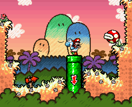
Yoshi's Island, in addition to every sprite looking amazing, even if it's just for a one-time minor enemy in a single level, is also lovingly animated, and very unique in it's coloring and shading style that imitates being colored with crayons. It also uses some tech from the Super FX chip to more fully realize the "crayon" aesthetic, such as applying some scattering to the thick outlines of bosses and other large things, sometimes reshaping the lines in real-time, like the slime boss that you have to mush around with egg shots to expose its heart. It's almost hard to believe that it's really a SNES game!


(Obviously the backgrounds aren't pixel art)
Kirby's Dreamland 3 has a similar, but much more "pastel" style. Having looked at rips of the game's sprites up close, though, I don't think a lot of it actually counts as "pixel art".

Darkstalkers is a series that I like more for it's animation. Any given individual sprite is no better or worse than anything else Capcom was putting out at the time, but the animations are really nuts. Characters change rather wildly for different poses, and many of their attacks involve temporarily transforming their limbs and such. The zaniness of it all was actually listed as a reason why they were hesitant to implement characters from the series in Marvel vs Capcom 3. Making animations like that in 3D is very time consuming, and also eats up more memory.
Ninja Baseball Batman, Mario & Luigi Superstat Saga, and Wario Land 4 all also have some really fun sprites and animations with unique styles. NBB uses American comic-book style shading with large swaths of black, though it's somewhat inconsistent with its application; Mario & Luigi uses a very flat coloring style with a heavy emphasis on its outlines (though the pseudo-anti-aliasing on the outside doesn't work well on dark backgrounds) to try and match its very 1960's-ish UPA cartoon inspiration; and Wario Land 4 rivals some cartoons like Ren & Stimpy with its hilariously grotesque bosses and such.

I'm sure there's more, but really I should just stop now.
(PS: Not actually a game, but still pretty awesome.)
e:
(as opposed to the many, many games like Armored Warriors that look great, but have nothing else of note)
Metal Slug... but Seiromem already mentioned it.
Yoshi's Island, in addition to every sprite looking amazing, even if it's just for a one-time minor enemy in a single level, is also lovingly animated, and very unique in it's coloring and shading style that imitates being colored with crayons. It also uses some tech from the Super FX chip to more fully realize the "crayon" aesthetic, such as applying some scattering to the thick outlines of bosses and other large things, sometimes reshaping the lines in real-time, like the slime boss that you have to mush around with egg shots to expose its heart. It's almost hard to believe that it's really a SNES game!
(Obviously the backgrounds aren't pixel art)
Kirby's Dreamland 3 has a similar, but much more "pastel" style. Having looked at rips of the game's sprites up close, though, I don't think a lot of it actually counts as "pixel art".
Darkstalkers is a series that I like more for it's animation. Any given individual sprite is no better or worse than anything else Capcom was putting out at the time, but the animations are really nuts. Characters change rather wildly for different poses, and many of their attacks involve temporarily transforming their limbs and such. The zaniness of it all was actually listed as a reason why they were hesitant to implement characters from the series in Marvel vs Capcom 3. Making animations like that in 3D is very time consuming, and also eats up more memory.
Ninja Baseball Batman, Mario & Luigi Superstat Saga, and Wario Land 4 all also have some really fun sprites and animations with unique styles. NBB uses American comic-book style shading with large swaths of black, though it's somewhat inconsistent with its application; Mario & Luigi uses a very flat coloring style with a heavy emphasis on its outlines (though the pseudo-anti-aliasing on the outside doesn't work well on dark backgrounds) to try and match its very 1960's-ish UPA cartoon inspiration; and Wario Land 4 rivals some cartoons like Ren & Stimpy with its hilariously grotesque bosses and such.


author=NessySpeaking of Saturn games that will make you sad that there's no English version...
Princess Crown
I'm sure there's more, but really I should just stop now.
(PS: Not actually a game, but still pretty awesome.)
e:
author=sinneliusPretty sure that's just the picture quality. That, and sprite games on 3D consoles like the PS2 or N64 tend to get blurred, especially if there's any "camera zoom" going on.
Look how blurry those values are...they can't just anti alias everything right?


I've always been a big fan of the art in the 2D zelda games. They make really good use of their resources with simple but clever shading, 16x16px sprites and two-frame animations. It's also really easy to read, which is good for action games (and why I copied it for Mirror Boy).
Also:

Woo, thanks for all the replies!
Yeah, i'm not so clear about the thread's purpose anyway.
Most of the tutorials i browsed now has flaws and its own limitation.
Most things being taught are general purpose, and when a problem becomes specialized say...for a game or a certain artistic mood/ object, the tutorial fails and all that's left is references and experiences.
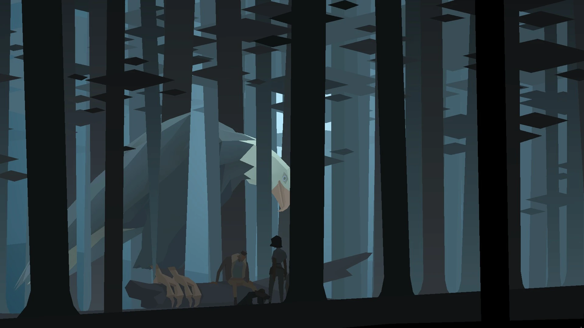
I am not very retrograde in my taste but, as i remember fondly, games like superbrother sworcery and kentucky route zero (Yes, again), which, i haven't played entirely,
has this sharp crispy art that is being used minimally and elegantly. And seeing them run on 24+fps, maybe they're not so pixel art in its application...
Classic zelda is indeed lovely, but perhaps it is the gameplay that partially elevate the craft. If i'm not wrong, Cartlife and recent 2d bits and pixels games are now 3d accelerated, which makes the look somewhat unique too.
And then, i also play things like this occassionally.
It's fast and quick, and the art, if not entirely crude and ugly, serves its mood.
Yes, the mood. Is it not the mood that drives an art?
No matter how HD something is, if the craft does not meet its purpose,
the quality and its use suffer, is it not?
What do you think?
And holy shit tho, that Yoshi Island is truly beautiful!
I think remember playing it on my gba emulator. :>
Yeah, i'm not so clear about the thread's purpose anyway.
Most of the tutorials i browsed now has flaws and its own limitation.
Most things being taught are general purpose, and when a problem becomes specialized say...for a game or a certain artistic mood/ object, the tutorial fails and all that's left is references and experiences.
I am not very retrograde in my taste but, as i remember fondly, games like superbrother sworcery and kentucky route zero (Yes, again), which, i haven't played entirely,
has this sharp crispy art that is being used minimally and elegantly. And seeing them run on 24+fps, maybe they're not so pixel art in its application...
Classic zelda is indeed lovely, but perhaps it is the gameplay that partially elevate the craft. If i'm not wrong, Cartlife and recent 2d bits and pixels games are now 3d accelerated, which makes the look somewhat unique too.
And then, i also play things like this occassionally.
It's fast and quick, and the art, if not entirely crude and ugly, serves its mood.
Yes, the mood. Is it not the mood that drives an art?
No matter how HD something is, if the craft does not meet its purpose,
the quality and its use suffer, is it not?
What do you think?
And holy shit tho, that Yoshi Island is truly beautiful!
I think remember playing it on my gba emulator. :>
Pages:
1

