


ANY ONE STILL USE THE RM2K CLASSIC RTP?
Posts
Pages:
1

Hey, sorry if this is the wrong forum, but it's the best place I could find for this.
I have a bit of a strange request. With the re-release of RM2k3 , my interest in RPG-making was sorta-kinda rekindled. Though, instead of the 2k3 RTP tile sets I prefer the old 2k ones. Yes, I'm sure I'm in the minority there, but does any one still use it? And if so does anyone have any maps made with the old RTP lying around?.
I'm making my game with the old RTP plus personal edits and was looking for screenshots and maps for some inspiration. I know it's a weird request, and most people probably prefer the 2k3 tilesets, but this is the only forum I know that has active 2k / 2k3 users.
Anyways, post your screenshots here or send em in a pm if you wanna keep them private.

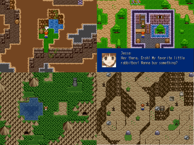
Sadly not that many people use the old 2k RTP. It's a shame, because it kicks the crap out of the 2k3 stuff. If you want to look at some good 2k maps for inspiration,
"Mystic Dawn" by Corfaisus is some of the higher quality 2k around here:
http://rpgmaker.net/games/6909/images/
"Mystic Dawn" by Corfaisus is some of the higher quality 2k around here:
http://rpgmaker.net/games/6909/images/

author=Pizza
Sadly not that many people use the old 2k RTP. It's a shame, because it kicks the crap out of the 2k3 stuff. If you want to look at some good 2k maps for inspiration,
"Mystic Dawn" by Corfaisus is some of the higher quality 2k around here:
http://rpgmaker.net/games/6909/images/
Yeah that was one of the games I managed to find. Definitely good stuff. What inspired me the most was Antiarctica. I really like how the RTP was used here.
author=Craze
I do love the 2k caves/cliffs. I don't use it personally, but I have in the past.
Thanks! That's what I'm talking about. I would have never thought to combine those wall auto-tiles like that. Very interesting. I don't suppose there's any more where that came from?
author=Sated
Find something made by Corfaisus. Lots of RTP mapping.
Will do!. Also, I've been lurking these parts for years ... I will never not be grossed out by that avatar...
A bit OTT, but what's the legality around using the 2k tile sets now that 2k3 is legal. The only thing not included in the new release are the tile sets I think even though they use all the character-sets and such

I think the 2k RTP is a lot better than the RTP the 2k3 provides. Better colors, better shapes, a whole ton more (free) edits. It really is a shame that the new 2k3 does not include a valid 2k-RTP license.

I think the 2k3 RTP is a lot better than the RTP 2k provides. 2k is so bright and cartoony, bloated shapes, and a less cohesive palette.
author=kentona
less cohesive palette.
I have to disagree on that.

As you can see, the 2k palette (on the left) uses far less colors. Both palettes are far from unified, but the 2k3 ones has a lot more *almost* similiar colors.
The rest is a matter of choice. The 2k3 RTP does contrast (the dirt and grass for example) a lot better and things like the fence are not weirdly cut off.
Eh, It's a matter of personal taste. The atmosphere I'm going for is bright and slightly cartoony. The art style I use is more western comic style than anime, so I use a lot of sharp contrast. I think that style would work better with the contrast found in the 2k palette. 2k3, I felt, always seemed a bit washed out by comparison. 2k3 RTP is to 2k RTP as RMXP RTP is to VX-Ace RTP in that regard.
It would be nice if they included an option for both in the new 2k3 release. 2k's RTP suits the original character-sets much better IMHO. That said, if someone were to tell me 2K3 is better I wouldn't really argue against it. I fully accept how silly 2k looks. I...just like it.
It would be nice if they included an option for both in the new 2k3 release. 2k's RTP suits the original character-sets much better IMHO. That said, if someone were to tell me 2K3 is better I wouldn't really argue against it. I fully accept how silly 2k looks. I...just like it.

Despite having more details, the 2k3 RTP has always felt very muddy to me. This is probably the result of having more texture, but not necessarily a higher value range. A good example is how the trees and the grass tile don't stand out much from one another. This meant that even though there was better detailing, it wasn't necessarily any more pleasant to look at than the 2k RTP. I always preferred it because it reads so much better.
Corfaisus

"It's frustrating because - as much as Corf is otherwise an irredeemable person - his 2k/3 mapping is on point." ~ psy_wombats
7874
author=Magi
Despite having more details, the 2k3 RTP has always felt very muddy to me. This is probably the result of having more texture, but not necessarily a higher value range. A good example is how the trees and the grass tile don't stand out much from one another. This meant that even though there was better detailing, it wasn't necessarily any more pleasant to look at than the 2k RTP. I always preferred it because it reads so much better.
If it's one thing I prefer 2k's RTP over 2k3's is that 2k3's trees look like someone vomited all over them, while in 2k they were lush.
I also love how my name is becoming synonymous with RTP instead of, you know, the RTP princess herself, Liberty. I should write a tutorial.
Corf, it was me back the day before kentona released HR. The title passes with time, it will forever flow away from its master....

author=goldenroyauthor=kentonaI have to disagree on that.
less cohesive palette.
As you can see, the 2k palette (on the left) uses far less colors. Both palettes are far from unified, but the 2k3 ones has a lot more *almost* similiar colors.
The rest is a matter of choice. The 2k3 RTP does contrast (the dirt and grass for example) a lot better and things like the fence are not weirdly cut off.
Exactly! The smoother colors, the muddiness, the lack of distractingly high contrast is what makes 2k3's RTP so much more pleasant to look at.

Pages:
1

