


[RMVX ACE] TELL ME WHAT YOU THINK OF THESE RETRO STYLE BATTLE BACKDROPS.
Posts
Pages:
1

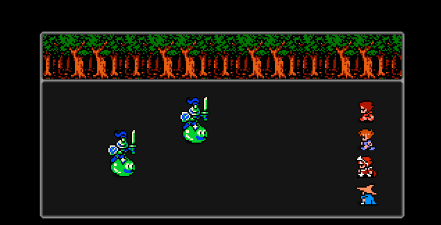
FINAL EDIT: Here's the finished design for the battle backgrounds. I brightened the battle field a little bit and added some color to the frame to give some flare based on what terrain you're fighting on.


I've always thought that Final Fantasy 1's method of "everything gets its own window" actually hurt it more than helped it.


It may have been how they did it way back then, but it's one of those things that hasn't aged well in the grand scheme of things and was quickly dropped for the next installment for a pretty good reason: multitudes of windows just gets aggravating to look at.
It may have been how they did it way back then, but it's one of those things that hasn't aged well in the grand scheme of things and was quickly dropped for the next installment for a pretty good reason: multitudes of windows just gets aggravating to look at.
author=SgtMettool
I've always thought that Final Fantasy 1's method of "everything gets its own window" actually hurt it more than helped it.
It may have been how they did it way back then, but it's one of those things that hasn't aged well in the grand scheme of things and was quickly dropped for the next installment for a pretty good reason: multitudes of windows just gets aggravating to look at.
Fair assessment. That's why I added the other stuff in the middle of the windows. I feel that just the layer on top is kinda boring, but I do see your point. I'll tinker with it again and come up with something else, thanks you.

author=Liberty
I actually think it looks pretty neato.
The current design you mean? I actually got inspired to do this when I stumbled across the Dragon Fantasy and Generica series on here. I've played those games before, but I kinda just forgot about them. I know, shame on me.

I think it looks nice right now, though there's no reason why you couldn't give a bit more variation in the trees or a few extra details. You've got plenty of room.
Can't wait to see it in action, it'll probably look very charming with a few heroes and monsters.
Can't wait to see it in action, it'll probably look very charming with a few heroes and monsters.


author=Cap_Hauthor=SnowOwlIt's fancier than one.
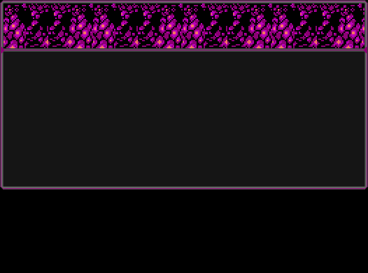
I don't get it. Why is there 2 rows of background per picture?
What he said. I wanted to represent old school, while still adding a little more to look at.
Could you show an example of a battle, the 2 rows don't really fit together so I'm intrigued as to how it will look.


I gotta be honest, I'm not a fan of the two row thing. I'd say stick to the top row.
Also, make sure the menu style is retro as well, to make it consistent (and you spelled Ability wrong)
Also, make sure the menu style is retro as well, to make it consistent (and you spelled Ability wrong)
The smooth, clean, hd quality of the mugshots clashes lots with the 8-bit elements.
author=Mirak
The smooth, clean, hd quality of the mugshots clashes lots with the 8-bit elements.
I agree on that one. Definitely would do something to change them into 8-bit as well. Or to something retro-ish.
Oh, the menu isnt for those graphics. I don't have a retro system skin yet. Can someone point me in the right direction? I've been trying to make one, but It isn't coming out right.
Ill see what I can do about the two rows.
EDIT: Oh damn, I'll be a monkeys uncle. I did spell that wrong.
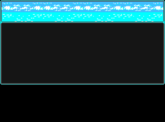
EDIT 2: Hows this, I upscaled the top frame by 2 and removed the bottom one.
Ill see what I can do about the two rows.
EDIT: Oh damn, I'll be a monkeys uncle. I did spell that wrong.
EDIT 2: Hows this, I upscaled the top frame by 2 and removed the bottom one.

Pages:
1

