


[RMVX ACE] MENU UI ALTERNATIVES?
Posts
Pages:
1

So those of you who have been following my game may be somewhat familiar with what my menu looks like.
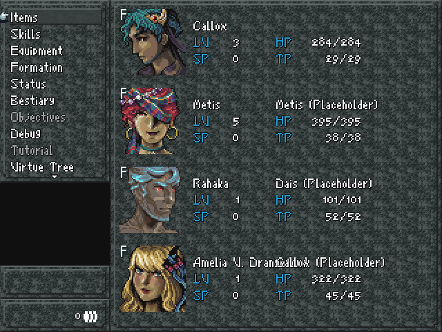
With the exception of the new facesets, the layout is...kind of messy (ignore the (Placeholder) and the text jumble at the bottom, that's just me putting the character's last name in the text box, so my mistake) and rough, especially when you factor that I'm using 640x480 resolution, which gives the menu extra space on the sides and such, which makes this UI look bloated.
Luckily, with the exception of the new facesets, all of it is open to replacement. What UI direction can I go with, whether it's changing up a script or making this one the best it can possibly be?
-I'm in the market for a new font. What looks good considering the game I want to make? I am not a fan of the 'smooth' look that a lot of RM games have, and thus am leaning towards an SNES pixel style.
-I'm also in the market for a new graphic. The gray gradient and style I have right now is really rough and definitely clashes with the facesets.
-How do I deal with the extra space, on the borders and within the menu? The blank box above the money textbox is supposed to signify the location you're in; I used a dummy map to make this screen, hence it's blankness.
-This carries over to the battle system UI to more or less the same degree.
Any suggestions? Even if you can answer one or any of these concerns that would be rad!

As it stands, all the information is clear and noticeable to me. So I personally like the simple approach you have now to improve on if you switch the background out.
Are you opposed to framing the facesets?
Are you opposed to framing the facesets?

I kinda think the character stat-information left of the portraits could be moved over a smidgen. I dunno, it just kinda feels cramped there!
I suppose the only other comment I have at the moment is that I like this background, and, I take it the money display is not supposed to look so squished.
I suppose the only other comment I have at the moment is that I like this background, and, I take it the money display is not supposed to look so squished.

The main problem, in my opinion, are the differences in pixel density. The background texture is using 1x1 pixels, the faceset is using 4x4 pixels, and the font is using 4x4 pixels as well... except for the border around the font, which is 1x1. It gives everything a sloppy appearance.
I may have explained that very badly; perhaps someone else can explain it better.
I may have explained that very badly; perhaps someone else can explain it better.
I like the way it looks now a lot. I agree that you should move the character information (and possibly also the portraits) over just a touch, but overall it looks very good.
My first thought when I saw it was that it looked like an old school RPG from the SNES era, and that I really want to play that game, so you must be doing something right.
My first thought when I saw it was that it looked like an old school RPG from the SNES era, and that I really want to play that game, so you must be doing something right.

I use the Luna Engine scripts for all of my UI stuff. You could probably nab it cheap during a Steam sale.
I think the font you're using is fine. Just ditch the windowskin for something a bit less "busy" and it will be perfectly readable.
I think the font you're using is fine. Just ditch the windowskin for something a bit less "busy" and it will be perfectly readable.

What about making the command windows a bit taller? I see there's a small arrow at the bottom, as to suggest even more command, but there's also a big black gap between the window and the small windows underneath.
author=Bricabrac
What about making the command windows a bit taller? I see there's a small arrow at the bottom, as to suggest even more command, but there's also a big black gap between the window and the small windows underneath.
This is a good question.
Unless that black space shows the map where you opened the menu. Cause I like that effect
Pages:
1

