


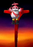
HAVE SOME ART!
Posts
Alright, well if you still can, go to school.
I'll keep my comments to myself and just say "You can become better" while hoping this happens.
At least you have some ground work to build on. Something a lot of people can't say.
I'll keep my comments to myself and just say "You can become better" while hoping this happens.
At least you have some ground work to build on. Something a lot of people can't say.

Alright, well if you still can, go to school.
I'll keep my comments to myself and just say "You can become better" while hoping this happens.
At least you have some ground work to build on. Something a lot of people can't say.
That's funny, dudesoft, because if memory serves, as I recall you have no talents at all to speak of.
Seriously, wow, I did not even draw this shit and this post pissed me off. I have no vested interest in this art but damn man, your tone is so annoying.
My vitriol in response to your vitriol aside, like...if you have CONSTRUCTIVE CRITICISM I would guess that the artist would really appreciate that as opposed to your infuriatingly snide comments and overall aura of condescending douchebaggery.
If you are such a godamn expert, by all means, explain what aprilschild is doing wrong.
author=aprilschild link=topic=2446.msg45436#msg45436 date=1227050724
OKAY.
Also, this is something I did in class today. Very sketchy, didn't take more than half an hour. I like it anyway. Tim and Raechel from Backstage II.

This is pretty cool. Backstage needs more fanart. I think that Rachel is younger and prettier than you have drawn her while Tim is much less badass looking and more of an ineffectual dweeby writer. He looks kind of like an anime-style mastermind here, which is cool, but it is not Tim. I know this was a quick sketch though. Backstage (the original) really needs more fanart, and I would love to see a more polished piece from you.
I treasure fan art like most treasure gold.
Oh yeah, I should have put this one in the last batch, because it's also pretty ancient. However, it's probably my best work to date... though upon further inspection I can see some issues (mostly with her hands). Book illustration.

This is flawless. I have no idea how anyone can have any problem with it. Then again, I don't know art so maybe someone who does will correct me. But I know what I like and you know I like this.
Hey hey hey hey. Cool it down a bit Max. No art is without flaws(in fact, I actively encourage said comments on my art, as I am nowhere near 'great' myself), and dudesoft's advice is very valid. School is very useful for artists-in-training, and aprilschild is still learning, too. Having said that, I have been prompted to critique each piece individually.
Meet the Ronbinsons fanart:
The anatomy looks very 'uncomfortable' here, and is the piece's main issue. Very stiff and lifeless for a cartoon character.
The arms are not stylistically thin, but are an awkward mix of realistic and cartoonish. He also doesn't appear to have an elbow, per se.
The 3/4 view perspective seems skewed. The underlying skeleton does not seem well defined, or at least accurately, making him look something like an action figure.
The main trunk of his torso is extremely long compared to his hips. The relationship from arm length to crotch is accurate, but the way this piece is going suggests that his feet would not be much below his knees, making me think of a monkey or ape(short legs, long arms).
On the plus side, I was immediately able to recognize the character, so you got the basics down pretty well despite any stylistic differences.
Sketch from Class:
Won't be very stingy with this one since most of my in-class sketching is rather unimpressive. =)
My main sticking point with this is the gal. The guy is pretty neat actually and would look better on his own.
The girl's arms suffer from a similar issue as the previous piece, though the hips are not visible so I do not see that relationship.
Her eyes, as someone mentioned, are off, and you recognized it so I will not prod on it.
The neck appears off. I get that she is being viewed from slightly above, but the neck actually flows very smoothly into the top of the torso and would not appear disconnected from it at any angle. Here, it sorta looks like it is.
Book Illustration:
As you mentioned, the hands have some issue, but mostly due to being a bit smudgy and indistinct.
The clavicle (shoulder-to-neck bone) is EXTREMELY pronounced almost to the point of anorexia or an extreme pose. Here, in her neutral pose, it would not be quite this pronounced
The arms are somewhat better than the above pieces, but they still seem incomplete, if that's the right word. Arms have a rigid and bony structure that needs to be displayed, or arms will not look right. (this applies to pieces that need to be more anatomically accurate, like this one - cartoons can get away with this somewhat)
While it is hard to see, the legs should PROBABLY be thicker from what I see.
The breasts are a rather cliche take on breasts in general. In reality, since the girl (appears) to not be wearing a bra especially, they would not be nearly so compressed together like they are.
As a side note, I really like the symbol and the shadow is pretty neat.
My basic and consistent issues with your work are as follows:
Your ribcage-to-hips proportions seem consistently off.
Your arms need more weight to them.
Your faces are pretty good structurally, but sometime your facial features appear to be just a tad low on the face - eyes should be around the middle.
Your poses can be a bit less stilted. Characters often appear 'boxed' in. A good example is the Robinsons fanart, the Backstage II fanart and the pic of Sadie.
I am not sure on this - it is hard to tell - but it appears on some pieces you haven't built in the basic skeleton. This is a big no no. This helps a ton and saves a lot of grief later in the process.
Mind, I am not at all trying to be menacing or demeaning here. Normally I do not get this detailed with critiques(and in fact, I can get more detailed, but I do not think that is necessary), especially on a website that does not specialize in artists, but it is necessary to understand what is wrong before it can be improved. You do not need to be her white knight, Max. Let her speak for herself. =)
Edit: As a side request, Dudesoft - post some work! Your torso and ribcage tutorials aren't bad at all.
Yes I was really hesitant to say anything because I don't know anything about art, I freely admit this. In fact it's why I usually stay out of this forum, as it's where I'm least active. To be totally clear I have no problem with anyone's anything being critiqued ever but dudesoft's post seemed to me to be astonishingly unhelpful. To me it was not at all criticism, but smug douchebaggery. (Especially since Aprilschild is, by deduction, 21 only age in the USA you can buy alcohol but not rent a car) and hence is either going to school for art already or not going to school for art but is almost certainly not at a point in life where the decision will be made where she goes to school and what for. So "LOL GO BACK TO SCHOOL" seems more like an offhanded dis than like an actual, legitimate piece of advice.) It was the tone that I had a complaint with. And still do.
I guess Karsuman's critiques are accurate in general, um, and definitely more helpful than dudsoft's. I don't agree with any of his specific critiques for the last piece (the clavicle appears overpronounced because it has a shadow falling on it, I've seen this happen to girls in real life, in a certain light, the arms are thin but I don't see a problem with that, and I think there is something kind of hilarious about calling breasts a cliche, like if that actually means anything, it went right over my head) but again, I don't know enough about art to have a leg to stand on.
Anyway, I am out of this topic, unless there is more art to comment upon.
Thanks Kars for your in-depth critique. This is the kind of stuff I like.
I do not like what Dudesoft says which is both vague and unhelpful and implies that I a) draw like someone with no training and b) draw so poorly that he can't even stand to give critique, which is both hurtful and unhelpful.
I am in school and not for art, but for TV writing. I am considering going to grad school for sequential art.
So yeah, thanks for the (real) criticism.
EDIT: Oh, my ribcage proportions may be off because mine are in life, lol. I have a very strange ribcage. I will try to use more sources - does anyone else find Victoria's Secret catalogues helpful?)
author=aprilschild link=topic=2446.msg45780#msg45780 date=1227123041
I will try to use more sources - does anyone else find Victoria's Secret catalogues helpful?)
I do :-* :-*
Anyway I think your art is good. Of course you aren't BEST EVAR but I am sure you are aware of that. I would definitely say you have the skills that will get you places.
I feel like your design is better than your illustration because your emblems look super cool. Your sketches and lineart aren't bad, but they aren't exceptional you know?
Also: Yeah Dudesoft you were a prick.
author=brandonabley link=topic=2446.msg45809#msg45809 date=1227126247
I feel like your design is better than your illustration because your emblems look super cool.
Haha, thank you! I'm slowly learning I'm better at design, which is weird, because I've been drawing people since I was like... a very small child... but I only started making emblems/design in the last year.
I don't have any natural talent for drawings/figures but I keep at it because for someone who doesn't have natural talent, practice is the only option. It always helps when people with talent give advice.
Thanks for the feedback, man : )
As a side note I have no natural talent whatsoever.
Man, if I could dig up my art from like three years ago I would show you. It's so embarrassing in comparison to now.
And yet I know I have a long way to go.
Anyway, I appreciate that you took my criticism well. =)
Man, if I could dig up my art from like three years ago I would show you. It's so embarrassing in comparison to now.
And yet I know I have a long way to go.
Anyway, I appreciate that you took my criticism well. =)
author=Karsuman link=topic=2446.msg45885#msg45885 date=1227137303
Anyway, I appreciate that you took my criticism well. =)
Something I am actively working on. Being in a writing conservatory helps with that because all our classes involve people critiquing one-another. I'm pretty thin-skinned naturally, so that's something else I need some practice on : )
Hey guys,
Thanks for all the helpful criticism. I tried working on it a little today, using the helpful figure/proportion chart Karsu posted.
I figured I'd show you guys my progression using my character, Gigi. She's the subject of a completely obscene amount of my art, as well as a very silly story that keeps growing ever longer.
Lots of art. No need to look at it all.
The first is this less good picture of Gigi and one of her romantic interests. It's a fun little picture, though not terribly well drawn:
Then there's my girl when I drew her for Valentine's day, crushing on some vampire badass.
Here is her and YET ANOTHER romantic interest. Gorsh she goes through 'em a lot, doesn't she?
With colors. In most of these she doesn't have the green hair, that was just for a special occasion. : D
This was from a couple of days ago, hand-drawn. I was happy with about 1/4th of it, that 1/4th being the guy (same guy from the third picture).
TODAY! Hopefully you guys will note at least some improvement. It was done on the 'puter.
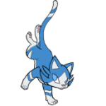
Oh, and the wolf pup in my avatar is also a drawing I did of Gigi. Don't ask.
Uh, yeah, thanks. Sorry for all the image dumps. :-[
Thanks for all the helpful criticism. I tried working on it a little today, using the helpful figure/proportion chart Karsu posted.
I figured I'd show you guys my progression using my character, Gigi. She's the subject of a completely obscene amount of my art, as well as a very silly story that keeps growing ever longer.
Lots of art. No need to look at it all.
The first is this less good picture of Gigi and one of her romantic interests. It's a fun little picture, though not terribly well drawn:

Then there's my girl when I drew her for Valentine's day, crushing on some vampire badass.

Here is her and YET ANOTHER romantic interest. Gorsh she goes through 'em a lot, doesn't she?

With colors. In most of these she doesn't have the green hair, that was just for a special occasion. : D

This was from a couple of days ago, hand-drawn. I was happy with about 1/4th of it, that 1/4th being the guy (same guy from the third picture).

TODAY! Hopefully you guys will note at least some improvement. It was done on the 'puter.

Oh, and the wolf pup in my avatar is also a drawing I did of Gigi. Don't ask.
Uh, yeah, thanks. Sorry for all the image dumps. :-[
Good old 8-heads rule on that last one.
This character's evolution is amusing to watch - in the second picture her face looks very much like a Disney Princess and in the last ones she looks like some sorta vampire. =)
This character's evolution is amusing to watch - in the second picture her face looks very much like a Disney Princess and in the last ones she looks like some sorta vampire. =)
author=Karsuman link=topic=2446.msg46192#msg46192 date=1227255234
Good old 8-heads rule on that last one.
This character's evolution is amusing to watch - in the second picture her face looks very much like a Disney Princess and in the last ones she looks like some sorta vampire. =)
Haha, she was always a vampire.
Maybe she just... wants to be a disney princess : )

I like your concepts and style a lot, I won´t say it is generally unusual, but it is different from what I am used to browse mostly. I like how sketchy certain pieces look and while I agree with most points Karsu made on your anatomy notions, you are still far better than myself at this.
Love the last Gigi pic and the machine gun lady best. Also, is it my inpression or the right eye for the machinegun girl is an artifical/cybernetic eye?:P
Love the last Gigi pic and the machine gun lady best. Also, is it my inpression or the right eye for the machinegun girl is an artifical/cybernetic eye?:P

woa cool stuff here...
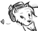
heh Anya is kinda sexy in a freakish way but anyway....
how long did the 3rd picture take you to line... (forevor)
good job though
heh Anya is kinda sexy in a freakish way but anyway....
how long did the 3rd picture take you to line... (forevor)
good job though
Wow, that's awkward. Legions still a... well, Legion and everyone mistook my vague comment as a cheekful of spit.
If you really want me to delve into detail I can. It's not like you're bad or anything, it's just obvious that you haven't perfected your style.
Legion, calling that image flawless is kind of silly. First of all, the perspective is slightly off, and the arms are not the proper length. One is even longer than the other one. Stay your tongue, Boy, and rethink before you start typing.
(Yes you may be angry at menow again. ;))
As for the art, yes I will give it detailed analysis with diagrams and help if you want. I just didn't want to delve into the matter so's not to sound too high and mighty or whatever.
If you really want me to delve into detail I can. It's not like you're bad or anything, it's just obvious that you haven't perfected your style.
Legion, calling that image flawless is kind of silly. First of all, the perspective is slightly off, and the arms are not the proper length. One is even longer than the other one. Stay your tongue, Boy, and rethink before you start typing.
(Yes you may be angry at me
As for the art, yes I will give it detailed analysis with diagrams and help if you want. I just didn't want to delve into the matter so's not to sound too high and mighty or whatever.
Stay your tongue, Boy, and rethink before you start typing.
lol. I like how your in-life put-downs read like bad RPG Maker game dialogue, with random capitalized words and everything. ;D
You are so not worth my time.
Please stop taunting each other. It's childish.
Thanks.
Edit: This especially applies to you, Max, as you are messing up your friend's thread with this nonsense.
Thanks.
Edit: This especially applies to you, Max, as you are messing up your friend's thread with this nonsense.
author=Max McGee link=topic=2446.msg46757#msg46757 date=1227559328
You are so not worth my time.
Dude I said that to myself years ago and have been laughing at your posts since. ;) Thanks for catching up.
author=Dudesoft link=topic=2446.msg46971#msg46971 date=1227624001author=Max McGee link=topic=2446.msg46757#msg46757 date=1227559328
You are so not worth my time.
Dude I said that to myself years ago and have been laughing at your posts since. ;) Thanks for catching up.
Yeah no more of this shit in my thread.
Seriously. Be less of an ass, or be yourself somewhere else.

