MONSTER DESIGNS (LARGE IMAGES)
Posts
Pages:
1
I like how the designs look on paper. However, on the sprite, I say use less saturated colors... the purple looks really intense, softening would make the body parts look more understandable.
A majority of your designs seem to look like Eevee from the pokemon series but your designs are pretty cool none the less.


It may be a necropost but I'll take it.
Yeah, I went for a design that made it easy to show a variety of expressions.
But think less Eevee and more
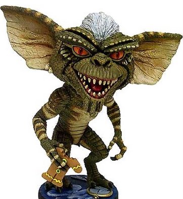
Yeah, I went for a design that made it easy to show a variety of expressions.
But think less Eevee and more

author=Phex link=topic=3338.msg76654#msg76654 date=1243249185yes but definitely more like Espeon. (uh oh my Pokémon trivia sense is coming back)
A majority of your designs seem to look like Eevee from the pokemon series but your designs are pretty cool none the less.
Pages:
1


