DOING IT! - WEEK FIVE
Posts

Ness what the
I am lost for words D:
That is awesome.
I am lost for words D:
That is awesome.

hello! I'm new and I'm just starting but I thought I'd post a map of the project in working on...

It's basically the slums/entry sections of a RELATIVELY big city (not capital-city size hehe).
So... what do you think? Any flaws? critique? It's not too bare/crowded right?
I think there will be more life when I add townspeople...
(These kinds of map posting are what this topic is intended for, right???)
Thanks! =)

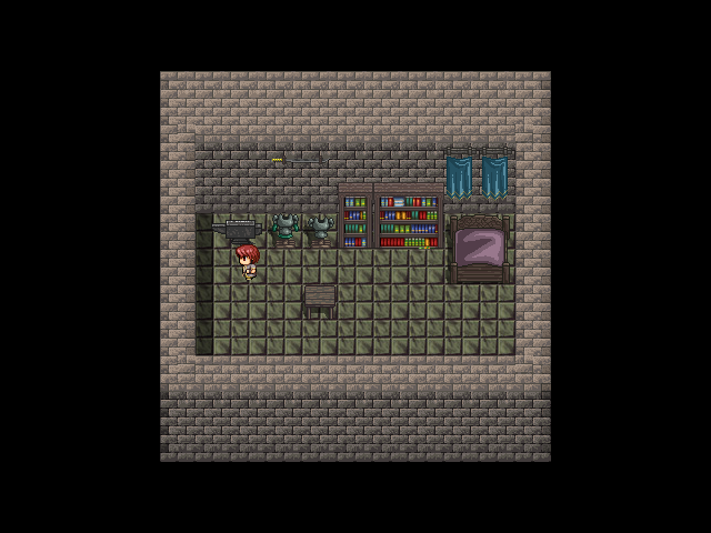
Here is a map that needs serious love.

This is what the map currently looks like. A bed. Bookcase. Nothing else. Well lets get to work.
Well its empty as hell. There is almost nothing here. I should add some windows. Maybe a weapon rack or two. Well lets see what I can do.
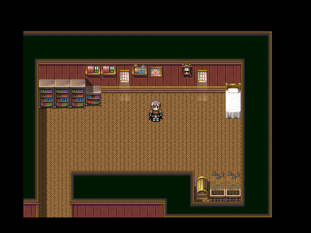
It looks better than before but still feels very empty. Like a void almost. Although it looks pretty cool so far. Its boring to walk around in. Time to fix this. I'm going add a table. A desk. Maybe a chair by the window. Who knows? Time to kill the Empty Monster.

MUCH BETTER. The Empty monster is dead. I'll post more maps later.
This is what the map currently looks like. A bed. Bookcase. Nothing else. Well lets get to work.
Well its empty as hell. There is almost nothing here. I should add some windows. Maybe a weapon rack or two. Well lets see what I can do.
It looks better than before but still feels very empty. Like a void almost. Although it looks pretty cool so far. Its boring to walk around in. Time to fix this. I'm going add a table. A desk. Maybe a chair by the window. Who knows? Time to kill the Empty Monster.
MUCH BETTER. The Empty monster is dead. I'll post more maps later.

Right click the image and select "copy image location", assuming you're using Firefox

The problem with a lot of newer creators (and do correct me if I'm wrong about your being a new RM user, I realise I'm generalising here and apologise to those who are great mappers the first time around) is that they tend to think things need to be larger than they do. I see a lot of maps that are double or more the size that they need to be. Not that I can say much - when I was a newbie (oh how long ago that was ;_;) I used to do the same thing. Sometimes I still do. *.*;
Back on topic, though.
Really, you could cut that room in half and still have enough room to swing a cat in. There's a golden rule in situations like this (and no, it's not the three tile rule).
It goes - "If you need to add more random/unnecessary things to fill it up then it's too big." Basically, if you need to add a table, more bookcases, a chest and spears to make it look full, there's too much space.
Ultimately, though, it's up to you.
tl;dr?
Too big - try make it smaller. ^.~
post=144267
The problem with a lot of newer creators (and do correct me if I'm wrong about your being a new RM user, I realise I'm generalising here and apologise to those who are great mappers the first time around) is that they tend to think things need to be larger than they do. I see a lot of maps that are double or more the size that they need to be. Not that I can say much - when I was a newbie (oh how long ago that was ;_;) I used to do the same thing. Sometimes I still do. *.*;
Back on topic, though.
Really, you could cut that room in half and still have enough room to swing a cat in. There's a golden rule in situations like this (and no, it's not the three tile rule).
It goes - "If you need to add more random/unnecessary things to fill it up then it's too big." Basically, if you need to add a table, more bookcases, a chest and spears to make it look full, there's too much space.
Ultimately, though, it's up to you.
tl;dr?
Too big - try make it smaller. ^.~
I'm not a new RM user. Mapping isn't my strength.
post=144276
I'm not a new RM user. Mapping isn't my strength.
I mentioned this earlier, but always consider the size of your character to the size of the room they're in.
For example, how big is your bedroom? How many steps can you take across the room? How much room does your bed take up in comparison to it's actual size? Figure out how many "tiles" the room is. You'll see the average-sized bedroom is probably only about 3x6 tiles or so. This same thing applies to most interior.
Here is the finished version
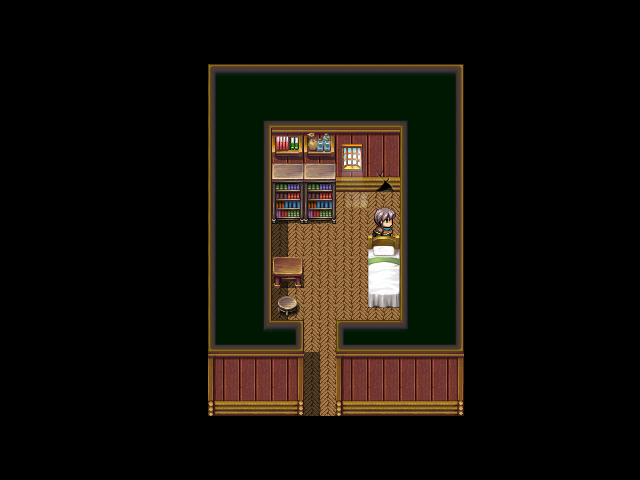
EXTREMELY COMPACT. 3 steps to walk across the map left to right.
This is the finished version of the Room I posted earlier. I'll post the rest of the house later.
EXTREMELY COMPACT. 3 steps to walk across the map left to right.
This is the finished version of the Room I posted earlier. I'll post the rest of the house later.
You should consider using the Kill Autoshadows script (http://rmrk.net/index.php?topic=24428.0), Orpheus. The way the autoshadows don't cover any objects but the floor is a little off-putting. Good job on tightening up the map though! However, I'd suggest using the two-tile-wide bookcase in place of the ones you have; a bit strange to have two exactly identical bookcases directly next to each other I'd think.
Also: Someone should tell me what they think of my map on page 2 :< I feel like it's too cluttered or something but I'm not sure.
Also: Someone should tell me what they think of my map on page 2 :< I feel like it's too cluttered or something but I'm not sure.
LockeZ

I'd really like to get rid of LockeZ. His play style is way too unpredictable. He's always like this too. If he ran a country, he'd just kill and imprison people at random until crime stopped.
5958
Cho, your map felt to me like the objects in it - on the left half, anyway - were simply added at random rather than with thought. They do not seem natural. I am not sure what causes the feeling. Some of the objects are only used once, like the mushroom, statue, and broken statue, making them seem like they don't fit in. The crystals are in several places but still manage to somehow seem unnatural. They should probably be up against walls, unless you want them to be central features of the area.
I'm also not really a fan of the random bits of wall in the middle of the passages, but I'm not sure how to fix that. VX RTP is so blocky.
I'm also not really a fan of the random bits of wall in the middle of the passages, but I'm not sure how to fix that. VX RTP is so blocky.

post=144711The statues are save/healing points (the robed person is to save, the dragon is to heal); the broken one is there as a "sure sucks to be you" thing, because I'm a jerk 8]
Cho, your map felt to me like the objects in it - on the left half, anyway - were simply added at random rather than with thought. They do not seem natural. I am not sure what causes the feeling. Some of the objects are only used once, like the mushroom, statue, and broken statue, making them seem like they don't fit in. The crystals are in several places but still manage to somehow seem unnatural. They should probably be up against walls, unless you want them to be central features of the area.
I'm also not really a fan of the random bits of wall in the middle of the passages, but I'm not sure how to fix that. VX RTP is so blocky.
I get what you mean though. I try not to overuse certain tiles and change it up a bit, but I guess that makes it seem like some of the stuff is just put at random when I only use it once. I did try to place everything where it might logically be found (where I thought it might be anyways, I'm no cave aficionado), and the walls in the middle were meant to make it feel more natural actually, since just like a straight hallway seems like an improbable way for a cave to form. But, I see where you're coming from.
Though, keep in mind it is just one floor of the dungeon; a lot of the tiles you only see once are used elsewhere in the prior floors. However, I'll try to go about making it look more natural.
Thanks for the input (again)!
edit: god i sound defensive
edit 2: Did a few quick edits and I think it looks a bit better, but I've gotta watch a film with my family so I'll work on it more later and post it up once I feel like it's up to snuff.
LockeZ
I'd really like to get rid of LockeZ. His play style is way too unpredictable. He's always like this too. If he ran a country, he'd just kill and imprison people at random until crime stopped.
5958
Cahrull, that tileset reminds me of Earthbound. Especially the cliffs. Though I suppose it must not be, since it's 32 bit.
If there is only one building though then it's not really a village. And if there are multiple then I hope they're not too far apart. You can only see one in this screenshot and it makes it seem like there's nothing else around it, but maybe the next buildings start one tile offscreen to the north and west.
If there is only one building though then it's not really a village. And if there are multiple then I hope they're not too far apart. You can only see one in this screenshot and it makes it seem like there's nothing else around it, but maybe the next buildings start one tile offscreen to the north and west.