


ZZZ ART ROOM
Posts
Pages:
1

Ok so I am becomming a Pixel artist (well trying to)
and i thought that if i want advice i should just create a 1 topic and post anything i want advice on.
Right?
Well thats what im going to do: I calling ZZZ Art Room
(ZZZ is short for ZimZamZoom)
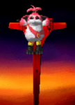
Ok so This picture is a picture of my other charcters Splash screen.

He his a Gambler and when he does his speacil move this will pop up and be transperent and he will do the skill. :D
anyways. What i want to know is how can i improve on that?
It was done in paint.NET but moved to paint so i could refine down to that size
Im abit of a noob when it comes to Paint.NET
Ok so what i know is wrong with it
His Right hand is smaller then the left hand.
His Finger nails
The background is white.
and there is no shading.

^^^ That image is off Vena..of course its a WIP but i cant think of what else to add. so
ideas anyone? also tips on improving are always working

^^^^ That Image is of Aces new splash screen. alot more better i belive but again. his fingers are stuck together witch makes it less appealing...I tryed to add a magic arua around the card didnt work as well as i wanted to. so yea. again Ideas tips?
So any tips to improve on??
P.S That other topic of mine can be deleted. :D
Thanks in advance
and i thought that if i want advice i should just create a 1 topic and post anything i want advice on.
Right?
Well thats what im going to do: I calling ZZZ Art Room
(ZZZ is short for ZimZamZoom)
Ok so This picture is a picture of my other charcters Splash screen.

He his a Gambler and when he does his speacil move this will pop up and be transperent and he will do the skill. :D
anyways. What i want to know is how can i improve on that?
It was done in paint.NET but moved to paint so i could refine down to that size
Im abit of a noob when it comes to Paint.NET
Ok so what i know is wrong with it
His Right hand is smaller then the left hand.
His Finger nails
The background is white.
and there is no shading.

^^^ That image is off Vena..of course its a WIP but i cant think of what else to add. so
ideas anyone? also tips on improving are always working

^^^^ That Image is of Aces new splash screen. alot more better i belive but again. his fingers are stuck together witch makes it less appealing...I tryed to add a magic arua around the card didnt work as well as i wanted to. so yea. again Ideas tips?
So any tips to improve on??
P.S That other topic of mine can be deleted. :D
Thanks in advance

His right hand is bigger than his left. Also, the angle that his left hand is reaching across the right forearm is almost physically impossible to do. Try making it come in from the other side.
Maybe showing that his fingers aren't entirely glued together could be a good idea? I would think it'd be more visually appealing.
Yes. That isnt one of the best things. hahaha
Ok so i have added two more things.
Please enjoy!
PS
Ok.
If someone could tell me how to add notes so i can clean up this post thanks :D
Ok so i have added two more things.
Please enjoy!
PS
Ok.
If someone could tell me how to add notes so i can clean up this post thanks :D

The last one definitely looks like he is flipping the viewer off. When throwing cards, you typically use your ring and pinkie finger, not index and middle.
Ring and pinkie? ive never seen anyone use ring and pinkie before.
Ive seein Index and middle but not ring and pinkie. to me. that would look strange
haha. and yes it dose but i couldnt get the thumb to sit right at all. apart from that on place
Ive seein Index and middle but not ring and pinkie. to me. that would look strange
haha. and yes it dose but i couldnt get the thumb to sit right at all. apart from that on place
Honestly not much can be said of your art at this point besides practice your anatomy (I can suggest books/videos). Also, use references. Even the Great Masters did that.
Oh..thats depressing hahhaha
Oh well..Must take it as a compliment haha
Yes. I surely will..and but anotmy you mean body parts right?
What is wrong with the body parts ive drawn?
Oh well..Must take it as a compliment haha
Yes. I surely will..and but anotmy you mean body parts right?
What is wrong with the body parts ive drawn?
I'm impressed!!! Really informative phorum post on rpgmaker.net my friend. I just wanted to comment & say keep up the quality work.

First off, you seem to have a specific style. Studying anatomy may not benefit you strictly speaking.
I highly suggest anyone going to be a cartoonist to study anatomy and take life drawing classes; as it will give you perspective and ideas.
Majority of good cartooning is exaggeration. It's easier to exaggerate features when you know where they should go or look.
Second, I suggest seeking pixel tutorials and continue to post here (though, don't just update your first post as it may be confusing to newcomers of this thread.
Look at ways to better your pixels. Right now, you're posting sketches. When you're dealing with pixel art, black lines are for Dudesoft-style amateurs. You can do better than that.
Third, keep at it! I want to see some improvements along the way.

Pages:
1

