


COLORS OVER THE RIVER II BY LITHYELD - COLORED
Posts
Pages:
1
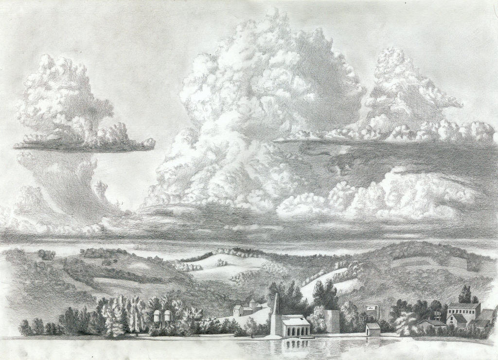
OK, so I ran across this image on Deviantart.com and fell in love with it immediately (and yes the artist knows), so I grabbed it as my very first full fledged coloring test.
Please let me know what you really think about it.
Original by artist lithyeld:
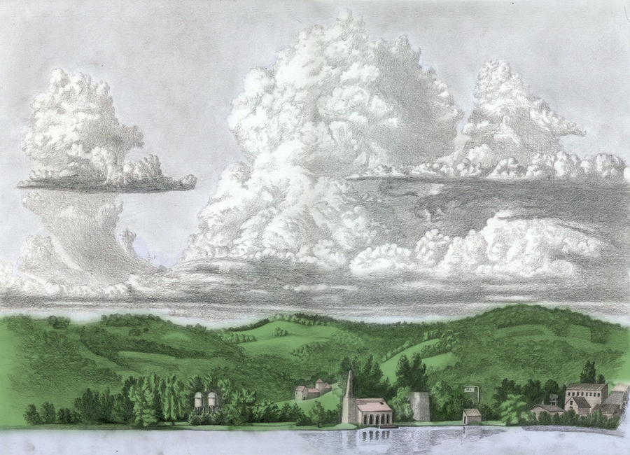
My colored rendition of the original image:
Please let me know what you really think about it.
Original by artist lithyeld:
My colored rendition of the original image:

I think there should be more of a gradient in the sky regarding the blues, and making them a bit darker, along with some more variation in the greens. Besides that, very very nice work!
By gradients you mean like the pressure markings from the pencil from the original artist?
As for the greens, yeah, I was struggling with that myself; every time I tried to change the color I had it mess up the original color I Was using so I figured I would leave it this way for now and then see what I could figure out with it later or get advice on from other people with it.
Thank you, by the way! ^^ <3
By gradient I mean that the sky goes from rather light near the bottom and graduates to dark. If you look at the horizon on a clear day then look directly above you, the blues are different.
author=SorceressKyrsty
By gradient I mean that the sky goes from rather light near the bottom and graduates to dark. If you look at the horizon on a clear day then look directly above you, the blues are different.
Oh! Ok, I understand... Thanks! I'll play around with that then. :)

Just a small tip, find a photo similar to this drawing and choose your colors from there, so you don't end up painting everything with the same tone.
author=alterego
Just a small tip, find a photo similar to this drawing and choose your colors from there, so you don't end up painting everything with the same tone.
Well, that way you wont learn anything. I would say experiment, try different colours, go wild and find a photo to compare to.

I have re-started on this image... I figured what I did wrong the first time was I just threw colors on there and failed to realize that shading was a necessity. So, I've started out with the darkening of some areas like the sky and correcting the brightness on the shaded parts of the clouds and then moving to the shadows on the ground and buildings, etc.
Would you say this is the right path to start from? Once finished with this, I intend to lighten area's that look like they need the lighter coloring and shades, etc. Then at that point I can start with the coloring and so forth, right?
Would you say this is the right path to start from? Once finished with this, I intend to lighten area's that look like they need the lighter coloring and shades, etc. Then at that point I can start with the coloring and so forth, right?
Pages:
1

