Login
Login
Register
Recover Password
Makerscore is a good measure of your worth as a human being
GAMES
Full Games List
Featured Games
New Games
Reviews
Media
Images
Blogs
Game Updates
DEVELOPMENT
Development Spotlights
Images Feedback Summary
Game Design Highlights
Tutorials
Articles
Scripts
Utilities / Plugins
Resources
Engines
Engine Bulletins
What is Makerscore?
EVENTS
Past Events
Achievements
Misaos
COMMUNITY
Forums
Post History
Chat
New to RMN?
STORE
Full Store List
RMN Music Pack (free)
Important
Summer Movie Wager
Shadows of Adam
Download Now
283 downloads
3 reviews
Add Review
Subscribe
Nominate
Submit Media
RSS
Summary
Blog
Images
Reviews
Media
Downloads
Play Lists
Erave
Added: 04/26/2015 02:22 PM
Last updated: 04/30/2024 12:07 PM
2092 views
Posts
Pages:
1
NTC3
5625
NTC3
View games
View playlists
Close
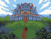
04/26/2015 02:52 PM
Well, this and the other image you have uploaded certainly looks very 16-bit in a good way. I like it a lot, but what's up with the "pure" black squares in the ravine? They look a bit out of place.
Erave
1444
Erave
View games
View playlists
Close
04/26/2015 03:01 PM
Good catch NTC3, didn't even notice that. That's an easy fix though.
NTC3
5625
NTC3
View games
View playlists
Close
04/26/2015 03:45 PM
Sure, glad to help.
WIP
I'm not comfortable with any idea that can't be expressed in the form of men's jewelry
11363
WIP
View games
View playlists
Close
04/27/2015 02:08 AM
Looks great! Love the amount of curviness to everything.
Pages:
1

 Add Review
 Subscribe
 Nominate
 Submit Media
 RSS
RSS