


CREATION'S PROFILE

I translate games as I don't have enough time to make them.
Search
Filter
 The Screenshot Topic Returns
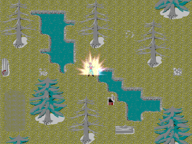
@obsorber: Don't take it the wrong way but Kyrsty is right, it's most unattractive map I've seen in years. Honestly man, there's nothing to argue here it's not even a question of taste, it's just a mess.
And yes, the character sprites have been created by me in a certain size. Then I have re-sized them for the game. I can't sprite so I create large sized templates from my own way of drawing and reside them.
Find another way then because it doesn't work.
Its based on classic style to fit with my skill level at graphic design which I already stated wasn't that good so you've pretty much pointed out the obvious. The graphics are the RTP that has been de-colourized to fit my game.
No, no, no. Enough of that, you're just coming at the defence of your shortcomings. If you're not good at it and you know it, practice and become better. I mean set higher standards for yourself. Polish your things a bit before showing them off because it's not even a case of providing criticism here, there's nothing to comment upon, everything has be ditched and start anew.
I was never aiming to make a colorful game but one that emphasized classic styles from the old consoles with my own original works within it. I enjoyed them and am not obsessed with graphics so much but game-play elements, story and presentation. Now days everyone thinks graphics are what makes a game good and forget the other important prospects which is why so many games which are great go unnoticed.
Again, that reasoning will get you nowhere, it encourages mediocrity and laziness. This isn't good like nes graphics were good in their simplicity. This is just not well done, there's no more explanation to be made.
You need loads and loads of practice. I'd spend my time practicing my pixels instead of making up excuses for yourself.
I mean the mapping isn't good, the DBZ light effect on the character is actually too high, the colors clash so bad...
Good luck for your future maps, sorry I know what I wrote is harsh but it wouldn't be in your best interest to encourage you down this path and it's kind of my pet peeve when people mess something and their defence mechanism kick in and they're rather not take responsability for it..
Here's an example of a pretty screenshot, by Harusame:
Another one by the same author:
Here's an example of simple pixel art which looks good, by Maelstrom:

 RMN v4.3 approaches! Command?
I am not going down the path of Ignore Game in this minor update.
That settles it then and that's certainly your right to do so. Something to keep in mind for future update.
Do you mean "not appear" as in a filter per individual, that filters out what they don't like?
Yes, that's what I had in mind. Everyone would then have a frontpage which showcases games that interest them in screenshots, blogs and other sections. I think it might also encourage people not to blogspam. Individuals would who would constantly submit mediocre content would then end up being ignored by most. Blogs which don't interest us wouldn't bump other blogs off the front page depending on how your filters are set up.
Creation's point about having a system in place to ignore a game by automation is kinda iffy. Sure, there's going to be games that I don't care about, and/or am frustrated by how much attention they get. Yet, having them just not appear seems... I dunno. I think "wrong" might be what I was looking for, but since I'd be ignoring them anyway, would I really be missing out on anything? I have no idea where this thought is going anymore.
Not sure I get your point either to be honest. If you're going to ignore a game anyway, why have other projects which you find more interesting on the front page? You'd have nothing to lose really.
RMN v4.3 approaches! Command?
A Who's Currently Active on RMN list
I like that, it sound neat.
I know I've discussed this already by PM but it'd be great to have more control as to what shows up on the front page. Having the option of ignoring certain projects would be nice so that blogs, images, releases from games which do not interest us do not appear.
Just to give an example, ''Sour into Sweet'' is something I have 0 interest for but it often takes up space on the front page because it's buzzing as a few members have an msn style conversation. It would also prevent the ''Jomar Center'' incident when irresponsible blog spamming reared its ugly face again.
Just my two cents.
Creation Custom Crafts: Craving Criticism
Thanks to both of you guys. It's good to see you again, ゆひかる, I was wondering where you were. Any chance you'll ever post some of your pixel art?
Actually, the heart is outdated, I did another one because other people told me it sucked more than the skull (and let's face it, it did). I just wasn't satisfied with the shading just yet which is why I didn't post it. Might as well though, it's alright I think.

Notice that the skull is slightly different (it was refused at Pixel Joint so I'm trying to fix it!)
As for the Kanji, I won't lie, it was a bitch to do and make it fit in the heart while keeping it readable. The new version of the heart is bigger so I could mess around to see if I could vary the brush stroke. I agree that it's kind of meh at the moment.
I had this version too, but I thought it wasn't very original:

Fair enough, you might say a heart and a skull is pretty cliché but I don't really have any ideas for a cool original lifebar.
But... but? Yeah, you're right about the heart which is my I inflated it a bit.
Well, if it's making your eyes bleed it's not a good thing. You're talking about the banana? I was told it lacked contrast before so I increased but I might have been a bit too heavy handed with the contrast. I make up might color ramp as I go to be honest. I'd rather not take someone else's palette, feels like I'd be missing out on a good opportunity to learn how to pick my colors.
Thanks for pointing out that my color could be improved upon, I appreciate it.
Actually, the heart is outdated, I did another one because other people told me it sucked more than the skull (and let's face it, it did). I just wasn't satisfied with the shading just yet which is why I didn't post it. Might as well though, it's alright I think.
Notice that the skull is slightly different (it was refused at Pixel Joint so I'm trying to fix it!)
As for the Kanji, I won't lie, it was a bitch to do and make it fit in the heart while keeping it readable. The new version of the heart is bigger so I could mess around to see if I could vary the brush stroke. I agree that it's kind of meh at the moment.
I had this version too, but I thought it wasn't very original:
Fair enough, you might say a heart and a skull is pretty cliché but I don't really have any ideas for a cool original lifebar.
I like the status bar, but the colors are a bit muted but I like that. The skull could still use a bit more of contrast, though. ...And maybe be made a bit smaller? Since it 'out-weights' the heart, visually speaking...
But... but? Yeah, you're right about the heart which is my I inflated it a bit.
I like the second bunch of sprites too. You've improved lots since I last peeked at this thread. =) The shapes are ok, but the colors are a lot more vibrant than in previous sprites. (Specially that yellow that is making my eyes bleed!) ...You're not working with a palette, are you? I strongly suggest you develop a palette or grab one somewhere (With permission, of course. Pixel-artists get iffy about their palettes.) So the colors of your sprites are consistent and harmonious throughout the game.
Well, if it's making your eyes bleed it's not a good thing. You're talking about the banana? I was told it lacked contrast before so I increased but I might have been a bit too heavy handed with the contrast. I make up might color ramp as I go to be honest. I'd rather not take someone else's palette, feels like I'd be missing out on a good opportunity to learn how to pick my colors.
Thanks for pointing out that my color could be improved upon, I appreciate it.
Creation Custom Crafts: Craving Criticism
Thanks! I've redone the heart!
A few new things, for the love of the pixel:


I think the apple looks the best. Don't be a stranger, let me know how to improve :). This place is lacking criticism lately ;).
A few new things, for the love of the pixel:
I think the apple looks the best. Don't be a stranger, let me know how to improve :). This place is lacking criticism lately ;).
The Screenshot Topic Returns
What are you some kind of bot? I've noticed whenever I seem to post messages for my game's support to forums in the RPG Maker Community I seem to always either get ridiculed in some way or have some sort of rude insolent fool make a mocking comment about my works. Why don't you try making a game with better quality than I present before acting like a pretentious fool!
You couldn't have picked a worst target. Have you seen what he's done? It's about the coolest stuff I've seen around for ages.
For your screen, I'd sprite a new main character because the big cute eyes clash very badly with the horror scheme you're trying to put in place there. Just a suggestion :).
The Screenshot Topic Returns
@Chana: Ok, thanks.
Wow, a reply from a Pixel Master!!!!
Ok for the shadows, Khos. Would you mind telling me why making the grass a different color than the grass? Wouldn't that unnecessarily expand my palette?
Wow, a reply from a Pixel Master!!!!
Ok for the shadows, Khos. Would you mind telling me why making the grass a different color than the grass? Wouldn't that unnecessarily expand my palette?
The Screenshot Topic Returns
Thanks for all the kind comments guys. I've tried to fix a few things you've mentioned, is this any better, how do you feel about the bush?

The Screenshot Topic Returns
(it's not Darken's, it's mine! xD)
Yeah, I'm getting a lot of flak for the flowers. Good point on the treeline as well. I'll see what I can do.
Yeah, I'm getting a lot of flak for the flowers. Good point on the treeline as well. I'll see what I can do.


