


LEGEND101'S PROFILE

Search
Filter
 screen8.png
Event_1.png
screen19.png
author=Clareain_Christopher
I really like what you did with the carpet.
Thank you I've been trying to tweak this all day, to make it look nice and
Have a luxurious feel.
 A Chained Destiny
author=Xmk11
It looks quite interesting and from what I've played so far is great!
Thank you. I'm glad you liked it.
screen18.png
author=urano23
It's cool but, are you going to change Celestia's faceset to adapt to Danny's style?
If I could find a front view faceset it would be possible.
author=Adon237
mercenary is spelled incorrectly
The spelling error has been corrected.
screen18.png
author=Clareain_Christopher
Pretty nice. Is there a darker shade of green for that text?
Yes, I am still experimenting with the text color.
Aragon.png
screen4.png
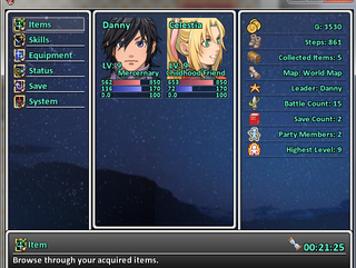
author=LockeZ
Consider putting the map either first or last, and getting rid of the icon and the word "Map:" next to it. That way it'll fit better. Right now it's the only text on the screen that's getting scrunched, which looks awkward to me.
Unless "Camping" is code for "Quit Program" it shouldn't be last underneath System and Title. It should be up with the other gameplay choices in the top half of the list. (If it is code for Quit Program you should probably just write Quit Program because that's confusing.)
Listing the leaders and party members on the right is pointless and redundant since the party members are right there in the middle of the screen and the first one is (presumably) always the leader. Filling the screen with useless/redundant data makes it harder for new players to pick up the game. So I would drop those two things, personally, unless there's some reason they're important.
I think the faces look fine next to each-other; did you change them already?
The menu has been changed, please check out the pic I have uploaded of it.

