


REQUESTING POINTERS FOR PIXEL WORK [UPDATED 13/03]
Posts
Pages:
1
Can say that "YES" I am a bot in the topic maker questiiion??
Anyway, here's my latest work and I am stumped for a while now

(original size to make it easier to edit)
Basically I am asking your help to well... point out the flaws in the color department (or anything else if you think it's important).
For some reason I just can't come up with a good enough color for this piece. Normally I'd use blue hue as shadow, but in this case, the color is suppose to be reddish-violet (think, fire) so I can't really 'cheat' with blue.
Honestly it looks damp, and well... can't say I am satisfied with how it turns out. So what do you think? How do I fix it? Changing it to pinkish instead? Increase the brightness? Use rainbow color? Delete it? Call it a day?
In all seriousness though, I'd really appreciate any pointers, please feel free to edit it to make your point. Oh and since it's WIP, and origiounal!Tm resource, please do not keep it more than 24 hour in your computer.
Frame it instead.
Note:
The progression is LEFT ---> RIGHT
I start with white color, then change it part by part.
Anyway, here's my latest work and I am stumped for a while now
(original size to make it easier to edit)
Basically I am asking your help to well... point out the flaws in the color department (or anything else if you think it's important).
For some reason I just can't come up with a good enough color for this piece. Normally I'd use blue hue as shadow, but in this case, the color is suppose to be reddish-violet (think, fire) so I can't really 'cheat' with blue.
Honestly it looks damp, and well... can't say I am satisfied with how it turns out. So what do you think? How do I fix it? Changing it to pinkish instead? Increase the brightness? Use rainbow color? Delete it? Call it a day?
In all seriousness though, I'd really appreciate any pointers, please feel free to edit it to make your point. Oh and since it's WIP, and origiounal!Tm resource, please do not keep it more than 24 hour in your computer.
Frame it instead.
Note:
The progression is LEFT ---> RIGHT
I start with white color, then change it part by part.

You may not agree with me, but I think it looks a little better with the outlines pulled more toward violet/magenta, as that is the color you've pulled the darker parts to.
Do you like how it looks if you desaturate it a little? When I did it, it ended up looking a little faded, but it really depends on how everything else in your game is going to look.
Do you like how it looks if you desaturate it a little? When I did it, it ended up looking a little faded, but it really depends on how everything else in your game is going to look.
Sorry for the late reply, was busy with some other stuff. I'll elaborate on the changes tomorrow, in the meantime you can compare your original sprite with my edit.

@s_w: I don't think anything is wrong with it, I think your shading and colouring could use some more work thats all.
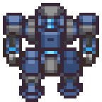
@DE: That is one fine mech...
@DE: That is one fine mech...
Sorry for being unresponsive, it has been a pretty busy week so far. Tying up loose ends and all that.
@Wonderpup
I am still trying to find the look, yes, but I don't want to desaturate too much.
@SupremeWarrior
Yeah, that's why I specifically asked for help in colouring. Shape wise, it's passable.
@DE
Awesome work. I think the contrast it a bit too much here, but that's the issue with my palette to be honest (I ended up changing the palette from yellow - Scarlet(?) Instead of mono violet all around).
Your shading really makes it stand out a lot more (looks more mecha-ish). I am Definitely gonna check it out in depth later when I got back!

SW I noticed you tend to pillow shade? or is over aliasing a better term hmm
I like DE's contrast since it shows more of the form easier specially on that size, but yeah.
I like DE's contrast since it shows more of the form easier specially on that size, but yeah.
author=Archeia_Nessiah
SW I noticed you tend to pillow shade? or is over aliasing a better term hmm
I like DE's contrast since it shows more of the form easier specially on that size, but yeah.
I believe "over-aliasing" is the correct term (and yes, I noticed it, a bad habit really). Somehow I always ended up wanting to keep the sprite as "smooth" as possible; so I use AA between shades.
I suppose it boils down to that I am afraid/unable to *NOT* using AA to make it smooth - while the problem is that this method is usually better for LARGE sprites (lots of area), but not so much for smaller ones (see the shoulder).
Also, my shading is terrible (Which way did the light comes frooooom)
Haven't been able to study DE's work today, so here's what I did to the color two days ago :


Pages:
1

