


SPRITING
Posts
Pages:
1
I have been practicing spriting, and this is how far I have gone.

Feel free to share your thoughts and tips.
Feel free to share your thoughts and tips.
A good start, but the head looks a bit wide. I'd say make the head less wide or bring the eyes closer together.
Than you for replying UPRC

A small update with the head fixed(hopefully). Cam't seem to get that 'wow that's good' feeling from the sprintes. I mean, everytihng is so simple and basic.
A small update with the head fixed(hopefully). Cam't seem to get that 'wow that's good' feeling from the sprintes. I mean, everytihng is so simple and basic.

It depends entirely on style and palette limitations. For me, I'd say that's a pretty nice sprite as it is already. My only major issue is that your two greens are a bit close together, and wider contrast would make them stand out a little more. Maybe some more contrast on the hair would be nice too. Don't be afraid to use more varying colours, or even to take the lighter colours into a yellower territory.
Yo! Try this on for need more contrast. 
Any ways, thanks a bunch Caz. You were right, I do get frightened when I zoom into sprite rips from professional games because of all the colours. I don't thing I have the contrast thing down yet, let alone spriting.
Anyone reading this post please let me know honestly, how far am I from spriting like a pro?
Spriting takes its time to learn (I'm very poorly trying to teach someone at the moment, in fact). Just try to experiment with colours, and if you make a mistake it's easy enough to fix without worrying about too much. Old school video games make very, very good use of only a few colours so they use a hell of a lot of contrast to get their point across.
The sprite is looking much better, but you should decide on a light source. There's a thing called "pillow shading" which is where you shade things as if the light source was between you and the sprite. This normally ends up looking quite bad and makes things look shapeless. Here is an example of a sphere:

See how the one on the left looks as though the light is between you and the image. It doesn't look spherical at all, and looks like a very flat circle. The one of the right has a definite light source (the upper right) and looks much more spherical and realistic.
Here it is put into practice:
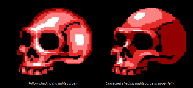
That skull on the left has good shape and is anatomically very correct. But it just doesn't cut it, because of the weird light source. It makes it look flat against the black background. The one on the right is fantastic, because it has form, contrast and an appropriate light source.
Don't be afraid to use references either. If I really struggle with how something should look, I get a picture from Google and shrink it down to the size of a sprite. I keep that next to me while I work then, so I'm not fully copying it but I'm getting a good idea of what shape and colour/shading the sprite should take on.
The sprite is looking much better, but you should decide on a light source. There's a thing called "pillow shading" which is where you shade things as if the light source was between you and the sprite. This normally ends up looking quite bad and makes things look shapeless. Here is an example of a sphere:
See how the one on the left looks as though the light is between you and the image. It doesn't look spherical at all, and looks like a very flat circle. The one of the right has a definite light source (the upper right) and looks much more spherical and realistic.
Here it is put into practice:
That skull on the left has good shape and is anatomically very correct. But it just doesn't cut it, because of the weird light source. It makes it look flat against the black background. The one on the right is fantastic, because it has form, contrast and an appropriate light source.
Don't be afraid to use references either. If I really struggle with how something should look, I get a picture from Google and shrink it down to the size of a sprite. I keep that next to me while I work then, so I'm not fully copying it but I'm getting a good idea of what shape and colour/shading the sprite should take on.
Tadaa!!

Caz, you and bobofgoo have been added to my friend list.
It is not a feature of rmn, but it is feature of my heart.
Caz, you and bobofgoo have been added to my friend list.
It is not a feature of rmn, but it is feature of my heart.

Whichever you choose to do will only further your improvements, so do whatever you feel most comfortable with. Something I find very helpful is sharing with other people to see things your own eyes can't, so do keep us up to date on what you create by posting here. :P

I've only recently started spriting, but I found that the best practice I had, was to make a whole sprite to the best of my ability, all the poses. Then I would go back and adjust things as I needed too.
I was surprised when I could suddenly see things to change that normally I would have had to look at a reference for. So I would recommend just practicing, and looking at references until you are comfortable.
I doubt there will ever be a day when someone gets a sprite 'just right' on the first go, but who knows. Also I found that looking at shading tutorials and stuff, on youtube among other places was a great help, if you'd like I can link a few I used.
^ lol, i have a feeling i swear i know who this is :)) :p
I agree though, i think references will prolly be ur best friend.
Another thing that might help is to keep thinking that 'less is more' when u r making highlights. U will usually be better off starting in a grayish-colour and shading-- if u do highlight, remember that rough surfaces will diffuse (weaken + spread) the light, while items like metal or hair will sharply reflect the light ( brighten + less spread).
Last tip: light actually follows a mathematical ratio of diffusion; it might help to consider the difference between ur base colour and darkest shade-- that difference should be roughly equivalent to the difference between ur base colour and lightest shade. :p
Thanx everyone. I will update the sprite soon (or later, or maybe... a lot later).
Knight r you taking about me. I seriously doubt it. My friends outside of this site are not associated with indie games in anyway(they don't make em', and they barely play em')
Knight r you taking about me. I seriously doubt it. My friends outside of this site are not associated with indie games in anyway(they don't make em', and they barely play em')
Pages:
1

