


IS IT POSSIBLE TO GET BETTER AT MAPPING?
Posts
Pages:
1

In all of the games I've worked on (at least 10 or more, not completed though) I can't make a good-looking map to save my life. I remember looking at a tutorial (or tips of mapping) and it didn't help either. I just don't understand how to get good at it, and it annoys me that so many people expect beautiful maps when i can barely make a house look good. If I can't get better at mapping, should I just give up on game making or only make games for family, friends, etc so they don't have high expectations?
Random Fact: My game was denied for poor mapping. I'm not arguing with the decision, I'm just confused and feel helpless at improving it.
Random Fact: My game was denied for poor mapping. I'm not arguing with the decision, I'm just confused and feel helpless at improving it.

Try playing some other games and see how they make their maps. Try to emulate their stuff. Maybe that helps.

You can post some of your screenshots to have feedback on them on the Screenshot Topic:
Screenshot Topic
Plus you can see what recommendations have been given to others posting there.
Screenshot Topic
Plus you can see what recommendations have been given to others posting there.

Mapping is an art form, and as such there is no right or wrong way to map...just as there is no right or wrong way to draw. I think everyone has their own style when it comes to mapping. I do have a couple(four...maybe) 'basic' principals I try to follow when mapping, I could jot them down for ya if you wanted.
@edchuy: I'll think about that. I'm working on a CMS and am going to start taking RPG Maker seriously.....maybe.
@giaks: That would help ^^ Maybe you can give pointers, and I'll post screenshots in the topic edchuy posted, and maybe others including you can give feedback on them.
If it helps, the denied text said "Map was too plain" and yeah, most of my house maps are just boxes surrounded in walls with little furniture due to lack of good chip/charsets xP
Sometimes less is more! Keep your map clean, colorful, feature some living and animated things like a butterfly around with slow speed and max. freq (really nice). And use a smooth light effect, nothing fancy...
Or you can always go to screenshot's threads and smash your eyes until you realize how it's done :)
Or you can always go to screenshot's threads and smash your eyes until you realize how it's done :)
@fbu: xD i once had a simple map that included fish jumping out of a river and falling back in. Is that similar to what you mean by living and animated things? Cuz I can do that :P

There are good and bad maps, that is a fact. I do have some tips, though.
When you create a new map, instead of hitting New Map, look down the list for an option called Load Sample Map. Scroll through these maps and see how things have been added. Take a few of them and edit them to see if you can make them better.
Play a few games - especially 4/5 star ones - to get an idea of what's the best in the eyes of the site.
Take a map that you think looks amazing and try to recreate it with the chips you're using. It doesn't have to be exact, but looking at how people went about doing things can really help.
Look for mapping tutorials. There are some out there. Here's two I made a while ago. They're not awesome but they should give you a few ideas:
Numero Uno
Second
Also, I recommend experimenting with the tiles you're using and seeing if you can figure out how best to make them.
Another little thing that might help is something called the three tile rule. It's... a technique that can be troublesome if used too much or often but it can help you make maps look more alive, especially when dealing with nature maps. Basically it's a rule that tells you to add something - a change of some kind - every three tiles. Often it can make a map look over-crowded but it can help you learn to add more to your maps and after that, it's just a matter of taking a few unnecessary bits away to make a map look better.
Also, when mapping inside of houses, think about the people who live there. You don't have to make complicated backstories for them if they're NPCs, but something as simple as 'a warrior who likes pink' or 'retired blacksmith' can help with decorating and giving those characters just a shade more depth. It will enhance your game immensely and helps a lot when it comes to mapping out interiors.
For example, our erstwhile warrior who likes pink would probably have pink pieces here and there in their house. Maybe a carpet or a few pictures, definitely their bedspread and perhaps curtains.
The retired blacksmith, on the other hand, would probably have tools of the trade around - hammers, clinchers, old swords and helmets, maybe some left-over pieces of metal.
You can also add personality traits to them. Say the pink warrior is messy? Then add a few bits and pieces of clutter to the floors. And maybe our blacksmith is organised, so everything has a place - metals with metals, armour and swords in the same area and such.
Now, if you've got a limited resource (I'm guessing you're not using the RTP since that has a LOT of decorative tiles) you could probably ask for someone to whip you up a few small pieces to complement the style of your graphics. Or you could look for some graphics that may already be out there. The idea is to know what fits with your graphics.
If at all possible, I highly recommend learning to edit tiles. This will open up doors in the future - if you need a specific tile, you can edit it in yourself. It need not be huge, epic edits, either. Start with recolouring, to get a sense of colour-usage and understanding how they work together. Then take it up a notch, little by little. Maybe make something a few pixels bigger or smaller.
Take two chairs, put them next to each other and then edit the joint area so that it makes a longer chair. Take a table and edit the length/width of it. Little things build up to bigger things in the long run and as you get used to working with the specific style of graphic, you'll get better and better.
Do NOT use lighting effects and the like until after you've gotten mapping down. The ways people use them often leads to covering up mistakes instead of enhancing the maps - as they're supposed to do.
In which engine does it have the sample map, because I'm using RPG Maker 2003. (well technically RPG Maker 2009 Ultimate) Should have mentioned that earlier, but didn't think it would affect mapping.
I actually use the RTP for almost all my maps, but I just can't use the decorative tiles effectively, I guess you'd say. Only tiles I usually use are stairt, weapons, food, tables, ladders, etc. Basic stuff. Also the first tutorial showed making mountains and I never understood that part of the tileset, but I can try it. Gotta try something new.
Thanks for the tips. Now I don't know if I should continue my very first CMS or work on mapping a bit more XD
Ah, yeah, 2k3 doesn't have sample maps, but you can still do the 'look at someone else's maps and try to recreate' thing instead. ^.^
I assumed you were using Ace since a lot of people new to RM products tend to pick it up. That said, if you're using the 2k3 RTP then you're in good luck! Not only is it very easy to edit but there's a nifty program you can use to do so since it's under 256 colours.
Check out iDraw. It's a pretty simple (yet versatile) image program that you can find online for free. It's great for pixelling - which is what the RTP is in 2k3 - and very easy to edit colours and whatnot. Very, very easy.
Mountains can be a hassle but the basic rules are thus:
Each cliff that joins should be the same height.
Layers are good.
Don't make them all straight-edged as that's unnatural.
Basically you want to start at the top or bottom and build up or down. Decide how high you want that cliff to be. Remember that the top and bottom count as one tile too. So if you have five middle tiles, remember the one top and one bottom. That's 7 total. Adding on the diagonal ones, you want the middle parts to start one tile higher than the straight edges and end one tile higher. Then add the top and bottom.
Experiment a bit and see what you can get to work for you. Don't worry about asking for help in the screenshot thread - people will help a lot if you explain you want your game to get on the site and what issues you're having.
Lastly, feel free to check out my RTP project and help yourself to the graphic edits in there. Learn to do your own edits, but you can check them out and see what things I changed and whatnot. I don't mind if you use them either, as long as you give credit somewhere in your documentation.
This is my basic approach to mapping. I did this in VX Ace, however I apply the principals to all the different versions of RPG Maker. I tried to get them as short and simple as possible. Ultimately mapping will come down to research and practice.
1) Break it up.

Nobody likes looking at an empty map.

Use walls, grass, paths, fences, cracks, water...etc to break up your base tiles.
2) Hinges and object population
3) Nature Vs. Man-made
4) The do-nots of mapping...
There are clearly many many other aspects to mapping, these however I believe are the most basic.
1) Break it up.
Nobody likes looking at an empty map.
Use walls, grass, paths, fences, cracks, water...etc to break up your base tiles.
2) Hinges and object population
A hinge is anything used to connect the floor with the wall. Generally they start at the floor and go up more then one tile above the player or they start on the wall and travels down to the floor.

In this image you can see how the trees, the tent, the vines, even the smaller ledge and the cave opening all act as hinges to link the floor and wall together.
Putting hinges on your map is part of a process I call object population. Your map will need more then just hinges to look full...
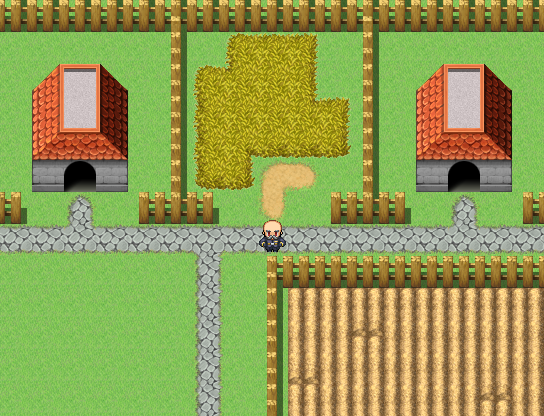
Here is a basic town map, it's been broken up by fences, houses, a path, a garden, and a bit of tall grass.

After populating the map with objects this is what it looks like, as you can see I have trees as hinges between the grass and the path/fence, I have broken up the garden by populating it with plants, and I have added a few bushes and some windows.
We could even say that empty lot sold, and an INN was constructed there.
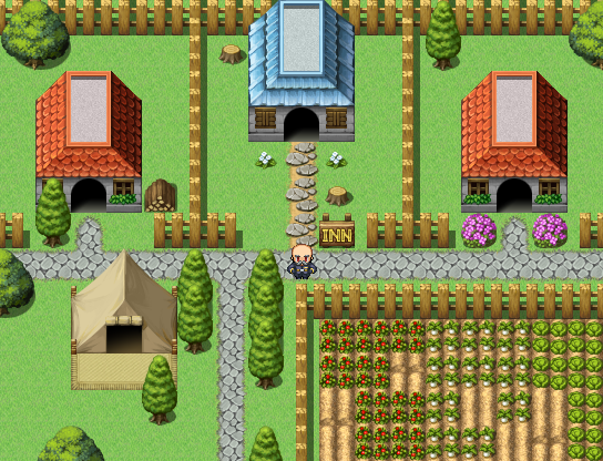
We could use the house as a hinge.
If we were to go inside the INN...these are the same ideas applied to an interior map:

Floor broken up by walls, carpet, a desk and a door.

Inn with hinges and other objects.
In this image you can see how the trees, the tent, the vines, even the smaller ledge and the cave opening all act as hinges to link the floor and wall together.
Putting hinges on your map is part of a process I call object population. Your map will need more then just hinges to look full...
Here is a basic town map, it's been broken up by fences, houses, a path, a garden, and a bit of tall grass.
After populating the map with objects this is what it looks like, as you can see I have trees as hinges between the grass and the path/fence, I have broken up the garden by populating it with plants, and I have added a few bushes and some windows.
We could even say that empty lot sold, and an INN was constructed there.
We could use the house as a hinge.
If we were to go inside the INN...these are the same ideas applied to an interior map:
Floor broken up by walls, carpet, a desk and a door.
Inn with hinges and other objects.
3) Nature Vs. Man-made
In this next screen shot you will see the wall of a castle, all the trees have been planted in a row, bushes in a row, the path is straight...it may not be a good looking map, still it's passable.

map with overlay:
In a man-made area such as towns, castles, and sometimes dungeons(depending on the theme) The way your map is constructed can be far more balanced and even then it can out in the middle of a forest.

Here is the same map, changed into a forest...it has all the components, something is just a little off.

If we break up how even the walls are, and the water, if we spread out the trees, flowers, and bushes in a more uneven manner. The map starts to take on a look more like a forest.
The suppose principal here is that it is more forgiving to make your maps balanced and even where humans are involved and to make things more uneven and natural looking...in nature.
That's not to say that towns always have to be even and balanced, if your games theme is post apocalyptic, you may find it better to make the towns more uneven and nature slightly more balanced to give the player the feeling that nature has more harmony then mankind. Like I said, just ideas not mapping rules.
map with overlay:

In a man-made area such as towns, castles, and sometimes dungeons(depending on the theme) The way your map is constructed can be far more balanced and even then it can out in the middle of a forest.
Here is the same map, changed into a forest...it has all the components, something is just a little off.
If we break up how even the walls are, and the water, if we spread out the trees, flowers, and bushes in a more uneven manner. The map starts to take on a look more like a forest.
The suppose principal here is that it is more forgiving to make your maps balanced and even where humans are involved and to make things more uneven and natural looking...in nature.
That's not to say that towns always have to be even and balanced, if your games theme is post apocalyptic, you may find it better to make the towns more uneven and nature slightly more balanced to give the player the feeling that nature has more harmony then mankind. Like I said, just ideas not mapping rules.
4) The do-nots of mapping...
Do not be afraid to play around editing graphics
Do not use colors that look terrible together unless you want to draw attention to something
Do not take constructive criticism the wrong way
Do not take negative criticism to heart
Do not give up
Do not use colors that look terrible together unless you want to draw attention to something
Do not take constructive criticism the wrong way
Do not take negative criticism to heart
Do not give up
There are clearly many many other aspects to mapping, these however I believe are the most basic.
author=giaks
Mapping is an art form, and as such there is no right or wrong way to map...just as there is no right or wrong way to draw. I think everyone has their own style when it comes to mapping.
This.
It takes time, just like every other skill you learn in life before you can get truly good at something; all you need to do is just practice with it, and you'll eventually get pretty good at it.
Still, constructive advice never hurt anyone. If you need some pointers on how to improve your map making skills, you could always try looking at how most existing 16-bit RPG's handle it with their maps and try to emulate that the best you can. You could also, like edchuy suggest, post your maps in The Screenshot Topic for some more helpful advice on how to get better (just look what it did to Mr_Detective since -- NOW HE'S AN ALL-STAR!)
All you gotta do is "practice," just like what Allen Iverson said. ^^
One thing that nobody has mentioned and that's important as well, especially from the player's point of view, is the issue of passability. Basically, it involves defining which areas of the map can be accessed and the paths used to do so. Generally speaking, you don't want players to be able to walk into solid objects (walls, trees, etc.) or go to places you don't intend for them to go (walking off a ledge, into deep water, etc.). There are some exceptions, though, where you might want them to able to do so. For example, in order for them to get to a treasure, if you want the player to act like a ghost or provide an invisible path to overcome a seemingly unsurmountable obstacle. If you make this choice, you generally want to make the players aware of this, unless you're really evil. Sometimes, you may want to make an area unreachable on purpose (see teaser chests).
One thing that's interesting about this is a screenshot won't be able to catch flawed passability unless it shows the player being able to move into the wrong spot.

Generally, you don't want the players to walk on top of the table unless there's a good reason for them to able check the armor. You can walk onto it from both the bottom and left of the table.
Screenshots taken from the editor are useful, but the best way to check its passability is by trying to walk everywhere on the map and find out if there are places you are able to get to that you didn't intend.
In summary, although not apparent at first sight, it's something to keep in mind when mapping. Personally, finding serious passability issues in a game is a pet peeve of mine. Looks aren't everything ...
One thing that's interesting about this is a screenshot won't be able to catch flawed passability unless it shows the player being able to move into the wrong spot.
Generally, you don't want the players to walk on top of the table unless there's a good reason for them to able check the armor. You can walk onto it from both the bottom and left of the table.
Screenshots taken from the editor are useful, but the best way to check its passability is by trying to walk everywhere on the map and find out if there are places you are able to get to that you didn't intend.
In summary, although not apparent at first sight, it's something to keep in mind when mapping. Personally, finding serious passability issues in a game is a pet peeve of mine. Looks aren't everything ...
LockeZ

I'd really like to get rid of LockeZ. His play style is way too unpredictable. He's always like this too. If he ran a country, he'd just kill and imprison people at random until crime stopped.
5958
author=giaksThis is super misleading, it's telling people "Don't try to get better, because there's no such thing as better." That's not true. You can always get better.
Mapping is an art form, and as such there is no right or wrong way to map...just as there is no right or wrong way to draw. I think everyone has their own style when it comes to mapping. I do have a couple(four...maybe) 'basic' principals I try to follow when mapping, I could jot them down for ya if you wanted.
Lowe's. Never Stop Improving.(tm)
Pages:
1

