


SCREENSHOT SURVIVAL 20XX
Posts

@pinkitt & Dookie those screens look fantastic. I'm totally jealous.

I've been messing around with the message boxes a bit and came up with this spiral notebook motif. I like it so much may just end up basing the whole menu system around it.

Here's the mostly finished version of that Cheerleader thing from before.

Aaaand here's what happens when you miss. (You can also see I've been messing around with the battle HUD a bit.)
I've been messing around with the message boxes a bit and came up with this spiral notebook motif. I like it so much may just end up basing the whole menu system around it.
Here's the mostly finished version of that Cheerleader thing from before.
Aaaand here's what happens when you miss. (You can also see I've been messing around with the battle HUD a bit.)
I made a map for a future game of mine on MV. I wanted to know what you think of it:

The "Save Map As Image" feature does not save events, so just pretend that there's a big gate where the door should be. XD
The "Save Map As Image" feature does not save events, so just pretend that there's a big gate where the door should be. XD
@Ilan: The cliff in the upper left seems to need some shadows on the right side. Also the part where the edge of the under-cliff dissapears behind it looks odd, but I don't know how you could fix it.
Edit: Also, the fence in the upper left should probably connect behind the house, so it doesn't look like a few fence posts just sitting between the edges.
Edit: Also, the fence in the upper left should probably connect behind the house, so it doesn't look like a few fence posts just sitting between the edges.
author=Chilly-Pheese-Steak
@pinkitt
@pinkitt
@pinkitt

(Jokes aside, jeeeesus those are some awesome sprites. The animation looks great and the miss animation is funny. Everything is so promising!)
@llan14 Looks good! I...assume you're gonna be putting up a door on the building? The front looks awkwardly empty.
@Rine: I tried shift-mapping before, but the fence remained the same. I don't know why it's happening... Actually, I think I know how to solve that. Thanks for the advice, Rine! :)
@Punkitt: I already explained what happened with the door... -_-
But thanks! :D
@Punkitt: I already explained what happened with the door... -_-
But thanks! :D
@Ilan: Just noticed, but the second floor of the building, where the center is taller and there is roof on either side, on the right side it looks like its missing a border of some kind, where the left side has a clean black line.


Shoot, I need to take some artwork advice from you! You make everything look so clean and connected, I'm jealous.
(Love the color pallette, btw.)
(Love the color pallette, btw.)

@Pizza- Is it intentional that the wood and the rocks/cliffs look the same?
author=Punkitt
Shoot, I need to take some artwork advice from you! You make everything look so clean and connected, I'm jealous.
(Love the color pallette, btw.)
Thanks. Glad to know the colours are nice- palette creation is something I've struggled with for a long time, but I feel that lately it's starting to click a bit more in my head.
author=InfectionFiles
@Pizza- Is it intentional that the wood and the rocks/cliffs look the same?
Yes. The wood is birch, the cliffs in the intended area are white stone (akin to the Cliffs of Dover). No reason for them to use a different colour ramp.

The only issue I have is that the grass is so bright, especially with the already bright trees/cliffs. I wonder if you could make the cliffs a little greyer, like shale? Though I guess if they're supposed to be a more chalky substance it would make sense for them to be that white (though if it's the more chalky kind of cliff, there'd probably be small mounds of the stuff around the bottoms of the cliffs).
Hm, maybe just desaturate the grass a tad? Not a ton, but enough that it's not quite so neon?
Edits

Middle stripe is the original colour. I kinda like the top ones a bit, more-so the top left which is basically just a little less saturation.
Top left - a tad less saturation,
Top Right - a bit more white (lighter),
Bottom left - a bit darker,
Bottom right - less saturation, more lighter

Pale mint green works nicely too.
Hm, maybe just desaturate the grass a tad? Not a ton, but enough that it's not quite so neon?
Edits
Middle stripe is the original colour. I kinda like the top ones a bit, more-so the top left which is basically just a little less saturation.
Top left - a tad less saturation,
Top Right - a bit more white (lighter),
Bottom left - a bit darker,
Bottom right - less saturation, more lighter
Pale mint green works nicely too.
@ESBY
Looks very neat, a believable future space station. Is that a sort of space based, scary game?
@Dookie
Love the style your going with. Especially the isometric perspective. And the simplistic, yet fun looking sprite style. Is the mouse character the protagonist?
@skelebelle
Those screenshot are amazing. The highly detailed drawn map goes really well with the sprites you're using. Lets not forget the visual novel-styled portrait. That looks like it belongs in a professional game.
Subscribing to your game right away.
@Chilly-Pheese-Steak
The message box style fits well overall teenage comedy feel of the game. The battle animations are both amazing and hilarious. Does she get back issues when the attack fails? At least, it looks like she's trying to do a handstand, suddenly feels a sharp pain in the back and falls over.
@Pizza & Liberty
I do like the looks of the edits Liberty made better then the original grass color. What brightness to go with should also depend on what colors/brightness is use for the game's characters. If the character are also bright and colorful, it could work better with an equally bright and colorful grass. As apposed to a more grayer, more realistic grass color.
Colt
@Pizza & Liberty
I do like the looks of the edits Liberty made better then the original grass color. What brightness to go with should also depend on what colors/brightness is use for the game's characters. If the character are also bright and colorful, it could work better with an equally bright and colorful grass. As apposed to a more grayer, more realistic grass color.
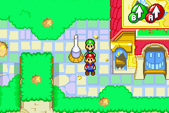
The grass is intentionally saturated to the level that it is, as the game in question is quite cheerful, colourful, and bright. An example of the colour reference I'm using is the original Mario and Luigi:

The grass is very careful balanced in terms of colour at the moment. It's not something I'm super worried about. Liberty's edits in particular may look alright on their own, but they practically ruin the atmosphere the palette is attempting to get across to the player, and this grass colour needs to be used in a lot of different areas, so it's fairly important.

Here's a few early screens from a side-project of mine; a (so far, kinetic) visual novel of sorts.
 This is a save scene that I've repeatedly recycled, but only recently bothered to clean up and fix that "semi-intentional" bug I left in.
Also, that typo... "Marue" :( Aaand here's a map I made for... reasons. I don't know. I just randomly brought up ace, created a blank project, and worked on this.
It's... good practice, I guess?
@Liberty> While I agree that the grass in superstar saga wasn't exactly the easiest to look at, they did well in setting up the light, comic atmosphere of the game so...
@Chilly-Pheese-Steak> That's really neat! Even small touches like that go quite a long way. The battle doesn't have a background or anything though. I assume you've yet to put one up?
@Ilan> The lower parts of the cliffs are too steep. Unless that's entirely intentional, it wouldn't hurt to break the steepness up a bit by adding multiple levels to it.
Here's a map I did for wyrm warriors. What I'm talking about is the bottom part of this map..
@Pizza> The grass looks blue-ish to me. I'm not sure if it's just my eyes or my screen, but it looks kinda off for me. That said, it's looking good!


Also, that typo... "Marue" :(

It's... good practice, I guess?

@Liberty> While I agree that the grass in superstar saga wasn't exactly the easiest to look at, they did well in setting up the light, comic atmosphere of the game so...
@Chilly-Pheese-Steak> That's really neat! Even small touches like that go quite a long way. The battle doesn't have a background or anything though. I assume you've yet to put one up?
@Ilan> The lower parts of the cliffs are too steep. Unless that's entirely intentional, it wouldn't hurt to break the steepness up a bit by adding multiple levels to it.
Here's a map I did for wyrm warriors. What I'm talking about is the bottom part of this map..

@Pizza> The grass looks blue-ish to me. I'm not sure if it's just my eyes or my screen, but it looks kinda off for me. That said, it's looking good!
I got no problem with Pizza's grass. I think it's a pretty good green as far as saturated greens go :P

@Pizza:
I don't see any issue with the colour of the grass. Lib's edit is pretty nice though, although obviously if its too different a vibe for that area then it's unusable. Are you using different palettes for different areas (Earthbound, for instance, used more or less the exact same grassy cliff tiles for almost the entire first half of game, with only colour changes between areas) or just the one throughout? If it's the latter, why's that?
The real issue with those tiles is the foliage on the ground. I understand that it's supposed to originate from the trees and so it should be similar in colour, but there needs to be some yellow or something in there to increase readability. It's not terrible or anything, and I get that you're trying to limit colours wherever possible, but a yellow/brown/mulchy/rotten leafy shade would let you apply it a bit more liberally around trees without them blending into the floor.

