


COOL (AND NOT SO COOL) LOOKING USER INTERFACES
Posts
LockeZ

I'd really like to get rid of LockeZ. His play style is way too unpredictable. He's always like this too. If he ran a country, he'd just kill and imprison people at random until crime stopped.
5958
What would you say the problems were with the Dragon Age menus? Talking about the problems with the interfaces seems a lot more useful to me; when that kind of thing is working really well I kinda don't even notice it's there.
I will say the biggest problem I had with the Dragon Age Inquisition menus is something that mostly doesn't apply to RPG Maker - it used different buttons for different actions instead of actually being a goddamn menu. For example, when your cursor was over a piece of equipment in your inventory, you could press A to equip it, press RB to mark it as vendor trash, press Y to destroy it, press RT to see its stats, press RT a second time to compare it to your current item, hold LT at that point to compare it to your off-hand item if it was a one-handed weapon or ring. You could press up or down on the D-pad to change characters, up or down on the left stick to change items, or up or down on the right stick to scroll through the text in the item description. What the fuck. All of these buttons were listed along the bottom of the screen, but -- why? It's slower, needlessly complex, and really obnoxious. Other parts of the game's menus did similar nonsense.
If your main menu uses a keyboard or controller, and it involves more buttons than a single set of directional keys, OK, Cancel, and maybe a Help button, you're doing it totally wrong. Maybe you have a really really good reason for doing it wrong that is specific to your game, but... you probably don't.
But if you do, this is what your decision-making process looks like. Really good article about designing a menu that teaches the player how to play. Not super relevant to RPGs.
Red_Nova

Sir Redd of Novus: He who made Prayer of the Faithless that one time, and that was pretty dang rad! :D
9192
DA: Origins' UI: Love it. No problems.
DA:2's UI: Love it. No problems.
Inqusition Menu: Clunky, laggy, and more complex than it needs to be.
Most of my specific complaints have already been detailed in my last post, but to sum it up: Bioware tried to fix something that wasn't broken. As a rule when designing UIs, I usually thought that fewer click = better.
Inquisition broke that rule by forcing players to backtrack through submenus in order to get to something that was possible to get to by a single press of a direction.
I thought about it for a while, and I'll admit that most of my issues with the UI don't really apply to RPG Maker. I hated the fact that it lags when it loads a 3D model of a character. Because of this, the game occasionally freezes when I press up or down to change party members. And because of this, it seemed to queue my inputs and goes two or three party members past where I wanted to go originally.
Important note: I played on the Xbox 360 version. Not the PC or current gen systems. It's likely the issue would be with my hardware instead of the game. But it doesn't change the fact that the menus were more complex than they needed to be. Because of the overly complex design, each 3 seconds loading time between menus added up to be a very frustrating experience.
I like this article! You're right, it does a pretty good job of teaching players some essential mechanics. Since RPGs generally require a lot of menu-navigating, there has to be some way this article can be useful to us...
DA:2's UI: Love it. No problems.
Inqusition Menu: Clunky, laggy, and more complex than it needs to be.
Most of my specific complaints have already been detailed in my last post, but to sum it up: Bioware tried to fix something that wasn't broken. As a rule when designing UIs, I usually thought that fewer click = better.
Inquisition broke that rule by forcing players to backtrack through submenus in order to get to something that was possible to get to by a single press of a direction.
I thought about it for a while, and I'll admit that most of my issues with the UI don't really apply to RPG Maker. I hated the fact that it lags when it loads a 3D model of a character. Because of this, the game occasionally freezes when I press up or down to change party members. And because of this, it seemed to queue my inputs and goes two or three party members past where I wanted to go originally.
Important note: I played on the Xbox 360 version. Not the PC or current gen systems. It's likely the issue would be with my hardware instead of the game. But it doesn't change the fact that the menus were more complex than they needed to be. Because of the overly complex design, each 3 seconds loading time between menus added up to be a very frustrating experience.
author=LockeZ
But if you do, this is what your decision-making process looks like. Really good article about designing a menu that teaches the player how to play. Not super relevant to RPGs.
I like this article! You're right, it does a pretty good job of teaching players some essential mechanics. Since RPGs generally require a lot of menu-navigating, there has to be some way this article can be useful to us...
author=LockeZ
For example, when your cursor was over a piece of equipment in your inventory, you could press A to equip it, press RB to mark it as vendor trash, press Y to destroy it, press RT to see its stats, press RT a second time to compare it to your current item ... All of these buttons were listed along the bottom of the screen, but -- why? It's slower, needlessly complex, and really obnoxious.
I haven't played a game with this kind of setup, but other than trying to remember what each button does, I don't see how it'd be slower or more complex than having a labyrinth of menus. I mean, when you sit there and rat off every function in a sentence like that it sounds like madness, but honestly I'd prefer "hit A to select, Y to delete, etc" to "hit A to bring up the menu, then select another menu to get to the menu that lets you delete the item". Granted, half the stuff you listed sounds like it should just be part of the display and not something you should have to press buttons or go through menus for.
LockeZ
I'd really like to get rid of LockeZ. His play style is way too unpredictable. He's always like this too. If he ran a country, he'd just kill and imprison people at random until crime stopped.
5958
I don't know if I can accurately explain why it's worse than choosing things from a list. It doesn't necessarily sound worse. But in practice, man. It's so worse. You still essentially have to select the thing from a list with your brain - but then after you've done that you have to look and see what button to push to activate your choice, instead of the button always being the OK button. The equipment menu is accessed infrequently enough (only once every few hours) that you have to read through the list of key bindings basically every single time.
There's an extremely similar menu when looking through your equipment in shops except some of the buttons are different. And also it's impossible to compare to your off-hand item in shops. Lord.
The fact that each time you change characters it takes several seconds to load and each time you press a button it takes half a second to register doesn't help, though that might just be the Xbox version.
Visually it's mostly okay, but I don't understand why it's so hard to just show the stats of an item automatically when you simply move the cursor over it, instead of having to press RT twice and then hold LT. Also please note that those stat bars at the bottom are never used and convey no information. They don't show the stats your equipment actually effects, and they don't show any numbers.
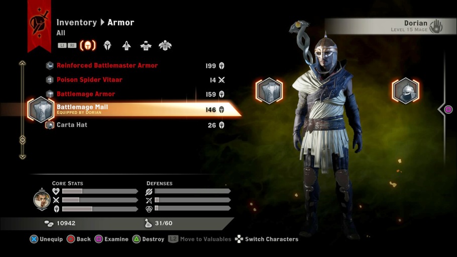
author=LockeZOkay, yeah, if the muscle memory never kicks in then I can see it being slower.
The equipment menu is accessed infrequently enough (only once every few hours) that you have to read through the list of key bindings basically every single time. There's an extremely similar menu when looking through your equipment in shops except some of the buttons are different.

