


NEW DEVELOPER MAPPING HELP THREAD
Posts
Hi guys! I'm new to RMMV. Here is some mapping I've done for a Crystal Cave type
of dungeon.
Thank you for looking and I appreciate any mapping advice.
of dungeon.

Thank you for looking and I appreciate any mapping advice.

Thank you! I will work on those walls. Would you also recommend black voids in the big chunks of wall ( or ceiling I suppose ) on the bottom and right side there?
Yeah, that's actually the point I was trying to make xD
If you're using voids might as well go full on out
If you're using voids might as well go full on out
Let's see what happens....
So, this is the first map I've tried to make in about a decade, I'm a scripter not a mapper...
It is obviously not finished I'm just not sure what to do with it next, details:
- Map is intended to be the site of a battle in an SRPG
- enemies will start on both sides of the river, as the player your initial goal will be to clear one side of the map then to push them across the bridge and then to rout them
- no (or very few) units will be capable of swimming/flying making the bridge critical
My own thoughts:
1. too empty (but really unsure what to add)
2. too neat/artificial (but unsure how to change that without making it look messy)
3. from a gameplay perspective may need a second bridge
Map is quite large so thumbnail here, click for full image:

author=Rhuan
Let's see what happens....
I'll give it a try if that is alright with you!
When maps are specialised for certain kinds of units you should exaggerate the environment to really showcase that. You stated swimming and/or flying units and this could be further emphasized by ground levels. Flying units don't have to take stairs to go down a ledge. Swimmers have to take the stairs but can swim across at any part regardless of how wide the river is.
If the focus is the bridge, you'll want a greater visual emphasis on it. Bigger bridge bigger river. Right now your bridge looks only big enough to have 4 characters in a row. There is no walking around to attack at other angles for those who cant' fly/swim. You want it to look important. Sandbag walls, crates, flags. Make it look important. Perhaps some visual indication that not just anyone can travel across the water (rocks, deeper looking water).
If this is an introduction battle it's alright to keep it sparse. A simple way to add variety is different colours of grass. Lighter/browner dead grass in areas expected to be commonly trodden on. Darker greens and flowers around the borders and away from expected action. Perhaps some trees to border the scene with a few spotted around as obstacles.
Also, is the battle suppose to be an even match? If so you will want to center the focal piece more.
I hope this helps!

You could also add some height to the map using cliffs around the edges, creating a 'frame' around the edges. Some small tree clumps around (archers could hide behind them to attack and be safe from attack?), flowers (after all, they'd still be growing, but they'd be trampled underfoot), longer grass and maybe a couple of river rocks.
Then there's stuff the soldiers would have brought with them. Pennants, armour/shields (if this is after a battle they'd be strewn around), picket lines (to deter horse charges) and the like.
Then there's stuff the soldiers would have brought with them. Pennants, armour/shields (if this is after a battle they'd be strewn around), picket lines (to deter horse charges) and the like.
Thanks for the suggestions - I haven't made any updates still thinking how to work in some of the ideas - had possibly been thinking in terms of finishing touches, now I feel like the map is maybe 20% done at best...
For now working on building more of my combat system instead.
For now working on building more of my combat system instead.

So I'm just throwing some maps together for practice at the moment. I've actually done a whole project that only used the sample maps because I was so bad at mapping, haha. So I figured the more practice I got, the better. This is the interior and exterior of a house--I was trying to create the illusion of a front porch but failed miserably. So if you have a few tips to nudge me towards remotely decent work, that would be great.
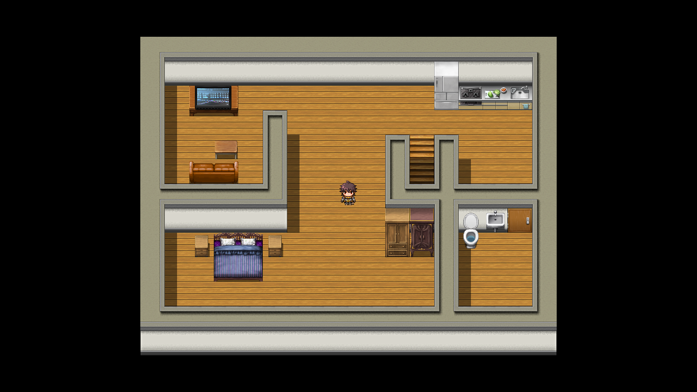

Your mapping looks fine, but a little too spacious. Try adding more details like tall grass, carpets, flowers, etc.
Great for a beginner tho!
Great for a beginner tho!
The front porch is an issue because the roof tile is the same height all the way around. This is weird because the front part is higher (since there's that extra wall piece) and would sit at a higher angle.
As for details, some tall grass would help break up the green a little bit, as would some flower beds, pavements, paths and general scenery.
The inside map has some issues as well. You've got the fridge, which is over one tile high, set against a wall that is only one tile high. It'd be going through the ceiling. XD You also have the TV down a bit (I'd rearrange that in the tileset itself to sit over two tiles in height so that it appears to sit in the middle of the table instead of aligning with the edge of it.)
Some carpets would help break up the wooden floor a bit (remember to keep them either rectangular or square if you're using autotile carpets), and it'd be best to section off the bedroom with a wall all the way across instead of leaving it open-plan (unless it's meant to be a studio apartment type thing). You also seem to be missing a table to eat at.
I recommend checking out some MV games and seeing how they use the same tiles to create areas. Experiment with spaces and sectioning rooms off in houses in order to get a good feel for what shapes you can make. Lastly, if you're having trouble filling a place up, try making the area a bit smaller.
So far, so good though! Keep it up~
Thanks guys! When I get home I'll see if I can't improve these a little bit, and maybe post a couple more things I was working on.
Any ideas for fixing that?
author=Liberty
The front porch is an issue because the roof tile is the same height all the way around. This is weird because the front part is higher (since there's that extra wall piece) and would sit at a higher angle.
Any ideas for fixing that?
LockeZ

I'd really like to get rid of LockeZ. His play style is way too unpredictable. He's always like this too. If he ran a country, he'd just kill and imprison people at random until crime stopped.
5958
Make the roof extend upwards by one tile higher, in those three columns. Leave the bottom of the roof and the front of the house alone.


The protagonist is here for a ritual hunt, this area is supposed to be a mountainous wilderness.
Thanks in advance!
LockeZ
I'd really like to get rid of LockeZ. His play style is way too unpredictable. He's always like this too. If he ran a country, he'd just kill and imprison people at random until crime stopped.
5958
Looks good, flyingWheat!
I'm not fond of the autoshadows personally. Neato otherwiso tho. Might wanna add some more trees, especially on that cliff.
Hey guys I'm fairly new at game developing and my VX ACE game got denied twice now. (The first time was because of the description which I edited and resubmitted my game afterwards.) This time my mapping is under site standards. Could I get some specific feedback on the mapping from the following screenshots I used for the submission please?


That sample map is good. Use it as an example. But replace it. No one likes sample maps.
Your maps are generally large and empty. There's also a lot of incorrectly used tiles. Like that tower in the first image looks hideous. Here's a slightly better looking version that you could use, should be easy to recreate on your own.

In the last image, you used water tiles incorrectly. They're mainly meant to be used like this;

(Again, you could make *this* look much better using edits. Also, you'll need to use shift mapping, so might wanna look up a tutorial for that, there's tons if you google ''rpg maker shift mapping tutorial''.)
Your cliffs are unreaslistic. Cliffs don't look like straight lines, they are messy and come in random shapes.
I made a tutorial that points out some more beginner mistakes in mapping for rpg maker, and I think you might want to look into it~ https://rpgmaker.net/tutorials/1343/
Your maps are generally large and empty. There's also a lot of incorrectly used tiles. Like that tower in the first image looks hideous. Here's a slightly better looking version that you could use, should be easy to recreate on your own.
In the last image, you used water tiles incorrectly. They're mainly meant to be used like this;
(Again, you could make *this* look much better using edits. Also, you'll need to use shift mapping, so might wanna look up a tutorial for that, there's tons if you google ''rpg maker shift mapping tutorial''.)
Your cliffs are unreaslistic. Cliffs don't look like straight lines, they are messy and come in random shapes.
I made a tutorial that points out some more beginner mistakes in mapping for rpg maker, and I think you might want to look into it~ https://rpgmaker.net/tutorials/1343/

