


HELP AND OPINIONS ON SILHOUETTE STAGES
Posts

author=XBuster
Tell you all what, would you like to see a video of it in action? I plan on adding a blog today which will reveal new chunks of information and a video is planned for this segment to see what it looks like in action. I'll create a series of mini levels with silhouettes and compile them in a video.
Sure : ) Sounds lovely. Tho if it's worth the work of piling it all together is up to you!
author=Kylailaauthor=XBusterSure : ) Sounds lovely. Tho if it's worth the work of piling it all together is up to you!
Tell you all what, would you like to see a video of it in action? I plan on adding a blog today which will reveal new chunks of information and a video is planned for this segment to see what it looks like in action. I'll create a series of mini levels with silhouettes and compile them in a video.
Yeah what the dragon said!
author=BlackWolf1992author=KylailaYeah what the dragon said!author=XBusterSure : ) Sounds lovely. Tho if it's worth the work of piling it all together is up to you!
Tell you all what, would you like to see a video of it in action? I plan on adding a blog today which will reveal new chunks of information and a video is planned for this segment to see what it looks like in action. I'll create a series of mini levels with silhouettes and compile them in a video.
Lol XD

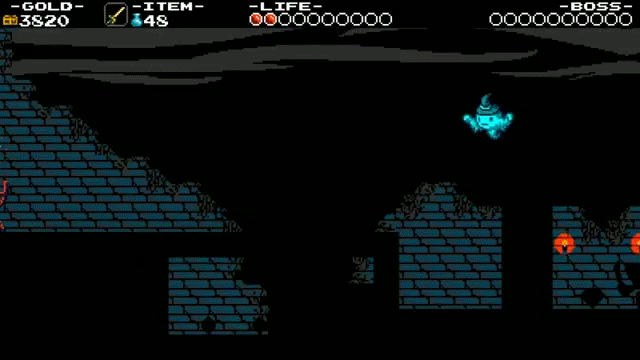
I think you're on the right track but need more analysis as to the reason of the effect you're going for. It seems a bit weird that the foreground-most objects (the vines at the top? I'm not counting the HUD as that needs to be coloured) are the most well-lit, while the very next layer (the gameplay area) is completely black.
As is seen in the DKC screenshot, important objects in the gameplay layer have colour for tracking reasons (the characters' clothes and the enemy's eyes). It bends the natural rules of lighting for gameplay and aesthetic purpose but everything not directly needed for gameplay is still following the laws of proper lighting and where the light is coming from.
In your screenshot it's not hard to tell where there's land and objects and where there isn't, but I think it just doesn't look good because the gameplay area appears as though it should be lit from two light sources (whatever's lighting the foreground and whatever's lighting the background). So having the gameplay area in shadow, breaking the rules of lighting, is a stylistic choice (which is fine. great, even) but unlike how other games implement this (often used in factory or stormy areas) I just don't think having the foreground-most layer entirely well-lit isn't a good idea.
author=Dragnfly
I think you're on the right track but need more analysis as to the reason of the effect you're going for. It seems a bit weird that the foreground-most objects (the vines at the top? I'm not counting the HUD as that needs to be coloured) are the most well-lit, while the very next layer (the gameplay area) is completely black.
As is seen in the DKC screenshot, important objects in the gameplay layer have colour for tracking reasons (the characters' clothes and the enemy's eyes). It bends the natural rules of lighting for gameplay and aesthetic purpose but everything not directly needed for gameplay is still following the laws of proper lighting and where the light is coming from.
In your screenshot it's not hard to tell where there's land and objects and where there isn't, but I think it just doesn't look good because the gameplay area appears as though it should be lit from two light sources (whatever's lighting the foreground and whatever's lighting the background). So having the gameplay area in shadow, breaking the rules of lighting, is a stylistic choice (which is fine. great, even) but unlike how other games implement this (often used in factory or stormy areas) I just don't think having the foreground-most layer entirely well-lit isn't a good idea.
This is some great feedback:) I also totally see where you're coming from as far as the vines not being colored black. I have recently been playing a masterpiece of a game known as Shovel Knight.
That game had 2 silhouette stages where in one it was hard to see because the background was nearly completely black so you had to wait for a quick burst of lightning to see where you were going(unless guided by a lighter brick wall).
This one however, was a lot better because it had a brighter background

I may result in either removing the vines altogether or simply blackening them as you've described. Wait...Oh! Its because I had the vines set as bg01 rather than bg07. Its a good thing you mentioned that. As I have mentioned, I am completely new to doing this in a game, so I appreciate everything being said so far:)
Learning about lighting has always been an interest of mine. I learned so far that when there is light, things are darker as they come closer. However, when it is dark, its the exact opposite(I think).

To toss my hat in the ring - the secret to good silhouette stages is high contrast between the black foreground and the background. That's the core of it.
Shovel Knight is a fantastic game, but the dark sections of Specter Knight (while I personally had no issue with them) were some of the most prominent complaints I read about the game. Because contrast only occurred with the blue walls and lightning strikes it meant that those unfortunate players that might not have the keenest eyes were caused loads of deaths and undue frustration. The main problem isn't necessarily that the stage design in those sections was poorly constructed, but mostly that the darkness was for style and added challenge that detracted too much without adding enough flair. All because it was too dark.
Silhouette stages should first and foremost be about amplifying the visual aesthetic of your level, without detracting from the gameplay whatsoever. The black outlines should add a treat for the eyes and maybe throw players for a bit of a loop, but not be difficult. The stage design should be relatively simple. If player's can't see and they die to something, then it isn't really their fault, and they'll get angry.
Therefore these stages usually work the best when there's a proper strong light source that illuminates it - that's how light works after all. So in your images, the fact is your background is far too dark. You need it to be sunset, or foggy, or with spotlights or something. These stages also tend to work best when you have a simple gameplay setup: The more clear your game objects are and the more they have a recognizable silhouette, the more clear the outlines of the stage. Last thing you want is anything that seems to define a solid entity and isn't: Case in point being the vines in your picture. Its not like you can't have them since they're so high up but if they are removed it makes the image simpler and therefore stronger. There's less clutter that players have to keep track of. Just make sure that at the beginning of the stage if there is anything that players can walk through, make it clearly identifiable and give players a chance to interact with it in safety.
My recommendation is - have the foreground straight black, and have a color gradient for your background that starts bright at the top and gets cooler toward the bottom. Tweak the colors until you can completely see what's going on in the stage and you should be set. Those mountains at the bottom either need to go, or only have them as a black outline, rather than filled in mountains.
That's what I was talking about. Although the Shovel Knight section was anything but unplayable, it did hinder your progress mostly if it was your first time. Your character would disappear in the background and you'd hit an enemy, which would bounce yourself in a pit. My only true complaint the whole game, but its not game breaking in any manner.
Its actually a great thing that you mention making it sunset or foggy or something. Game Maker has a built in fog function that can expose anything that is in front of or behind it. I could use that in the background. And yes, the game does have lots of simple objects you can tell the shape of such as coins, springs, switches and slopes.
That is actually a good idea with the gradients. I have lots of gradients already and are used in every room, but depending on the room size, it will stretch accordingly. I'll tweak it a bit more and return with more screenshots and a video. I did promise to add one here. Thanks a bunch for your feedback. Its been very helpful:)

