


SPRITERS, DOES THIS LOOK ALRIGHT?
Posts
Pages:
1
I'm new to spriting in general, This is an idle pose for a character of mine while in battle, I just wanna know what I did right, what I did wrong, and any tips you're willing to share, thanks!
http://imgur.com/lr2XBP8

http://imgur.com/lr2XBP8
Well she looks like she's rubbing her tummy. And if this is an idle battle pose, I would have her sword up at ready. Overall, there's a lot of motion here, and I don't there needs to be so much.
Huh, she does look like she's rubbing her belly... how did I not see that? As for the actual position of the sword, she supposed to sort of look really relaxed, and she has had no actual training in story, I'm trying for more "combat ready" poses on other characters but she's supposed to look abnormal there.
As for the motion; what should I cut out? I want her skirt flowing, and the sword, maybe the shoulder bobbing could be cut?
As for the motion; what should I cut out? I want her skirt flowing, and the sword, maybe the shoulder bobbing could be cut?
I would reduce the shoulder bobbing (not cut it completely). Look at how she's moving and imagine yourself in that pose, and then look at scale. Her shoulders are raising and falling by half a foot.
Ok then... how's this?
http://imgur.com/I1TWRZ0
I find it kind of hard to make it bob less, since it's going up and down by only one pixel...
As for the belly rubbing, not sure how to fix that, still trying to plan it...
http://imgur.com/I1TWRZ0
I find it kind of hard to make it bob less, since it's going up and down by only one pixel...
As for the belly rubbing, not sure how to fix that, still trying to plan it...
Are you sure? How far is the head going up and down by?
As for the hand, try moving it more to the side and closing the fist. EDIT: I mean, drop it a bit.
As for the hand, try moving it more to the side and closing the fist. EDIT: I mean, drop it a bit.
The head isn't actually moving, her knee is bending to cause a bounce, the head is just following suit.(As for the actual displacement: 2 pixels.)
As for dropping the hand, I would, but then it's hovering over her crotch, and... well let's just say it doesn't look right... :|
As for dropping the hand, I would, but then it's hovering over her crotch, and... well let's just say it doesn't look right... :|
That's what I thought. Reduce that to one pixel. Reduce motion in the upper arms, because those are moving by a bit, too. I'm guessing also by two pixels (I'd swear it was three.
And if you drop the hand, it should come closer to her side unless you move her whole arm in.
And if you drop the hand, it should come closer to her side unless you move her whole arm in.
http://imgur.com/oxw8mtk
Ok, so I reduced the number of pixels she drops, and removed the knee bending, how's it look now?
-Edit-
Also removed the motion on boots...
Ok, so I reduced the number of pixels she drops, and removed the knee bending, how's it look now?
-Edit-
Also removed the motion on boots...
LockeZ

I'd really like to get rid of LockeZ. His play style is way too unpredictable. He's always like this too. If he ran a country, he'd just kill and imprison people at random until crime stopped.
5958
My advice is unrelated to the animation, since generally I think idle poses usually shouldn't be animated. That's just my personal preference because I think it always looks silly. So I don't have any advice on how to make the bobbing up and down look less silly, because I don't think that's even possible to do.
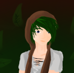
Her shirt is suffering from a serious case of pillow shading. Her legs too. On her arms it's not as noticable because they're only two pixels thick, and on her face it's not as noticable because it can be interpreted as the shadow of her hair, but it's really happening over the whole sprite.
The solution to pillow shading is to define a light source. In 99% of cases this just means the light is coming from "upper left" or "upper right." If you can help it, you don't usually want it coming from directly overhead, or from the same direction as the camera, because it doesn't look as nice. Angled lighting helps your shapes look more defined. You also don't want the light coming from behind the character unless you're making special sprites that are only used in a dramatic scene with a sunset backdrop; that looks cool for one scene, but if used for the whole game it lowers visibility.
If you're planning to use the RTP graphics in RPG Maker, I would recommend an upper-left light source because that's what the RTP tilesets use (although almost every RTP tile is a perfect cube, so if you remove the auto-shadows then it's hardly noticable). If you're making all your graphics from scratch then upper-right will work just as well, but pick one and stick with it.
If this battle sprite gets flipped during back attacks or something, then it'll be lighted from the wrong direction when that happens, but fortunately nobody cares. Even professional spriters just let that happen, and no one notices. As long as it looks right at least half of the time, it's fine.
Additionally, I would recommend doing something else with her non-sword arm, especially if you keep the bobbing up and down animation. If you change this into a non-animated pose, then the arm being where it is would probably look fine. Flipping her arm so that her hand is pointing outward would be the easiest solution, though I'm not sure it looks any better.
I'm not really a very good spriter, and there's a lot of other info about color palettes and stuff that someone else might be able to give you, but pillow shading is something I do at least understand. I took a stab at fixing the pillow shading on the first frame your sprite so you can at least see what I'm talking about. I won't claim I did a good job but I feel confident that it's at least not worse than yours, heh.

Zoomed in:

One thing you might notice I did with the shading is fudge a lot of the outlines. I don't think there's anything wrong with outlines around each of the different-colored areas of your sprite, but lighter regions often look better with lighter outlines, especially if they're only a few pixels wide. You instinctively did that yourself in a few places in your original sprite, but I changed the placement of the lighter outlines to match the lighting, and even removed one or two pixels out of the outlines in a couple places where it could be mistaken for shading, like her shoulder and parts of the left edge of her shirt.
I didn't change her hair or shoes at all. They seemed fine to me.
Her shirt is suffering from a serious case of pillow shading. Her legs too. On her arms it's not as noticable because they're only two pixels thick, and on her face it's not as noticable because it can be interpreted as the shadow of her hair, but it's really happening over the whole sprite.
The solution to pillow shading is to define a light source. In 99% of cases this just means the light is coming from "upper left" or "upper right." If you can help it, you don't usually want it coming from directly overhead, or from the same direction as the camera, because it doesn't look as nice. Angled lighting helps your shapes look more defined. You also don't want the light coming from behind the character unless you're making special sprites that are only used in a dramatic scene with a sunset backdrop; that looks cool for one scene, but if used for the whole game it lowers visibility.
If you're planning to use the RTP graphics in RPG Maker, I would recommend an upper-left light source because that's what the RTP tilesets use (although almost every RTP tile is a perfect cube, so if you remove the auto-shadows then it's hardly noticable). If you're making all your graphics from scratch then upper-right will work just as well, but pick one and stick with it.
If this battle sprite gets flipped during back attacks or something, then it'll be lighted from the wrong direction when that happens, but fortunately nobody cares. Even professional spriters just let that happen, and no one notices. As long as it looks right at least half of the time, it's fine.
Additionally, I would recommend doing something else with her non-sword arm, especially if you keep the bobbing up and down animation. If you change this into a non-animated pose, then the arm being where it is would probably look fine. Flipping her arm so that her hand is pointing outward would be the easiest solution, though I'm not sure it looks any better.
I'm not really a very good spriter, and there's a lot of other info about color palettes and stuff that someone else might be able to give you, but pillow shading is something I do at least understand. I took a stab at fixing the pillow shading on the first frame your sprite so you can at least see what I'm talking about. I won't claim I did a good job but I feel confident that it's at least not worse than yours, heh.
Zoomed in:
One thing you might notice I did with the shading is fudge a lot of the outlines. I don't think there's anything wrong with outlines around each of the different-colored areas of your sprite, but lighter regions often look better with lighter outlines, especially if they're only a few pixels wide. You instinctively did that yourself in a few places in your original sprite, but I changed the placement of the lighter outlines to match the lighting, and even removed one or two pixels out of the outlines in a couple places where it could be mistaken for shading, like her shoulder and parts of the left edge of her shirt.
I didn't change her hair or shoes at all. They seemed fine to me.
This is actually all very helpful and in depth, thanks a lot! As for the "Pillow Shading", I had no idea my crappy shading actually had a proper term... I knew it didn't look right, but I've never been able to shade outside of that method, although, the face was actually intended to be the hair's shadow, that part was on purpose, and before I added the hair, it was shaded more like her shirt, And I've always shaded hair differently then I've shaded the rest of my sprites, take this for example:
I think I'll use your edit as a guide, and alter my sprite, to see if I can't make it look better, thanks!
-EDIT-
As for the "bounce" I like it, it's always been done in the rpgs I've played, to me if the character isn't bouncing, I'me sorely dissapointed :b
I think I'll use your edit as a guide, and alter my sprite, to see if I can't make it look better, thanks!
-EDIT-
As for the "bounce" I like it, it's always been done in the rpgs I've played, to me if the character isn't bouncing, I'me sorely dissapointed :b
LockeZ
I'd really like to get rid of LockeZ. His play style is way too unpredictable. He's always like this too. If he ran a country, he'd just kill and imprison people at random until crime stopped.
5958
If you insist on the bouncing, and also don't want to flip her arm around, I think you could also avoid the belly-rub by making her arm either stay in sync with her torso or say in sync with the ground. One of the two. (should maybe do that anyway even if you flip her arm?)
Pages:
1

