


SCREENSHOT SUPERBOWL SUNDAY
Posts
author=Ashramaru link=topic=3024.msg77493#msg77493 date=1243595221
@Lennon: Could this project be A Simple Tale?
Nice deduction. :)
author=Tau link=topic=3024.msg77492#msg77492 date=1243595186
I'm loving the new look as well, although that style is enough for most that color scheme gives it a completely original vibe to it. Keep it up Lennon seriously, we need more originality in this community.
Thanks!

@Lennon: I love it when I see someone actually making their own art, freaking awesome. However those trees bother me, they are not very tree like. Sure it's an abstractish world you got going there, but still, I feel they should be rounder.

Something like this maybe?
Something like this maybe?
author=Darken link=topic=3024.msg77513#msg77513 date=1243608827
@Lennon: I love it when I see someone actually making their own art, freaking awesome. However those trees bother me, they are not very tree like. Sure it's an abstractish world you got going there, but still, I feel they should be rounder.
Something like this maybe?
Hmm. I think I'll do another layer on the bottom, but I don't want to do much more than that.

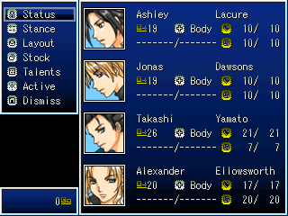
Been trying to find the perfect style for the DMS of The Last Bible. Anyways I changed all the EXFonts, New Faces, New System Set, and Rewrote the Enemy AI in the DBS. The way things are working I think I may create a Turn Based Event for the DMS inspired by Lost Odyssey.
Menu Before
Menu After

Items Before
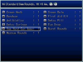
Items After

Mainly aesthetics that were bothering me before. I'll post some new maps and tileset sprites I have been working on soon. Next Update: Big Futuristic City.
Menu Before
Menu After
Items Before
Items After
Mainly aesthetics that were bothering me before. I'll post some new maps and tileset sprites I have been working on soon. Next Update: Big Futuristic City.
Just thought I'd add to the people saying Lennon's customs are cool. I really like the style.
Here's the title screen for a game I'll probably never finish, also custom obviously.
(The font sucks, I'll fix it etc).
Here's the title screen for a game I'll probably never finish, also custom obviously.
(The font sucks, I'll fix it etc).


author=Ashramaru link=topic=3024.msg77608#msg77608 date=1243659819Maybe it's just the unattractive gray gradient, but I actually think the first version of the menu looks sleeker than the second. It's probably less suited to the tone of your game, but. =X
Been trying to find the perfect style for the DMS of The Last Bible. Anyways I changed all the EXFonts, New Faces, New System Set, and Rewrote the Enemy AI in the DBS. The way things are working I think I may create a Turn Based Event for the DMS inspired by Lost Odyssey.
IMAGES
Mainly aesthetics that were bothering me before. I'll post some new maps and tileset sprites I have been working on soon.
I agree with you now that I look at it on a different monitor. I think its the gradient for the system, but who knows, I think I may simply recolor the Dark Blue one and see if the transition within the shades are smoother.Thanks for the input.

Almost done, now if only I could find the right font. :'(
Almost done, now if only I could find the right font. :'(
author=Ashramaru link=topic=3024.msg77615#msg77615 date=1243671356Much better! Now all you need is a better font to complete it!
I agree with you now that I look at it on a different monitor. I think its the gradient for the system, but who knows, I think I may simply recolor the Dark Blue one and see if the transition within the shades are smoother.Thanks for the input.
(Screen).
Almost done, now if only I could find the right font. :'(
Well, I have these screenshots from a Japanese-esque game I attempted one time.
Yes, the Japanese lanterns are custom :P!

Oh no! Our cart has broken down in a misty forest.

Again in the forest.
author=Darken link=topic=3024.msg77661#msg77661 date=1243708149
Man that intense lighting really bugs me. I wish I could actually see something.
This.
Why can't people not make their games fucking invisible? :<


it's not in motion so the brightness is actually quite misleading. it would be perfectly visible in-game.
@nickad: The screenshots too dark for me to see whats going on without squinting. Perhaps increase the amount of light in the areas, there is no need for something to be that dark...unless its a survival horror.
@Nickad: Like people are saying lighten it up a bit. Not too much though or it'll lose the dark atmosphere you have there.


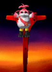
Been chipping away at AST for a while now. Finally decided on a look for the main character. I got some work done on The Thorny Thicket (Shown with the char), and also did up a first draft of the menu there. Might have to darken up the menu a tad, but it's all good for now.
Been chipping away at AST for a while now. Finally decided on a look for the main character. I got some work done on The Thorny Thicket (Shown with the char), and also did up a first draft of the menu there. Might have to darken up the menu a tad, but it's all good for now.
DOOMBOTS ARE ATTACKING THE FORUM. WHAT DO YOU DO?

shit copied from GW thanks a lot doombot-induced forum breaking:
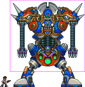
this is still the sigmabot version and I am probably gonna recolour to make it a bit more uniform but other than that this by-and-large what it is going to look like. the pink box is the window size, and bear in mind that it's full-screen.
these are all the things it does:
all in all not a guy to meet on a dark night.
ARE YOU A BAD ENOUGH DUDE TO DEFEAT THIS MOTHERFUCKER?
shit copied from GW thanks a lot doombot-induced forum breaking:
this is still the sigmabot version and I am probably gonna recolour to make it a bit more uniform but other than that this by-and-large what it is going to look like. the pink box is the window size, and bear in mind that it's full-screen.
these are all the things it does:
- the shoulders come off and try to crush you with the telescopic hands.
the head comes off and chases you around, but in this mode it can't do anything else
the head breathes fire
it walks around the room trying to crush you
it fires rockets
all in all not a guy to meet on a dark night.
ARE YOU A BAD ENOUGH DUDE TO DEFEAT THIS MOTHERFUCKER?
author=Darken link=topic=3024.msg77661#msg77661 date=1243708149
Man that intense lighting really bugs me. I wish I could actually see something.
author=Karsuman link=topic=3024.msg77663#msg77663 date=1243708283author=Darken link=topic=3024.msg77661#msg77661 date=1243708149This.
Man that intense lighting really bugs me. I wish I could actually see something.
Why can't people not make their games fucking invisible? :<
author=AznChipmunk link=topic=3024.msg77664#msg77664 date=1243708284
Yeah, it's somewhat too intense, it doesn't look natural.
author=Ashramaru link=topic=3024.msg77668#msg77668 date=1243708942
@nickad: The screenshots too dark for me to see whats going on without squinting. Perhaps increase the amount of light in the areas, there is no need for something to be that dark...unless its a survival horror.
It is basically what geodude said. It's perfectly visible in-game. It's probably the light site skin that RMN has that contrasts with it :(.
Here, I've added a dark border around each one. Does it look any more visible?


Hopefully it looks more visible :(.
author=Lennon link=topic=3024.msg77673#msg77673 date=1243709609Looks cute. I like how you use the colour scheme/palette well. The graphics are also cute.
@Nickad: Like people are saying lighten it up a bit. Not too much though or it'll lose the dark atmosphere you have there.
Picture.
Been chipping away at AST for a while now. Finally decided on a look for the main character. I got some work done on The Thorny Thicket (Shown with the char), and also did up a first draft of the menu there. Might have to darken up the menu a tad, but it's all good for now.
Though, the only thing that bugs me is the forest canopy/auto-tile. I don't know, it just bugs me as it is so... Plain? Though, it suits your style well :P.
author=geodude link=topic=3024.msg77681#msg77681 date=1243720279What are you making this in? RPG MAKER? Gamemaker?
Massive images and post.

