


SPRITE WORK (OLD GUY REDONE)
Posts
Pages:
1
Well, I'm back into overhauling my third game, and I'm trying to improve some of my custom sprites. I don't know a whole lot about pixel art or anything, and I'm trying to improve my technique.


This is the sprite I'm currently trying to fix. The one on the left is the old version, and the one on the right is the newly edited one. He's the ghost of a fat old miner, and appears semi-transparent in the game.
Does anyone have any tips on how I might improve it further? Any tips for sprite work in general would help, too.

Make him look a little bit darker. The left one actually doesn't look bad despite being pillow-shaded, and while the right one has better shading, the left one looks deeper. This is probably because it has one more dark shade.
Keep in mind that you're a bajillion times better than me at this, so take any advice I give you with a grain of salt.
Keep in mind that you're a bajillion times better than me at this, so take any advice I give you with a grain of salt.

I think you need to define your light source a little better, on his chest there's just this slash of light there for no reason. Also the darkening on the lower part of the body seems too straight as well. You should study ball shading and apply it.
Oh, DOY. I feel dumb now. Yeah, he's round like a ball. My brain must've crapped out on me or something.
The light source I'm going for is in the top-left foreground. Is this any better?

Also, about the darkness of his shading, I don't think it's that big of a problem. He looks too light standing next to the old one, but in the game...

...he still looks okay. Any further advice?
1. 2. 3.
1. Really Old
2. Revised
3. Re-revised
The light source I'm going for is in the top-left foreground. Is this any better?
Also, about the darkness of his shading, I don't think it's that big of a problem. He looks too light standing next to the old one, but in the game...
...he still looks okay. Any further advice?
1.
1. Really Old
2. Revised
3. Re-revised
Okay, we're done with the fat round dead miner guy, so now I'm looking for advice on:

(original on left, new on right)
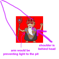
...this weird old man. I think the shading around most of his body is okay, but I'm not sure about his clothes. Something doesn't seem quite right, and it's not too obvious to me this time. Any suggestions?
(original on left, new on right)
...this weird old man. I think the shading around most of his body is okay, but I'm not sure about his clothes. Something doesn't seem quite right, and it's not too obvious to me this time. Any suggestions?
Okey-dokey. I fixed the areas you pointed out, although I'm not entirely sure what you meant by "subtle." Here's the new version:

And next to the old ones:
I'm still not totally sure about it, but I think he looks okay now.
And next to the old ones:
I'm still not totally sure about it, but I think he looks okay now.
Well, I wanted his face to have an eerie glow, so it's like the inside of him is lit up, but the exterior (teeth included) is not. Can ya dig it?
I don't know how to argue this without entering the realm of ghost physics (which is 100% fabricated). So, think of it this way...you can see the ghost, and you can see through him, but you can't see inside him. His insides glow an intense white, and the only places you can see it are his mouth and eyes. But, you can only see through him, not in him, so the internal glow of the rest of his body is contained.
That probably makes no sense, but that's the best I can do to justify it. Please don't make me play the "A Wizard Did It" card.
That probably makes no sense, but that's the best I can do to justify it. Please don't make me play the "A Wizard Did It" card.
Pages:
1

