


THOUGHTS ABOUT TITLESCREENS
Posts
Hope this is the right section.
OK, I'm wondering what your guys opinion on titlescreens is, like what do you think they should look like, should the text be fancy and non-readable, or simple and readable, should the titlescreen have objects that relate to game, etc.
Personally I think a title screen should be kept simple one or two objects representing the game text that is readable but cool, no fancy photoshop filters or real life objects, hand drawn or pixel art is the way to go. Or you can even rip stuff from old SNES, Gameboy games.
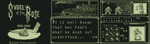
Property of MFlanaga, not for personal use
This in my opinion is a great titlescreen, the objects reflect the title and the game, the text is cool and readable.
Now I hope this makes sense, and is in the right section, now I would like to hear your thoughts, or images of what you think is a great titlescreen and why.
OK, I'm wondering what your guys opinion on titlescreens is, like what do you think they should look like, should the text be fancy and non-readable, or simple and readable, should the titlescreen have objects that relate to game, etc.
Personally I think a title screen should be kept simple one or two objects representing the game text that is readable but cool, no fancy photoshop filters or real life objects, hand drawn or pixel art is the way to go. Or you can even rip stuff from old SNES, Gameboy games.
Property of MFlanaga, not for personal use
This in my opinion is a great titlescreen, the objects reflect the title and the game, the text is cool and readable.
Now I hope this makes sense, and is in the right section, now I would like to hear your thoughts, or images of what you think is a great titlescreen and why.

It's nice when effort is made. That's about it. I think a titlescreen should be relevant, have readable text and be simple. I've seen fancy moving titlescreens that are like there own little movie, and yeah, it's nice-but a picture does the same job for me. We get lots of "I need a titlescreen" topics in the request forum. I always just think, "why?" It should be the last thing you worry about, no?
If anyone really judges a game by a titlescreen they have issues anyway. I don't think I've seen a bad one so I have none to post.
If anyone really judges a game by a titlescreen they have issues anyway. I don't think I've seen a bad one so I have none to post.
author=Little Wing Guy link=topic=3658.msg73455#msg73455 date=1241479130I'm going to have to disagree with that last part. If you find a very poor MS paint titlescreen, it makes the game look bad and unprofessional. If you have a good, professional titlescreen it will make the game look good and very exciting to play. I'm not saying that if you have a bad titlescreen people will exit the game, I'm saying first impressions are good. Do you get what I mean?
It's nice when effort is made. That's about it. I think a titlescreen should be relevant, have readable text and be simple. I've seen fancy moving titlescreens that are like there own little movie, and yeah, it's nice-but a picture does the same job for me. We get lots of "I need a titlescreen" topics in the request forum. I always just think, "why?" It should be the last thing you worry about, no?
If anyone really judges a game by a titlescreen they have issues anyway.


By the time I see a game's title screen I've already decided if I want to play it or not through game screenshots/videos, a game's description, or recommendations. I agree that a bad title screen is unprofessional but time spent on a title screen could go towards improving the meat and bones of the game instead of something you see for less than a minute.
*edit*
As for the actual topic on hand, I think title screens should be as simple as possible (title, logo, easy to read font, not filled with clutter) and take minimal time for the player to get the ball rolling (say NO to lots of start up ads and videos! NWN I'm looking at you).
*edit*
As for the actual topic on hand, I think title screens should be as simple as possible (title, logo, easy to read font, not filled with clutter) and take minimal time for the player to get the ball rolling (say NO to lots of start up ads and videos! NWN I'm looking at you).

In terms of RM games, title screens do little to intrigue me. Just slap some text on a a picture and you should be good to go. This doesn't mean I don't appreciate the work put into more intricately made title screens, although, again, it's something I find has little importance.
Basically, any title screen is fine with me, be it simple or complex. The only exception is if there was obviously no effort into making it, or it has a terribly low resolution.
Basically, any title screen is fine with me, be it simple or complex. The only exception is if there was obviously no effort into making it, or it has a terribly low resolution.

I always judge books and games by their cover. Lack of care and attention in something as visible as a title screen usually does not bode well for the game itself. (If you can't put effort into the title screen, who's to say you put effort into the game?)
Now, for aesthetic reasons I like a more symbolic background, like a sword or impersonal scenes, with an easy to read and contrasting title/font. It should also suit the game's graphical style (like, if it's 8-bit, make the title more retro).
Here are some title screens I've made:

I made this one for Feld recently.

Whipped this up in 5 mins for an upload of an old old game of mine.

For my game Hellion (which uses DWIV chips), I used an outline of the Dragonlord overlaid by the original DQ title screen. I'm not terribly happy with the font choice, though.

A nice simple sword image with a color matched gothic style font.

A cheesy font with a cartoonish background suits the cheesy nature of this community project.

This is for a 3 hour contest. I Google-imaged villains and found this sweet pic.

For Generica (also made with 8-bit DWIV chips). Not very happy with this one, mostly because I drew the sword freehand in MS Paint, but then realized it was way too small so resized it. I would've spent more time on it, except that I had more pressing issues while making this game in 10 days.

Some title I made for some kid. He didn't like it for some reason, but I do.

Chronicles of the Rose prototype for Stedar (I think).

Chronicles of the Rose prototype 2.

Chronicles of the Rose prototype 3.

Chronicles of the Rose prototype 4.

My game Runelords title prototype 1.

My game Runelords title prototype 2.

My game Runelords title prototype 3.

My game Runelords title prototype 4 (I went with this one).
Now, for aesthetic reasons I like a more symbolic background, like a sword or impersonal scenes, with an easy to read and contrasting title/font. It should also suit the game's graphical style (like, if it's 8-bit, make the title more retro).
Here are some title screens I've made:
I made this one for Feld recently.
Whipped this up in 5 mins for an upload of an old old game of mine.
For my game Hellion (which uses DWIV chips), I used an outline of the Dragonlord overlaid by the original DQ title screen. I'm not terribly happy with the font choice, though.
A nice simple sword image with a color matched gothic style font.
A cheesy font with a cartoonish background suits the cheesy nature of this community project.
This is for a 3 hour contest. I Google-imaged villains and found this sweet pic.
For Generica (also made with 8-bit DWIV chips). Not very happy with this one, mostly because I drew the sword freehand in MS Paint, but then realized it was way too small so resized it. I would've spent more time on it, except that I had more pressing issues while making this game in 10 days.
Some title I made for some kid. He didn't like it for some reason, but I do.
Chronicles of the Rose prototype for Stedar (I think).
Chronicles of the Rose prototype 2.
Chronicles of the Rose prototype 3.
Chronicles of the Rose prototype 4.
My game Runelords title prototype 1.
My game Runelords title prototype 2.
My game Runelords title prototype 3.
My game Runelords title prototype 4 (I went with this one).
In my experience almost all Rpg Maker games with bad title screens were terrible. I mean sure there are some exceptions. However why have a crappy title screen. It does not have to move or have a super fancy logo. But it better not make me throw up when I see it.
Think about it you want to show people how good your game is. Starting off the player by showing him the worst your game has to offer is going to make him stop playing faster than if you showing animal porn.
Think about it you want to show people how good your game is. Starting off the player by showing him the worst your game has to offer is going to make him stop playing faster than if you showing animal porn.

A Blurred Line has an amazing title screen. Simple yet effective. Ken that Dream title screen is amazing man, WTF was that guy/girl thinking when turning that down. If I make a game called Dream then I shall use that.
Heres my one Ocean Dreams made for me. Pretty straight forward.

Heres my one Ocean Dreams made for me. Pretty straight forward.

author=kentona link=topic=3658.msg73523#msg73523 date=1241540673You have some cool titles, though you have a few bad ones :-X . My favorite is Chronicles of the Rose prototype 3, the colour blends well with the text and character, the background gives it a peaceful, forest feel. It is not poorly made, and seems professional.
I always judge books and games by their cover. Lack of care and attention in something as visible as a title screen usually does not bode well for the game itself. (If you can't put effort into the title screen, who's to say you put effort into the game?)
Now, for aesthetic reasons I like a more symbolic background, like a sword or impersonal scenes, with an easy to read and contrasting title/font. It should also suit the game's graphical style (like, if it's 8-bit, make the title more retro).
author=captainregal link=topic=3658.msg73532#msg73532 date=1241553884I guess you could put it that way.
In my experience almost all Rpg Maker games with bad title screens were terrible. I mean sure there are some exceptions. However why have a crappy title screen. It does not have to move or have a super fancy logo. But it better not make me throw up when I see it.
Think about it you want to show people how good your game is. Starting off the player by showing him the worst your game has to offer is going to make him stop playing faster than if you showing animal porn.
Thanks for the comments guys, the different looks on the discussion is sure to help somebody out.
Alright, let's say I just made a title. It's just a black background with some fancy text. How many of you would be turned off from the game just because of how the title looks?

I must say that kentona makes some bad ass title screens, and I really appreciate the work he did for mines. Title screens and the overall quality of a game do seem to correlate.
In that case I'll put begging someone who knows what they're doing to make a titlescreen for me high up on my list of things I need to do to fix my game


My game, I didn't make it (Malad did.)
Minimalistic, and atmosphere already begins building here. I'm probably going to redraw the actual words "muse" in the future, just adjusting that a little.
Also, I can do title screens for people.
author=Jakester link=topic=3658.msg73593#msg73593 date=1241568898I think it really depends on the game your making, like a horror game with white creepy text might suit the game.
Alright, let's say I just made a title. It's just a black background with some fancy text. How many of you would be turned off from the game just because of how the title looks?
author=AznChipmunk link=topic=3658.msg73776#msg73776 date=1241661961The right side seems too open. :-\
My game, I didn't make it (Malad did.)
Minimalistic, and atmosphere already begins building here. I'm probably going to redraw the actual words "muse" in the future, just adjusting that a little.
Also, I can do title screens for people.
author=AznChipmunk link=topic=3658.msg73776#msg73776 date=1241661961
Also, I can do title screens for people.
You and I should talk ;)

