SUMMER SCREENSHOT SPECTACULAR!
Posts
author=ChaosProductions link=topic=3962.msg81967#msg81967 date=1245571404That purple font is REALLY hard to read when on a dark red background. I suggest changing its colour :-X.
Screenshot.
Figure'd I'd throw this up for critique before hittin' the sack.


Random battle screen of a new game in motion.
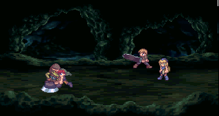
The bottom area would be just the default RTP menu border, I'm gonna be hitting that department soon. I'm merely showin' off characters. I think it'll only be those 3.
The bottom area would be just the default RTP menu border, I'm gonna be hitting that department soon. I'm merely showin' off characters. I think it'll only be those 3.
Nice. I was wondering this when I saw the gamepage screenshots, are they custom, or some kind of edits?
@J-man:
I like the graphics themselves. c: But given the setting/BG picture, the sprite seems to have a pasted-on feel due to its brightness in contrast to the cave. It's not too big of a deal, but if you could darken the sprites via events for the setting, or perhaps lighten up the cave BG picture a bit, it'd mesh better. Looking good none the less!
I like the graphics themselves. c: But given the setting/BG picture, the sprite seems to have a pasted-on feel due to its brightness in contrast to the cave. It's not too big of a deal, but if you could darken the sprites via events for the setting, or perhaps lighten up the cave BG picture a bit, it'd mesh better. Looking good none the less!


@Chaos:
Definitely much better. Not only are the texts now readable, changing the top hue to black-ish gives a really nice contrast too. There's a nice and mysterious atmosphere now. c:
Map-editor WIP structure of some platform:
^Refined the map + in-game cheesy effects:

(Kinda reminds me of Protoss for some reason, heh.)
Definitely much better. Not only are the texts now readable, changing the top hue to black-ish gives a really nice contrast too. There's a nice and mysterious atmosphere now. c:
Map-editor WIP structure of some platform:

^Refined the map + in-game cheesy effects:
(Kinda reminds me of Protoss for some reason, heh.)
Man, Protoss made me quit that game. Friggin' Dragoons.
Looks nice though, Reives. Makes me think of a Mayan temple or something.
Looks nice though, Reives. Makes me think of a Mayan temple or something.

Mad props to GameOverGamesProductions for this sweet globe for Hero's Realm world map:

Check it out because it is awesome.
Check it out because it is awesome.
Ha! I guess thats pretty cool but how would you use that in rpg maker?

author=Mr.Nemo link=topic=3962.msg82226#msg82226 date=1245696566
you require more vespene gas
pylons only require minerals.

author=Darken link=topic=3962.msg82236#msg82236 date=1245701433Well that's awfully rude. Make a funnier one.
lol guise i put a funny image with the word fail on it heh heh am i cool on the internet yet