


ARE THESE SPRITES GOOD?
Posts
Pages:
1

k first of all, i dont know where to post this so plz forgive me. :-\
ok on to the main part. i wanted to make sprites of Vincent (from ff7) using Charas.ex. thing is, his hair looked.......awful. so i decided to completely redo his hair. here is the result:
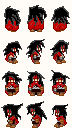
so now my question is, are the sprites i made decent? if not, what do i need to fix?
ok on to the main part. i wanted to make sprites of Vincent (from ff7) using Charas.ex. thing is, his hair looked.......awful. so i decided to completely redo his hair. here is the result:
so now my question is, are the sprites i made decent? if not, what do i need to fix?
It's really flat. Why the overall structure is there, there is very little shading.

I'm not sure I like the gray outline on the black hair. I'd make the hair itself a lighter shade of black, then outline it with pure black.

While I don't like the idea of someone making an FF7 fangame or whatever it is you're doing, I actually think the sprite is fine. Though the advice given by the two people above me is pretty good, it really depends on the level of detail you're trying to achieve.

author=Cop Killa link=topic=3982.msg80101#msg80101 date=1244843105
While I don't like the idea of someone making an FF7 fangame or whatever it is you're doing, I actually think the sprite is fine. Though the advice given by the two people above me is pretty good, it really depends on the level of detail you're trying to achieve.
And maybe whether or not you want people to bother looking at your game.
Ditch that grey outline... please. It looks pretty bad.
author=Craze link=topic=3982.msg80123#msg80123 date=1244849653author=Cop Killa link=topic=3982.msg80101#msg80101 date=1244843105
While I don't like the idea of someone making an FF7 fangame or whatever it is you're doing, I actually think the sprite is fine. Though the advice given by the two people above me is pretty good, it really depends on the level of detail you're trying to achieve.
And maybe whether or not you want people to bother looking at your game.
Uhh what? Graphical quality isn't the be-all end-all unless you only want idiots to play your game. I guarantee I'm less likely to play any of the games with the super amazing ultra lighting/shadow effects and other purely visual bullshit that no one really cares about than I am to play something like Earthbound or Ghosts of Aliens

thank you all!
is this one better? i managed to fix it a bit and recolor it (though its quite subtle as the grey outline became black and the main part became a slightly lighter shade of black):
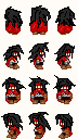
also, what do you mean by "flat"?
and no, im not making some kind of ff7 fan game.
is this one better? i managed to fix it a bit and recolor it (though its quite subtle as the grey outline became black and the main part became a slightly lighter shade of black):
also, what do you mean by "flat"?
and no, im not making some kind of ff7 fan game.

author=Cop Killa link=topic=3982.msg80170#msg80170 date=1244871791
Uhh what? Graphical quality isn't the be-all end-all unless you only want idiots to play your game. I guarantee I'm less likely to play any of the games with the super amazing ultra lighting/shadow effects and other purely visual bullshit that no one really cares about than I am to play something like Earthbound or Ghosts of Aliens
:(

author=Cop Killa link=topic=3982.msg80170#msg80170 date=1244871791
Uhh what? Graphical quality isn't the be-all end-all unless you only want idiots to play your game. I guarantee I'm less likely to play any of the games with the super amazing ultra lighting/shadow effects and other purely visual bullshit that no one really cares about than I am to play something like Earthbound or Ghosts of Aliens
There's never a legitimate reason not to consistently aim to improve.


I'm too lazy to continue this but it should give you a general idea. Basically, make the tones stand out more from each other. I like to use a middle grey background to test the contrast. If, zoomed out, I can't really see a difference, then I work on it so that the colors stand out more. I also tried looking at a pic of vincent to get an idea of what the hair would look like. Hair can be difficult though so don't be discouraged if you don't get it right the first few times. I have a pixel artist friend who's better than I am who hates doing hair.
I also try to clean up lineart, and not make colors feel too random. There's a tutorial on keeping clean lineart here:
http://www.derekyu.com/?page_id=221
I have other tutorials on my blog http://tilesettutorial.wordpress.com (plug ahoy), so feel free to check those out as well. I like the "So you like to be a pixel artist" link, as well as sprite art.
I like using a sort of pinkish/peach tone for highlights for red, and I tend to go to reddish/purple for shadows/dark reds. Then for grey, I try to make the darker colors more grey/blue while the highlights a little more yellow.
I don't really like the animation I did but I was lazy.
I hope it helps in some way.
author=Cop Killa link=topic=3982.msg80170#msg80170 date=1244871791
Uhh what? Graphical quality isn't the be-all end-all unless you only want idiots to play your game.
I never use super-ultra lfx or shadows, but I do use consistent and appealing graphics. I would never release something that I just randomly shoved together - and if you are honestly trying to get people (not just rpgmakervx.net twelve-year-olds) to play your game, making it not look good is a great way to get people to not bother with your game.
author=Feldschlacht IV link=topic=3982.msg80188#msg80188 date=1244879321author=Cop Killa link=topic=3982.msg80170#msg80170 date=1244871791
Uhh what? Graphical quality isn't the be-all end-all unless you only want idiots to play your game. I guarantee I'm less likely to play any of the games with the super amazing ultra lighting/shadow effects and other purely visual bullshit that no one really cares about than I am to play something like Earthbound or Ghosts of Aliens
There's never a legitimate reason not to consistently aim to improve.
Well sure, if you want to actually complete your game and not just show screenshots to people.
Well sure, if you want to actually complete your game and not just show screenshots to people.
Improvement and completion aren't mutually exclusive.
On topic; your sprites aren't bad, but continue to work on them. The contrast could use some work, and the colors could be tighter as well.

my ass and your face aren't mutually exclusive either 8)
ocean's advice is fairly good though, his shading works. hair does blow to shade.
ocean's advice is fairly good though, his shading works. hair does blow to shade.
author=Ocean link=topic=3982.msg80193#msg80193 date=1244883519
I'm too lazy to continue this but it should give you a general idea. Basically, make the tones stand out more from each other. I like to use a middle grey background to test the contrast. If, zoomed out, I can't really see a difference, then I work on it so that the colors stand out more. I also tried looking at a pic of vincent to get an idea of what the hair would look like. Hair can be difficult though so don't be discouraged if you don't get it right the first few times. I have a pixel artist friend who's better than I am who hates doing hair.
I also try to clean up lineart, and not make colors feel too random. There's a tutorial on keeping clean lineart here:
http://www.derekyu.com/?page_id=221
I have other tutorials on my blog http://tilesettutorial.wordpress.com (plug ahoy), so feel free to check those out as well. I like the "So you like to be a pixel artist" link, as well as sprite art.
I like using a sort of pinkish/peach tone for highlights for red, and I tend to go to reddish/purple for shadows/dark reds. Then for grey, I try to make the darker colors more grey/blue while the highlights a little more yellow.
I don't really like the animation I did but I was lazy.
I hope it helps in some way.
wow. i'll try to see if i can learn something from the tutorial.
thanks so much! :D

Pages:
1

