


PIXEL CONTEST #2: WINNERS ANNOUNCED AND ALL RESULTS POSTED!
Posts

The results are in! (Mostly!)
Yes, it's probably about time. I want to apologize to everyone who might have been anticipating this, I am pretty much entirely to blame for the delay in the announcement of the winners. I started a new job several weeks ago, and have been working eight to ten hours overnights the past fourteen days or so, leaving me absolutely exhausted and without a lot of time to sit down and get this done. I requested to my manager that I not be given so many shifts in a row, so hopefully this won't be a hinderance to my being in the community during the next few months or whatever.
Anyhow, I buckled down for an hour or two tonight to get this done as best I could, because the building demand for it among the staff members and those who participated. Unfortunately, because of the scale of the event, I wasn't able to get all of the individual, in-depth critiques done simultaneously. The "reviews" for each of the (non-winning) pieces should be posted and added to this topic sporadically throughout the next several days. For now, I'm happy to reveal the winning entries-- their creators shall be sent their prize money via RMN's official PayPal account sometime very soon!
Again, we'll be announcing the scores for everyone's submissions in the coming week, so check back soon if you were anticipating a response to your entry. For now, here are the winners!
The Results:
First Place: DE
Score: 38/40

Adherence to Theme: Wonderfully, wonderfully presented. The style and structure of the visuals very much conveys the sensibility of a game environment, and absolutely nowhere does it appear as though it'd been strictly conceived for a contest. No HUD exists, but the use of text excuses this, providing the illusion of cutscene or dramatic moment. (Likewise, the text is well-made and professional, admirable for its sharpness without anti-aliasing.)
10/10
Originality/Creativity: While not quite warranting a perfect score, this entry came extremely close. The astounding atmosphere achieved was largely unparalleled, achieving not only familiar steam-punk ambience, but effortlessly fusing them with elements of noir and foreboding touches of darkness. We felt that while the setting itself was not an entirely new locale, it's presentation was striking enough to appear fresh.
9/10
Detail/Use of Color: Despite his use of a mere 51 colors, the depth, detail and clarity of the image was truly wonderful. Hues and tones subtly complement one-another, with the shading itself appearing truly spot-on.
However, a unanimous decision was proposed not to award the entry a nine simply because of our small qualms with it's perspective. Most noticeably, the looming backdrop of what appeared to be a reactor seemed flat and our of sync with the rest of the piece. The pipes, likewise, were a tad bit off in their adherence to the angle of the building, but this was a relatively negligible issue.
9/10
Style/Form: This is where the piece truly delivers. Everything presented here is crisp, intricate, and expertly constructed. It was essentially the epitome of in-game screenshot mockup, and DE deserves his due for astonishing us with the depth and precision of his craft.
10/10
Total Score: 38/40
----------------------
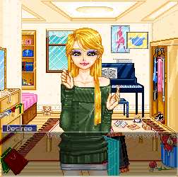
Second Place: Blitzen
Score: 33/40

Adherence to Theme: Our understanding of the piece was that it was meant to resemble a point-and-click adventure game, so hopefully this was correct? The hand-icon in the bottom corner seems to indicate that. The issue of perspective both helped and subtly hurt the piece; while we enjoyed it aesthetically, it seemed impractical functionally and we couldn't warrant awarding a full score.
8/10
Originality/Creativity: Also a largely creative piece. The characters both appear originally crafted, and the environment scenario is largely an untouched one. We were happy to see creativity paired with such talent in both of the winning pieces.
8/10
Detail/Use of Color: Expertly done. The color coordination and shading are absolutely spon-on in their implementation, and as mentioned, the angle very intriguing. The female character is particularly well designed, and we very much admired how so much was done with so few colors, in regards to the foreground. Very nice work here.
9/10
Style/Form: Yet again, very nicely put put together. Our largest nitpick was arguably the design of hand-icon, with several of us being of the opinion that it was not entirely distinguishable from the background, and could use a stronger defining outline. Likewise, with lighting as such a strong component of the piece, we wished both characters could receive proper shadows, as it would have contributed nicely to their depth.
8/10
Total Score: 33/40
----------------------
Natook
Score: 19/40
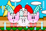
Adherence to Theme: While nicely done, we felt this entry was quite far from adequately pertaining to contest theme. No HUD of any sort existed, and it did not appear to our judges as particularly representative of an in-game screenshot. We awarded it a the middle-of-the-road score of five, as it arguably could pass as a single frame of an animated character sprite, but even this, we felt, was pushing it. Nice effort, anyhow.
5/10
Originality/Creativity: Again, this issue divided us somewhat amongst ourselves. While we felt it was somewhat of an easy route to create an illustration of an existing character, we also noticed a nice and rarely attempted touch in using (what seemed to be) a mid-animation frame. However, everything reeked of imitation: from the background details down to the animation itself-- it seemed as though you simply re-illustrated existing Kirby sprite-work, and that isn't something encouraged in this contest.
4/10
Detail/Use of Color: This entry faired quite a bit better here... there were a number of small, intricate details nicely placed throughout the piece. The vibrancy of the colors, despite their occasionally awkward shading, truly shine here. It was difficult to discern whether Natook was going for a "NES ERA" kind of Kirby image, but having only our speculation to go by, we felt collectively that many of the colors lacked depth and crispness, however.
6/10
Style/Form: We found very little form to speak of here. Being as small as it is, we found it decidedly difficult to mark for style, and nearly everything in the piece looked very stale and unpolished. None of it appeared as though it would be moving around or actually taking place in a game environment... and in that sense, it just came across as the static image that it is.
Total Score: 19/40
----------------------
Edit by Karsu: I am totally hijacking this thread, because Blind has proven himself incapable of doing so.
Sorry about the briefness guys, but hey...it's something.
Cop Killa:
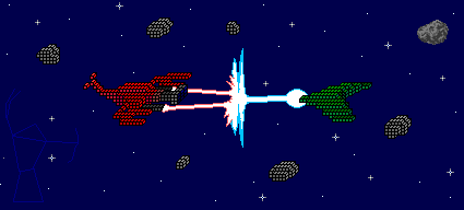
Cop Killa's piece has a number of serious problems. Firstly, there is no real indication of it being a game, the colors are used poorly and there is little detail, and the black outlines everywhere kill what little detail and form there was in the piece. Using pure black outlines on sprites is usually not a good idea. On the plus side, the concept is relatively original. As a side note, what is with that detailed asteroid in the far upper-right? It doesn't match everything else.
Adherence to Theme: 4
Originality/Creativity: 6
Detail/Use of Color: 2
Style/Form: 3
Penalty: N/A
Overall: 15 / 40
D-Bones:
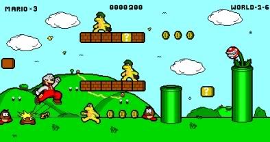
This piece has a major positive point: it actually does look like a shot from a possible game. Beyond that, though, it has trouble in all other areas - the use of an unoriginal character design in a familiar setting is the biggest detractor. One major thing that was noted during the review of this piece was the inconsistency of the characters with the environment - the characters are detailed and well done, but the background looks like it was slapped together quickly and without much thought. Also, .jpeg with sprites is a no-no and highly discouraged; this is a very precise art form and .jpegs make everything look worse immediately.
Adherence to Theme: 7
Originality/Creativity: 3
Detail/Use of Color: 4
Style/Form: 4
Penalty: -1 for .jpeg format
Overall: 17 / 40
Neok:

Neok admirably creates what looks like a fun, side-scrolling brawler. It is the first scoring entry on this list with an actual attempt at an interface, and the concept itself is somewhat clever - but the execution could've been better. The details are muddy and distorted and the characters clash with the background, dragging this piece down and making it weaker than it could be. Like our previous entries, it also has issues with flatness.
Adherence to Theme: 7
Originality/Creativity: 7
Detail/Use of Color: 4
Style/Form: 5
Penalty: N/A
Overall: 23 / 40
Arcan:

Arcan demonstrates a good degree of spriting skill here. There is an interface present, and it is quite attractive, and it really feels like a game mockup - albeit, an unfinished one, which is this piece's greatest flaw. Everything appears to fit and feels coherent. The colors are especially good.
Adherence to Theme: 9
Originality/Creativity: 7
Detail/Use of Color: 8
Style/Form: 7
Penalty: -5 (sorry man, can't warrant giving an award to an unfinished entry - why couldn't you just put something there!?)
Overall: 26 / 40
Darken:
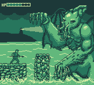
Darken attempts a very limited color palette (only four!) and mostly succeeds despite the rather complicated subject matter. The simple interface reminds one of simple, oldschool side-scrollers. A few nagging issues persist; the dithering on the cloud is probably too much, distracting from the foreground image, the water details in the middlgeround are weak, and Cthulhu's wing outline is awkwardly drawn when on the sky.
Adherence to Theme: 7
Originality/Creativity: 8
Detail/Use of Color: 6
Style/Form: 6
Penalty: N/A
Overall: 27 / 40
Boobledeboo
An intriguing take on the contest subject matter, Boobledeboo directly emulates, but does not duplicate, the Phoenix Wright games. While the flatness issues and the color choices weaken it, the strong emphasis on detail counts for a lot. The animation is also solid, suggesting an understanding and knowledge of the limitations of sprite animation. A solid work.
Adherence to Theme: 8
Originality/Creativity: 7
Detail/Use of Color: 7
Style/Form: 6
Penalty: N/A
Overall: 28 / 40
Yes, it's probably about time. I want to apologize to everyone who might have been anticipating this, I am pretty much entirely to blame for the delay in the announcement of the winners. I started a new job several weeks ago, and have been working eight to ten hours overnights the past fourteen days or so, leaving me absolutely exhausted and without a lot of time to sit down and get this done. I requested to my manager that I not be given so many shifts in a row, so hopefully this won't be a hinderance to my being in the community during the next few months or whatever.
Anyhow, I buckled down for an hour or two tonight to get this done as best I could, because the building demand for it among the staff members and those who participated. Unfortunately, because of the scale of the event, I wasn't able to get all of the individual, in-depth critiques done simultaneously. The "reviews" for each of the (non-winning) pieces should be posted and added to this topic sporadically throughout the next several days. For now, I'm happy to reveal the winning entries-- their creators shall be sent their prize money via RMN's official PayPal account sometime very soon!
Again, we'll be announcing the scores for everyone's submissions in the coming week, so check back soon if you were anticipating a response to your entry. For now, here are the winners!
The Results:
First Place: DE
Score: 38/40
Adherence to Theme: Wonderfully, wonderfully presented. The style and structure of the visuals very much conveys the sensibility of a game environment, and absolutely nowhere does it appear as though it'd been strictly conceived for a contest. No HUD exists, but the use of text excuses this, providing the illusion of cutscene or dramatic moment. (Likewise, the text is well-made and professional, admirable for its sharpness without anti-aliasing.)
10/10
Originality/Creativity: While not quite warranting a perfect score, this entry came extremely close. The astounding atmosphere achieved was largely unparalleled, achieving not only familiar steam-punk ambience, but effortlessly fusing them with elements of noir and foreboding touches of darkness. We felt that while the setting itself was not an entirely new locale, it's presentation was striking enough to appear fresh.
9/10
Detail/Use of Color: Despite his use of a mere 51 colors, the depth, detail and clarity of the image was truly wonderful. Hues and tones subtly complement one-another, with the shading itself appearing truly spot-on.
However, a unanimous decision was proposed not to award the entry a nine simply because of our small qualms with it's perspective. Most noticeably, the looming backdrop of what appeared to be a reactor seemed flat and our of sync with the rest of the piece. The pipes, likewise, were a tad bit off in their adherence to the angle of the building, but this was a relatively negligible issue.
9/10
Style/Form: This is where the piece truly delivers. Everything presented here is crisp, intricate, and expertly constructed. It was essentially the epitome of in-game screenshot mockup, and DE deserves his due for astonishing us with the depth and precision of his craft.
10/10
Total Score: 38/40
----------------------
Second Place: Blitzen
Score: 33/40
Adherence to Theme: Our understanding of the piece was that it was meant to resemble a point-and-click adventure game, so hopefully this was correct? The hand-icon in the bottom corner seems to indicate that. The issue of perspective both helped and subtly hurt the piece; while we enjoyed it aesthetically, it seemed impractical functionally and we couldn't warrant awarding a full score.
8/10
Originality/Creativity: Also a largely creative piece. The characters both appear originally crafted, and the environment scenario is largely an untouched one. We were happy to see creativity paired with such talent in both of the winning pieces.
8/10
Detail/Use of Color: Expertly done. The color coordination and shading are absolutely spon-on in their implementation, and as mentioned, the angle very intriguing. The female character is particularly well designed, and we very much admired how so much was done with so few colors, in regards to the foreground. Very nice work here.
9/10
Style/Form: Yet again, very nicely put put together. Our largest nitpick was arguably the design of hand-icon, with several of us being of the opinion that it was not entirely distinguishable from the background, and could use a stronger defining outline. Likewise, with lighting as such a strong component of the piece, we wished both characters could receive proper shadows, as it would have contributed nicely to their depth.
8/10
Total Score: 33/40
----------------------
Natook
Score: 19/40
Adherence to Theme: While nicely done, we felt this entry was quite far from adequately pertaining to contest theme. No HUD of any sort existed, and it did not appear to our judges as particularly representative of an in-game screenshot. We awarded it a the middle-of-the-road score of five, as it arguably could pass as a single frame of an animated character sprite, but even this, we felt, was pushing it. Nice effort, anyhow.
5/10
Originality/Creativity: Again, this issue divided us somewhat amongst ourselves. While we felt it was somewhat of an easy route to create an illustration of an existing character, we also noticed a nice and rarely attempted touch in using (what seemed to be) a mid-animation frame. However, everything reeked of imitation: from the background details down to the animation itself-- it seemed as though you simply re-illustrated existing Kirby sprite-work, and that isn't something encouraged in this contest.
4/10
Detail/Use of Color: This entry faired quite a bit better here... there were a number of small, intricate details nicely placed throughout the piece. The vibrancy of the colors, despite their occasionally awkward shading, truly shine here. It was difficult to discern whether Natook was going for a "NES ERA" kind of Kirby image, but having only our speculation to go by, we felt collectively that many of the colors lacked depth and crispness, however.
6/10
Style/Form: We found very little form to speak of here. Being as small as it is, we found it decidedly difficult to mark for style, and nearly everything in the piece looked very stale and unpolished. None of it appeared as though it would be moving around or actually taking place in a game environment... and in that sense, it just came across as the static image that it is.
Total Score: 19/40
----------------------
Edit by Karsu: I am totally hijacking this thread, because Blind has proven himself incapable of doing so.
Sorry about the briefness guys, but hey...it's something.
Cop Killa:
Cop Killa's piece has a number of serious problems. Firstly, there is no real indication of it being a game, the colors are used poorly and there is little detail, and the black outlines everywhere kill what little detail and form there was in the piece. Using pure black outlines on sprites is usually not a good idea. On the plus side, the concept is relatively original. As a side note, what is with that detailed asteroid in the far upper-right? It doesn't match everything else.
Adherence to Theme: 4
Originality/Creativity: 6
Detail/Use of Color: 2
Style/Form: 3
Penalty: N/A
Overall: 15 / 40
D-Bones:
This piece has a major positive point: it actually does look like a shot from a possible game. Beyond that, though, it has trouble in all other areas - the use of an unoriginal character design in a familiar setting is the biggest detractor. One major thing that was noted during the review of this piece was the inconsistency of the characters with the environment - the characters are detailed and well done, but the background looks like it was slapped together quickly and without much thought. Also, .jpeg with sprites is a no-no and highly discouraged; this is a very precise art form and .jpegs make everything look worse immediately.
Adherence to Theme: 7
Originality/Creativity: 3
Detail/Use of Color: 4
Style/Form: 4
Penalty: -1 for .jpeg format
Overall: 17 / 40
Neok:
Neok admirably creates what looks like a fun, side-scrolling brawler. It is the first scoring entry on this list with an actual attempt at an interface, and the concept itself is somewhat clever - but the execution could've been better. The details are muddy and distorted and the characters clash with the background, dragging this piece down and making it weaker than it could be. Like our previous entries, it also has issues with flatness.
Adherence to Theme: 7
Originality/Creativity: 7
Detail/Use of Color: 4
Style/Form: 5
Penalty: N/A
Overall: 23 / 40
Arcan:
Arcan demonstrates a good degree of spriting skill here. There is an interface present, and it is quite attractive, and it really feels like a game mockup - albeit, an unfinished one, which is this piece's greatest flaw. Everything appears to fit and feels coherent. The colors are especially good.
Adherence to Theme: 9
Originality/Creativity: 7
Detail/Use of Color: 8
Style/Form: 7
Penalty: -5 (sorry man, can't warrant giving an award to an unfinished entry - why couldn't you just put something there!?)
Overall: 26 / 40
Darken:
Darken attempts a very limited color palette (only four!) and mostly succeeds despite the rather complicated subject matter. The simple interface reminds one of simple, oldschool side-scrollers. A few nagging issues persist; the dithering on the cloud is probably too much, distracting from the foreground image, the water details in the middlgeround are weak, and Cthulhu's wing outline is awkwardly drawn when on the sky.
Adherence to Theme: 7
Originality/Creativity: 8
Detail/Use of Color: 6
Style/Form: 6
Penalty: N/A
Overall: 27 / 40
Boobledeboo
An intriguing take on the contest subject matter, Boobledeboo directly emulates, but does not duplicate, the Phoenix Wright games. While the flatness issues and the color choices weaken it, the strong emphasis on detail counts for a lot. The animation is also solid, suggesting an understanding and knowledge of the limitations of sprite animation. A solid work.
Adherence to Theme: 8
Originality/Creativity: 7
Detail/Use of Color: 7
Style/Form: 6
Penalty: N/A
Overall: 28 / 40

Blindmind what blasphemy is this, the rest are ignored and no feedback or anything like the previous one?
You had more than a week! (or was it two weeks) anyway yeah
And as expected, DE won and Blitzen, congrats~
You had more than a week! (or was it two weeks) anyway yeah
The results are in! (Mostly!)Oh :gwa:
And as expected, DE won and Blitzen, congrats~

I wasn't a judge.
But hot damn that thing is crazy, DE.
But hot damn that thing is crazy, DE.


classic fallacy, consider that the foreground shouldn't really be where the eye is drawn to in this case.
also, stylistic choice really. i guess they never finished shading earthbound, huh?
also, stylistic choice really. i guess they never finished shading earthbound, huh?

It's called Alter AILA Genesis.
@FG: you're wrong, and I'm saying that as a guy who creates such stuff on regular basis. Ask any professional artist, they'll tell you the same. Heck, just fire up DosBox and any of the Lucasarts games (Indiana Jones is nice).
@FG: you're wrong, and I'm saying that as a guy who creates such stuff on regular basis. Ask any professional artist, they'll tell you the same. Heck, just fire up DosBox and any of the Lucasarts games (Indiana Jones is nice).


Bearded Guy: Better watch out, there is a fire extinguisher weilding psycho out there.
The piece that won second was actually my favorite. I guess DE's deserved to win considering it was the most aesthetically pleasing and clearly showed the most talent, but I still liked Blitzen's more, probably because it was goofier and seemed more creative.
This is personal preference really and again I don't think the judges made the wrong decision, but I just wanted to throw it out there.
This is personal preference really and again I don't think the judges made the wrong decision, but I just wanted to throw it out there.
I liked Neok's, Darken's and boobledeeboo's entries more than Natook's (no offense Natook, yours is quite good, too). I totally agree with the #1 and #2 selections.

