


PIXEL CONTEST #2: WINNERS ANNOUNCED AND ALL RESULTS POSTED!
Posts

post=94334
Because Blind is a lazy jerk.
Sorry about the briefness guys, but hey...it's something.
Cop Killa:
Cop Killa's piece has a number of serious problems. Firstly, there is no real indication of it being a game, the colors are used poorly and there is little detail, and the black outlines everywhere kill what little detail and form there was in the piece. Using pure black outlines on sprites is usually not a good idea. On the plus side, the concept is relatively original. As a side note, what is with that detailed asteroid in the far upper-right? It doesn't match everything else.
Adherence to Theme: 4
Originality/Creativity: 6
Detail/Use of Color: 2
Style/Form: 3
Penalty: N/A
Overall: 15 / 40
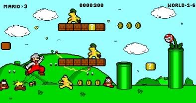
D-Bones:
This piece has a major positive point: it actually does look like a shot from a possible game. Beyond that, though, it has trouble in all other areas - the use of an unoriginal character design in a familiar setting is the biggest detractor. One major thing that was noted during the review of this piece was the inconsistency of the characters with the environment - the characters are detailed and well done, but the background looks like it was slapped together quickly and without much thought. Also, .jpeg with sprites is a no-no and highly discouraged; this is a very precise art form and .jpegs make everything look worse immediately.
Adherence to Theme: 7
Originality/Creativity: 3
Detail/Use of Color: 4
Style/Form: 4
Penalty: -1 for .jpeg format
Overall: 17 / 40
Neok:
Neok admirably creates what looks like a fun, side-scrolling brawler. It is the first scoring entry on this list with an actual attempt at an interface, and the concept itself is somewhat clever - but the execution could've been better. The details are muddy and distorted and the characters clash with the background, dragging this piece down and making it weaker than it could be. Like our previous entries, it also has issues with flatness.
Adherence to Theme: 7
Originality/Creativity: 7
Detail/Use of Color: 4
Style/Form: 5
Penalty: N/A
Overall: 23 / 40
Arcan:
Arcan demonstrates a good degree of spriting skill here. There is an interface present, and it is quite attractive, and it really feels like a game mockup - albeit, an unfinished one, which is this piece's greatest flaw. Everything appears to fit and feels coherent. The colors are especially good.
Adherence to Theme: 9
Originality/Creativity: 7
Detail/Use of Color: 8
Style/Form: 7
Penalty: -5 (sorry man, can't warrant giving an award to an unfinished entry - why couldn't you just put something there!?)
Overall: 26 / 40
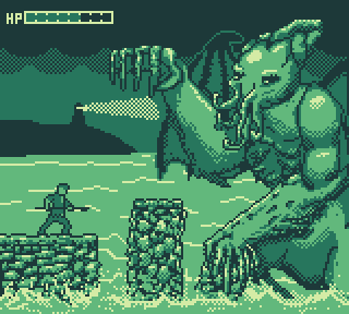
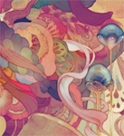
Darken:
Darken attempts a very limited color palette (only four!) and mostly succeeds despite the rather complicated subject matter. The simple interface reminds one of simple, oldschool side-scrollers. A few nagging issues persist; the dithering on the cloud is probably too much, distracting from the foreground image, the water details in the middlgeround are weak, and Cthulhu's wing outline is awkwardly drawn when on the sky.
Adherence to Theme: 7
Originality/Creativity: 8
Detail/Use of Color: 6
Style/Form: 6
Penalty: N/A
Overall: 27 / 40
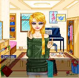
Boobledeboo
An intriguing take on the contest subject matter, Boobledeboo directly emulates, but does not duplicate, the Phoenix Wright games. While the flatness issues and the color choices weaken it, the strong emphasis on detail counts for a lot. The animation is also solid, suggesting an understanding and knowledge of the limitations of sprite animation. A solid work.
Adherence to Theme: 8
Originality/Creativity: 7
Detail/Use of Color: 7
Style/Form: 6
Penalty: N/A
Overall: 28 / 40

Finally results! :D
Now I can see how stuff got judged :3

Wow, all of these are mighty impressive. I espically like Arcan & Neok's stuff. Good for you guys! You all did great. I, unfortunately. Cannot do this if my life depended on it.
As a side note, what is with that detailed asteroid in the far upper-right? It doesn't match everything else.
you dun get it =[

post=94334
D-Bones:
This piece has a major positive point: it actually does look like a shot from a possible game. Beyond that, though, it has trouble in all other areas - the use of an unoriginal character design in a familiar setting is the biggest detractor. One major thing that was noted during the review of this piece was the inconsistency of the characters with the environment - the characters are detailed and well done, but the background looks like it was slapped together quickly and without much thought. Also, .jpeg with sprites is a no-no and highly discouraged; this is a very precise art form and .jpegs make everything look worse immediately.
Adherence to Theme: 7
Originality/Creativity: 3
Detail/Use of Color: 4
Style/Form: 4
Penalty: -1 for .jpeg format
Overall: 17 / 40
Haha, funny thing about that...
If by bronze you mean nothing then yes, grats.
post=94594
Oh, hey, cheers Karsuman.
Does this mean i get bronze? :D
Yes, but Arcan gets the satisfaction of knowing that had he actually COMPLETED his drawing, his 31/40 would have beaten your puny 28/40.

