


WE DID IT FIRST SCREENSHOT THREAD
Posts
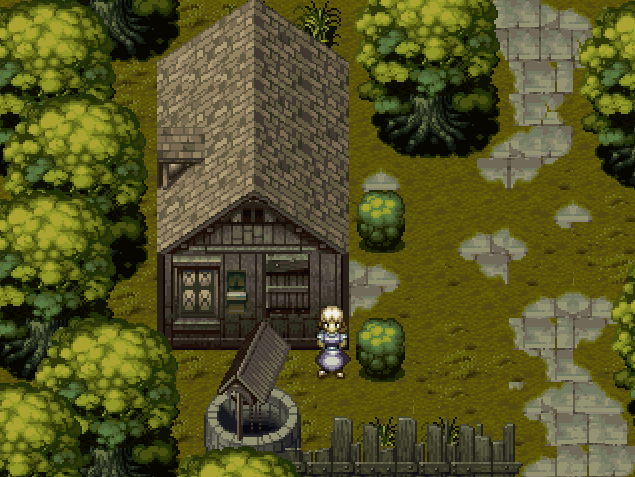
It's so cuuuuuute.

I generally don't like that sort of thing, but I am in a team as a mapper and that is what they want. So I am obligated to deliver!

Wow, that's pro use of that chipset. Looks great!
I'm starting to like more compact maps more. Never really did like big ones. Especially the giant RTP rooms with 95% open space and like one chair.
I'm starting to like more compact maps more. Never really did like big ones. Especially the giant RTP rooms with 95% open space and like one chair.
Thanks guys! I personally love REFMAP regardless of what people say.I feel that it is a lot more versatile than Suikoden or most other chipsets, but maybe its just me. :-X

author=Tau link=topic=5.msg12654#msg12654 date=1208713965author=WIP link=topic=5.msg12653#msg12653 date=1208713297Agreed! ;D
It's so cuuuuuute.
QFT

I agree with what everyone's said so far. I've always liked it when people put more detail into less space. I've recently started to appreciate when people excise unnecessary stuff. I've heard a similar approach being applied to writing and movies, so it only seems natural to apply it to games as well.
I think this ties nicely into the Gamasutra article WIP mentions here.
I think this ties nicely into the Gamasutra article WIP mentions here.


Just tried out my tileset in RMVX. RMVX was kinda fun to play around with, but I'll save doing my actual project until later.
Visit the Tileset tutorial to check out tutorials on this. I didn't get to do an in depth one on the ceiling though. If you zoom in 8x or more in the TileA4, you could see how I did it with the step by step things there.
I saw the pot earlier tonight, Ocean and it looks pretty rad. I think they don't really match the perspective, though!
author=Ocean link=topic=5.msg12823#msg12823 date=1208845974
Just tried out my tileset in RMVX. RMVX was kinda fun to play around with, but I'll save doing my actual project until later.
Wow awesome rough draft dude. I will suggest two things because it seems like you are asking for suggestions (otherwise why post man). I am being picky because I love you:
- I love your colors and the windows are gorgeous.
- Your floors look a little too boxy. I like the tile mosaic idea, but you need to eliminate any suggestion of geometric shapes in the tiles. If you relax your eyes, you will notice straight lines going down and going sideways making a grid. This is kind of opposite of the point of a mosaic. To fix this, you should vary the shades of your tiles more (try shades of slate-blue, slate-green, slate-yellow etc), and you should make the tiles so that there are no straight lines going all the way across.
- Also the floors look too busy, but I think that is because I see straight lines.
- I don't know how but can you do something with the walls so that they aren't just a solid shade of red? Flat shades are great if you use flat shades for everything. Because you aren't, though, the walls look plain.
But anyway great spriting overall man. Just watch out for geometric shapes in your tiles because a lack of any geometric shapes is what makes people love tiles from SD3, Terranigma, FF6, etc.
Wow awesome rough draft dude. I will suggest two things because it seems like you are asking for suggestions (otherwise why post man). I am being picky because I love you:Yes, this is good feedback. I always accept criticisms and suggestions, the Vase used to be very different before they told me that it looked too flat, so I changed it. I am not a master pixel artist and am still learning.
- I love your colors and the windows are gorgeous.
- Your floors look a little too boxy. I like the tile mosaic idea, but you need to eliminate any suggestion of geometric shapes in the tiles. If you relax your eyes, you will notice straight lines going down and going sideways making a grid. This is kind of opposite of the point of a mosaic. To fix this, you should vary the shades of your tiles more (try shades of slate-blue, slate-green, slate-yellow etc), and you should make the tiles so that there are no straight lines going all the way across.
- Also the floors look too busy, but I think that is because I see straight lines.
- I don't know how but can you do something with the walls so that they aren't just a solid shade of red? Flat shades are great if you use flat shades for everything. Because you aren't, though, the walls look plain.
But anyway great spriting overall man. Just watch out for geometric shapes in your tiles because a lack of any geometric shapes is what makes people love tiles from SD3, Terranigma, FF6, etc.
The floor could stand to be better. I'll go and fix it soon once I start working on the next tileset tutorial. I'll make an image of just that floor tile so I can check out the tiling and try to kill it (I noticed some now that I'm looking at it). I could also make it a 32x32 pattern instead of 4 16x16 ones so the tiling is less obvious.
What I really wanted to do for this particular scene is make a different floor tile altogether, and some carpets. I have an idea of how it'll look like, so I'll post that once I'm done with it.
I chose flat red so it could be easily tiled. But at this size in the screenshot, it does look really flat, normally I test it on a smaller size wall so it never really bothered me. I'll go work on that too.
author=Ocean link=topic=5.msg12862#msg12862 date=1208882357
The floor could stand to be better. I'll go and fix it soon once I start working on the next tileset tutorial. I'll make an image of just that floor tile so I can check out the tiling and try to kill it (I noticed some now that I'm looking at it). I could also make it a 32x32 pattern instead of 4 16x16 ones so the tiling is less obvious.
Well see I am awful at graphics but I made a floor tile that is exactly the same as yours and it took me all night to get it right because I suck so I thought I would offer my experiences! Here is the graphic:

This is from a prototype and the graphics aren't done obviously but you can see how I avoided geometric shapes in it. However you can still notice the big green blob so it needs fixing.
Well, I'm going for straight lines rather than rounded shapes like you're using there.
Like this:

(FF5, not mine)
Well, the tiling is pretty obvious here though. Maybe I need a different example. Whoops.
Or maybe I could just go with the rounded shapes and see how that goes.
Like this:
(FF5, not mine)
Well, the tiling is pretty obvious here though. Maybe I need a different example. Whoops.
Or maybe I could just go with the rounded shapes and see how that goes.
author=Ocean link=topic=5.msg12865#msg12865 date=1208883568
Well, I'm going for straight lines rather than rounded shapes like you're using there.
Like this:
(FF5, not mine)
Well, the tiling is pretty obvious here though. Maybe I need a different example. Whoops.
Or maybe I could just go with the rounded shapes and see how that goes.
Well you should go all the way in either direction. FFV looks consistent because it has a very boxy motif, and FFVI looks consistent because it has a wild, chaotic motif.


Wow, that looks really impressive Ciel!
I love that Charset, it matches well with the chipset (which is also very nice).
I love that Charset, it matches well with the chipset (which is also very nice).
I agree with iamnot. Where are those graphics from?

