


SCREENSHOT SESAME STREET (40TH ANNIVERSARY EDITION)
Posts
@Tau: Use a dark brown color for the outlines cause black never looks good and I'd also recommend putting more color contrast between the sides and ground.
@Bandito: Proportions man! The sides of the boat are really huge compared to the cabin size and the masts are also extremely huge.
@Bandito: Proportions man! The sides of the boat are really huge compared to the cabin size and the masts are also extremely huge.
If he's going for the Mother 3 style that I do, then black works wonders. Don't care what anyone says.
Black outlines are generally a bad way to go but I will agree that Mother is one of the few games it actually works for. However, this does not make up for the fact that those tiles are severely lacking. I still think he should work more on choosing the correct colors.


I was playing Mother lately and decided to try my hand at making my own graphics. I like the cliffs, but the trees... XP
Can not draw!

More stuff. I like how the rocks came out. ^.^


I need to expand the bottom box.
Liberty, the grass needs more details :(.
Edit: Also, I might as well post another screenshot.
The Barracks!
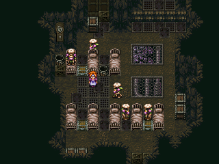
I also promise that this will be the last one on this area!
Edit: Also, I might as well post another screenshot.
The Barracks!
I also promise that this will be the last one on this area!

@ Liberty: Couldn't you at least try to do some squiggles lines for the grass to make it at least 'grassy'.
nickad, that looks like my game before i completely rethought the concept of it. good job with the cave stuff- my only suggestion is to add something around the grates to make them look a bit more natural. or un-natural and man-made as the case may be. more like they're a functional grate of some kind rather than just a 'window' cut into the ground.
maybe plates around them or something like that. just a thought.
maybe plates around them or something like that. just a thought.

I'm not sure that I want to use too many colours Nightblade, but I'll have a fiddle with it and see if I can add at least one lighter colour. I'm trying to keep it really simple colour- and graphic- wise.
i'd like to see one lighter or darker colour for the flora/fauna. the trees/flowers look a little flat at present.
as far as the cliffs/dirt/grass go, they look pretty spiffy as is.
as far as the cliffs/dirt/grass go, they look pretty spiffy as is.
@Liberty >> How about adding some dark green shading around the tree roots to give the impression that the roots are actually digging into the ground? In fact, you should add shading around all of the objects (such as the rocks, the flowers and the cliffs) to make it appear as if they are embedded in the ground. Also, perhaps add some minor shading to the rocks, flowers and the sides of the cliffs (the left and right ends of them that curve around. Perhaps a slightly lighter shade of the brown used on the edges to give off the effect that it is curving around?), because as they are now, they're quite bland and don't seem to give the illusion of a 3D aspect of the world, but rather just a 2D shape.
It would also be nice if the trees and other objects had shadows to denote the direction that the sun/light source is shining in.
Other than that, I am quite intrigued with the floor tiles. They're un-realistic, but at the same time just have this nice aesthetic touch and organic shape that appeals to me :).
@Tardis >> I see what you mean. It DOES look like a 'window' cut into the ground. Thanks for the advice. I'll see what I can do :).

Okay so tried some high/low lights in the trees and flowers and added shading to the cliffs. Not sure that I like it or not (cliffs, I mean). Also, shadow under the trees. Probably should add some under the flowers too, now that I think about it. Not looking too bad, methinks, but there's a lot more to do!

I realize those things on the cliffs are ledges, but I keep seeing hearts. Pink hearts en masse. D=

Lib we should team up for the contest, seeing as were doing the same type of graphical work right now.. It seems you have more time on your hands though. Send me a pm! Looks great BTW!
@Lennon - Thanks man, trying to right now jut some simple work, gather the skills.. Fuck I'm wasted right now.
@Lennon - Thanks man, trying to right now jut some simple work, gather the skills.. Fuck I'm wasted right now.


